@ditus/react-web-retail
This repo contains UI components based on Material UI for use in web-based retail applications. These components can be used when building a responsive, themed, and accessible web-based retail application. All components have multi-language/translation support and can be themed. The repo is open source and will remain so.
Installation
npm i @ditus/react-web-retailDemo
To view the components, type:
npm i
npm run storybook
Components
The following components are included in the package. For demo's and to view components in actual size, run storybook as indicated above. Some components are internal and are not listed here since they are not exposed. If you don't see a component that you believe should be here or you would like to see an internal component made external, submit a request and we will respond promptly.
Add To Cart
The Add to Cart component displays a button that allows customers to add a product to their shopping cart.
Brand Link
The Brand Link component displays the brand name of a product.
It can also be displayed as a link, if there are many products of the same brand:
Cart Empty
The Cart Empty component displays a message stating that the customers shopping cart is empty.
Cart Icon
The Cart Icon component displays a shopping cart icon that can be clicked to redirect the customer to their shopping cart.
The Cart Icon with a badge specifying the number of products in the shopping cart:
Choking Hazard
The Choking Hazard component displays a warning on products that contain small parts and could be harmful to younger children.
Featured Product Attributes
The Featured Product Attributes component displays a subset of product attributes that consumers would be more interested in.
Featured Taxonomies
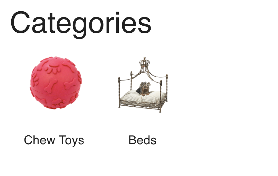
The Featured Taxonomies component displays related taxonomies used to categories products. Customers would usually click a taxonomy to view all products within that category.
Featured Taxonomy
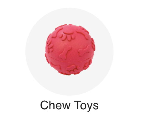
The Featured Taxonomy component displays a single category or taxonomy of products, such as dog toys or cat food.
When the mouse is hovered over the component, it appears as:
Low Stock
The Low Stock component displays a message when a product is low on quantity.
Price
The Price component displays the price of a product.
Product
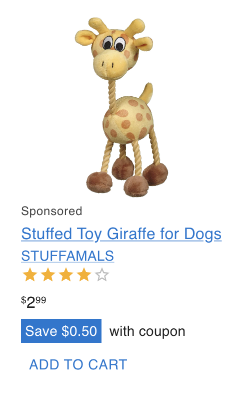
The Product component displays a product's information and is used in search results and lists of products.
Product Attribute
The Product Attribute component displays a single name/value pair representing an attribute of the product, such as the product's color or dimensions.
Product Attributes
The Product Attributes component displays a list of product attributes.
Product Image
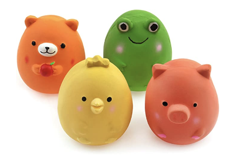
The Product Image component displays a single image of a product.
Rating Bar
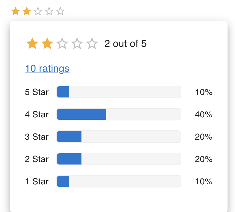
The Rating Bar component displays a product star rating and when the user presses or hovers over the component, a popup appears displaying more information on the ratings of the product.
Rating Linear Progress
The Rating Linear Progress component displays a styled Linear Progress bar that displays the rating for a product.
Rating Summary
The Rating Summary component displays the ratings for a product broken down by star rating, including the average rating and total number of ratings.
Rating Summary Bar
The Rating Summary Bar component displays the ratings for a single star (1 through 5) on the Rating Summary component.
Save Coupon
The Save Coupon component displays a message indicating how much the consumer will save with a coupon that is automatically applied at checkout.
Sponsored
The Sponsored component displays the word 'sponsored' and is meant to be displayed when a product is promoted for advertising reasons.
Swatch
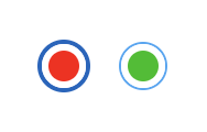
The Swatch component displays a variant color or material for a product using a solid color or image.
This is an example of a solid color:
This is an example of an image:
Swatches
The Swatches component displays one or more swatches.
Wish List Icon
The Wish List Icon component displays a wish list icon that can be clicked to redirect the customer to their wish list.
The Wish List Icon with a badge specifying the number of products in the wish list:
Roadmap
See the open issues for a list of proposed features (and known issues).
License
This project is licensed under the terms of the MIT license.


