
<mwc-snackbar> 

IMPORTANT: The Material Web Components are a work in progress and subject to major changes until 1.0 release.
Snackbars provide brief messages about app processes at the bottom of the screen.
Material Design Guidelines: Snackbars
Installation
npm install @dev.mohe/mwc-snackbarNOTE: The Material Web Components are distributed as ES2017 JavaScript Modules, and use the Custom Elements API. They are compatible with all modern browsers including Chrome, Firefox, Safari, Edge, and IE11, but an additional tooling step is required to resolve bare module specifiers, as well as transpilation and polyfills for IE11. See here for detailed instructions.
Example usage
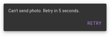
Standard
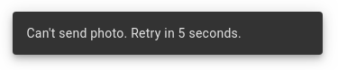
<mwc-snackbar id="photoErrorSnackbar"
              labelText="Can't send photo. Retry in 5 seconds.">
</mwc-snackbar>

<script type="module">
  import '@dev.mohe/mwc-snackbar';
  const snackbar = document.querySelector('#photoErrorSnackbar');
  sendPhoto.then(...).catch(() => snackbar.show());
</script>
Optional action and dismiss button
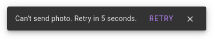
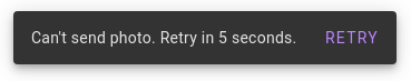
<mwc-snackbar labelText="Can't send photo. Retry in 5 seconds.">
  <mwc-button slot="action">RETRY</mwc-button>
  <mwc-icon-button icon="close" slot="dismiss"></mwc-icon-button>
</mwc-snackbar>
Custom action button color
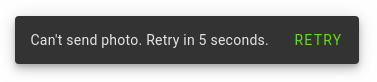
mwc-snackbar {
  --mdc-snackbar-action-color: #64dc17;
}
Variants
Stacked
Action buttons with long text should be positioned below the label instead of
alongside it. Set the stacked attribute or property to enable this layout.
Leading
By default, snackbars are centered horizontally within the viewport. On larger
screens, they can optionally be displayed on the leading edge of the screen
(the left side in LTR, or the right side in RTL). Set the leading
attribute or property to enable this layout.
API
Slots
| Name | Description |
|---|---|
action |
Optional <mwc-button> which closes the snackbar with reason 'action'. |
dismiss |
Optional <mwc-icon-button> which closes the snackbar with reason 'dismiss'. |
Properties/Attributes
| Name | Type | Description |
|---|---|---|
open |
boolean |
Whether the snackbar is currently open. |
timeoutMs |
number |
Automatic dismiss timeout in milliseconds. Value must be between 4000 and 10000 (or -1 to disable the timeout completely) or an error will be thrown. Defaults to 5000 (5 seconds). |
closeOnEscape |
boolean |
Whether the snackbar closes when it is focused and the user presses the ESC key. Defaults to false. |
labelText |
string |
The text content of the label element. |
stacked |
boolean |
Enables the stacked layout (see above). |
leading |
boolean |
Enables the leading layout (see above). |
Methods
| Name | Description |
|---|---|
show() => void |
Opens the snackbar. |
close(reason: string = '') => void |
Closes the snackbar, optionally with the specified reason indicating why it was closed. |
Events
| Name | Detail | Description |
|---|---|---|
MDCSnackbar:opening |
{} |
Indicates when the snackbar begins its opening animation. |
MDCSnackbar:opened |
{} |
Indicates when the snackbar finishes its opening animation. |
MDCSnackbar:closing |
{reason?: string} |
Indicates when the snackbar begins its closing animation. reason contains the reason why the snackbar closed ('dismiss', 'action', or a custom string via the close method). |
MDCSnackbar:closed |
{reason?: string} |
Indicates when the snackbar finishes its closing animation. reason contains the reason why the snackbar closed ('dismiss', 'action', or a custom string via the close method). |
CSS Custom Properties
| Name | Default | Description |
|---|---|---|
--mdc-snackbar-action-color |
 #bb86fc
|
Color of the action button text. |
Global CSS Custom Properties
This component exposes the following global theming custom properties.
| Name | Description |
|---|---|
--mdc-typography-body2-<PROPERTY> |
Styles the typography of a snackbar. |