react-pager
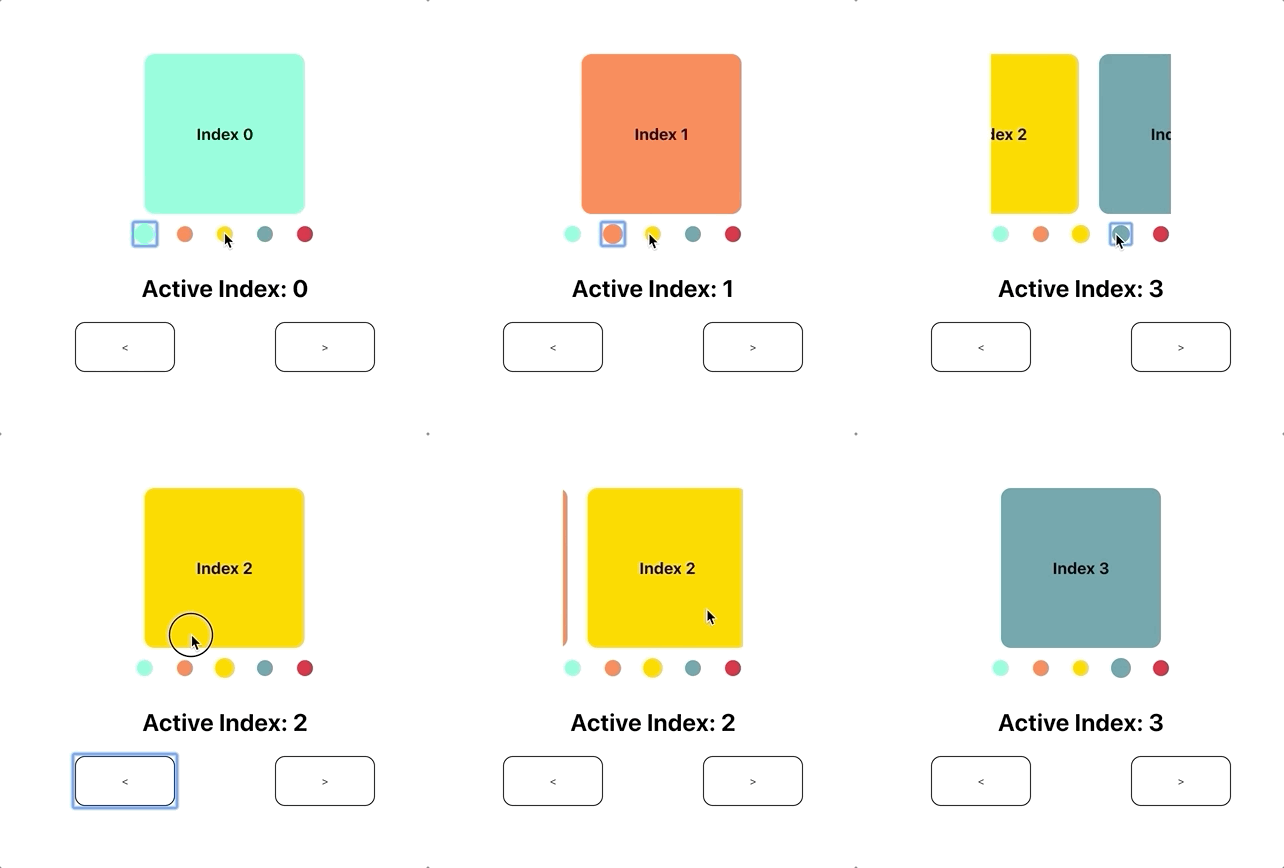
A fully controllable, high performance pager for React
Install
yarn add @crowdlinker/react-pager
Example
import React, { useState } from 'react';
import { Pager, PagerProvider } from '@crowdlinker/react-pager';
import { Slide } from './shared-components';

function MyPager() {
  const [activeIndex, onChange] = useState(1);

  return (
    <PagerProvider activeIndex={activeIndex} onChange={onChange}>
      <Pager>
        <Slide />
        <Slide />
        <Slide />
        <Slide />
      </Pager>
    </PagerProvider>
  );
}
API Reference
Pager
import { Pager } from '@crowdlinker/react-pager';

interface PagerProps {
  type: 'horizontal' | 'vertical';
  children: React.ReactNode[];
  activeIndex?: number;
  onChange?: (nextIndex: number) => void;
  initialIndex?: number;
  adjacentChildOffset?: number;
  pageSize?: number;
  minIndex?: number;
  maxIndex?: number;
  threshold?: number;
  clamp: {
    next: number;
    prev: number;
  };
  clampDrag: {
    next: number;
    prev: number;
  };
  pageInterpolation: iInterpolationConfig;
  gestureOptions: Partial<GestureConfig>;
}
PagerProvider
import { PagerProvider } from '@crowdlinker/react-pager';

interface iPagerProvider {
  children: React.ReactNode;
  initialIndex?: number;
  activeIndex?: number;
  onChange?: (next: number) => void;
}
Pagination
import { Pagination } from '@crowdlinker/react-pager';

interface iPagination {
  children: React.ReactNode[];
  pageInterpolation: iInterpolationConfig;
  style?: any;
}
Slider
import { Slider } from '@crowdlinker/react-pager';

interface iSlider {
  style: any;
  numberOfScreens: number;
}
Progress
import { Progress } from '@crowdlinker/react-pager';

interface iProgress {
  style: any;
  numberOfScreens: number;
}
Hooks
There are a number of useful hooks you can use in your screens when you wrap <Pager /> in a <PagerProvider />
  usePager(): [activeIndex, onChange]
  useFocus(): boolean -> is screen focused
  useOnFocus(fn) -> fn() to fire on screen focus
  useOffset() -> the animatedIndex of the page relative to the activeIndex
  useInterpolation(interpolationConfig) -> interpolated style object
  useJumpTo() -> (nextIndex: number) => void -> jump to index without animation
  useRoutes(routes: string[]): [activeRoute, changeByRoute] -> maps indices to strings
What is animatedIndex?
Animated index represents the animated value of the active index -- it includes possible intermediate values. When panning or transitioning, the activeIndex value moves from 0 -> 1 but the animatedIndex value captures all intermediate values between 0 and 1 during this transition.
Hooks in action
function MySlide(props) {
  const [data, setData] = useState();

  useOnFocus(() => {
    if (!data) {
      myApi.fetchData(props).then(setData);
    }
  });

  const style = useInterpolation({
    transform: [
      {
        scale: {
          range: [-1, 0, 1],
          output: [0.9, 1, 0.9],
          extrapolate: 'clamp',
        },
      },
      {
        rotate: {
          unit: 'deg',
          range: [-1, 0, 1],
          output: [90, 0, 120],
        },
      },
    ],
  });

  return <animated.div style={{ flex: 1, ...style }}>...</animated.div>;
}
Interpolation
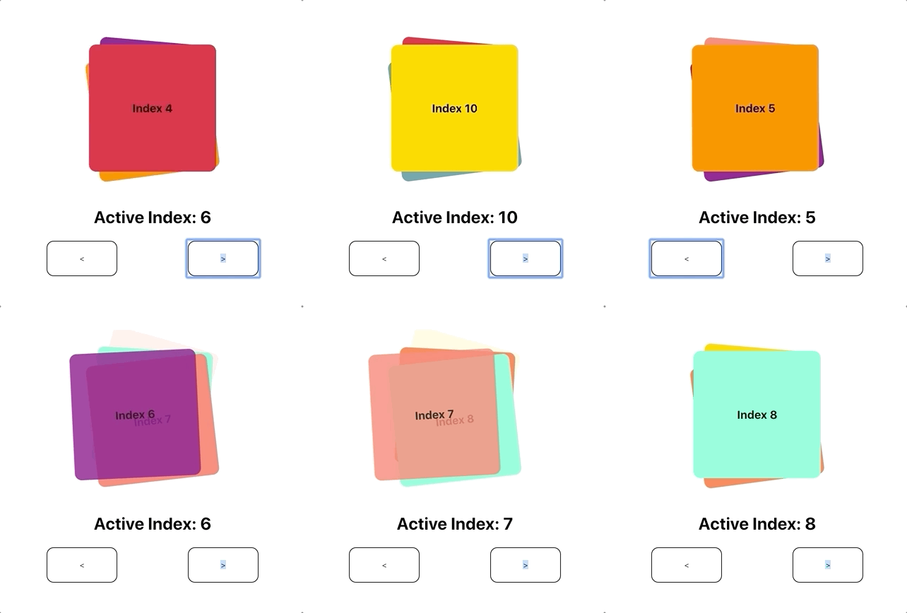
One of the core features of this library is the ability to customize style transformations based on a screen's position relative to the focused screen.
Here is an example of an interpolation configuration:
const scaledDown = {
  transform: [
    {
      scaleX: {
        range: [-1, 0, 1],
        output: [0.8, 1, 0.8],
        extrapolate: 'clamp',
      },
    },
  ],
};
The object itself is the same shape as any style prop you would normally pass into a <Animated.View /> component. However, the values of these properties define an interpolation configuration.
The input range refers to the position relative to the focused screen:
range: [-1, 0, 1];
// [-1] targets the screen before the focused screen
// [0] targets the screen that is focused
// [1] targets the screen after the focused screen
The output range reflects the style values that will be applied for each specified inputRange value:
output: [0.8, 1, 0.8];
// [0.8] will be applied to the screen before the focused screen
// [1] will be applied to the screen that is focused
// [0.8] will be applied to the screen after the focused screen
In this case, screens that are on the left and right of the focused screen will be scaled to 80% of their size, and any screen outside of this range will also be given 80% scale.
You can customize the behaviour of all of the screens in a <Pager /> by passing this configuration as the pageInterpolation prop. The interpolations can target all kinds of style properties, such as translations, rotations, and more.
Alternatively, you can customize styles for individual screens by using the useInterpolation() hook. This accepts the same configuration object, and will return the style property that you can apply to your <animated.div>
Examples
More examples can be found on the react-native version of this library, here: https://github.com/CrowdLinker/react-native-pager. If you have any configurations you like, please feel free to share and we can update the examples! Cheers


