@corey_hutcheson/reusable-react
A small re-usable library containing useful react components.
Information
At this time, the library only contains a SPA navbar. But other components will be added as they are created.
Installation
Install reusable-react in your project using npm:
npm install --save @corey_hutcheson/reusable-react
Usage
Import the needed react-components into your project, like so:
import { Navbar } from "@corey-hutcheson/reusable-react";
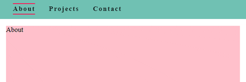
Basic Navbar
import React from "react";
import ReactDOM from "react-dom";
import { Navbar } from "@corey-hutcheson/reusable-react";

const App = () => {
  const links = [
    {
      element: "about",
      text: "About"
    },
    {
      element: "projects",
      text: "Projects"
    },
    {
      element: "contact",
      text: "Contact"
    }
  ];

  return (
    <>
      <Navbar links={links} />

      <main>
        <div>
          <section id="about" className="section">
            About
          </section>
          <section id="projects" className="section">
            Projects
          </section>
          <section id="contact" className="section">
            Contact
          </section>
        </div>
      </main>
    </>
  );
};

ReactDOM.render(<App />, document.querySelector("#root"));
Navbar Props
| Prop | Default | Description |
|---|---|---|
| links | required | Array of objects, each with element and text property |
| icon | false | Pass react component representing icon |
| theme | 'light' | Accepts 'light', 'dark', or a theme object {...themeProps} |
| extraComp | false | Pass component if you'd like to show extra info in top left of navbar |
| scrollToOffset | 0 | Offset in pixels when scrolling to element |
| spyOffset | -300 | Offset in pixels for when scroll spy is activated |
More Examples
Dark variant with Icon:
<Navbar icon={<Icon />} theme="dark" scrollToOffset={-50}>
  <div element="about" text="About" />
  <div element="projects" text="Projects" />
  <div element="contact" text="Contact" />
</Navbar>

Contributing
Pull requests are welcome, and very much appreciated.