
Request Progress Bar
A fully customizable and easy-to-use request progress bar for your Angular applications. The package works by listening to all incoming requests via an HTTP interceptor, and displays the loading state to your users.
Author
Features
- Customizable bar color
- Automatically starts working when added to your root component
- Option to set loading state manually
- Animated transitions for a more user-friendly experience
Demo
You can see a demo of the Request Progress Bar component here.
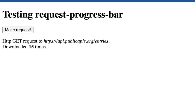
Screenshots
Works best with
- Angular 15+
Installation
You can install the request-progress-bar package using npm:
npm i @billnice/request-progress-barUsage
To use the Request Progress Bar component, you can add the request-progress-bar component to your root component, for example:
@Component({
  selector: 'app-root',
  template: `
    <request-progress-bar [barColor]="'#ff0000'"></request-progress-bar>
    <router-outlet></router-outlet>
  `,
})
export class AppComponent {}
Make sure to include the RequestProgressBarModule in your AppModule:
import { RequestProgressBarModule } from '@billnice/request-progress-bar';

@NgModule({
  declarations: [AppComponent],
  imports: [BrowserModule, RequestProgressBarModule],
  providers: [],
  bootstrap: [AppComponent],
})
export class AppModule {}
In the example above, the Request Progress Bar component is included in the root component and the color is set to red.
Options
The Request Progress Bar component has the following options:
-
barColor: The color of the progress bar. Default value is#ff0000. -
isLoading: a boolean that controls the state of the progress bar.
Customizing the Progress Bar Color
You can customize the color of the progress bar by setting the barColor input property. For example:
<request-progress-bar [barColor]="'#00ff00'" ></request-progress-bar>In the example above, the color of the progress bar is set to green.
Manually Setting the Loading State
You can manually set the loading state of the progress bar by setting the isLoading input property.
For example:
<request-progress-bar [isLoading]="true"></request-progress-bar>In the example above, the progress bar is set to the loading state. You can set this property to another dynamic value to control the loading state of the progress bar.
Conclusion
The Request Progress Bar component is a convenient and easy-to-use solution for showing the progress of HTTP requests in your Angular application. With its built-in interceptor and customizable progress bar color, you can easily integrate it into your application and start using it right away.