svelte-simple-tables
Features
- Create sortable, paginated tables that follow WAI-ARIA guidelines.
- Columns dynamically resize to accommodate all visible content.
- Automatically responsive. Tables become horizontally scrollable without breaking page layout.
- Four color themes provided. Users can adjust every detail of existing themes or create new themes with CSS custom properties.
Examples
- svelte-simple-tables docs site
- Coming Soon: CSS Theme Editor
Installation
yarn
yarn add -D @a-luna/svelte-simple-tablesnpm
npm install -D @a-luna/svelte-simple-tablespnpm
pnpm install -D @a-luna/svelte-simple-tablesUsage
<script lang="ts">
	import SimpleTable from '@a-luna/svelte-simple-tables';
	import type { TableSettings } from '@a-luna/svelte-simple-tables/types';
	import { columnSettings } from './columnSettings';
	import { data } from './data';

	interface VaxData {
		personId: number;
		name: string;
		age: number;
		birthdate: Date;
		vaccinated: boolean;
	}

	const tableSettings: TableSettings = {
		tableId: 'vax-status-table',
		showHeader: true,
		header: 'Vax Status',
		showSortDescription: true,
		sortBy: 'age',
		sortDir: 'desc',
		tableWrapper: true,
		paginated: true,
		pageRangeFormat: 'compact',
		pageNavFormat: 'compact',
		pageSize: 10,
		pageSizeOptions: [5, 10, 15, 20, 25],
		themeName: 'darker',
		rowType: 'vax records',
	};
</script>

<SimpleTable {data} {columnSettings} {tableSettings} />
SimpleTable expects three props: data, columnSettings, and tableSettings:
| Name | Type | Description |
|---|---|---|
data |
T[] |
Array of T objects (T is a generic type) . Each object will be rendered as a row in the table. |
columnSettings |
ColumnSettings<T>[] |
Array of ColumnSettings<T> objects (T is the same generic type from data). Each ColumnSettings<T> object specifies which property to display, the column header text, etc. |
tableSettings |
TableSettings |
Configuration object for sizing, layout, pagination, and other overall table settings. |
data
You must define a type or interface for your tabular data (VaxData in this example). This becomes the generic type T used by the data and columnSettings props.
🤔 HELP ME UNDERSTAND Why is it necessary to specify the type of the items in thedataarray?SimpleTableuses an experimental svelte feature that makes it possible to use generic types with component props. This enables advanced error-checking and autocompletion in your IDE.
The data for your table will typically be provided from a response to an API request or database query. In this example, data is imported from a typescript file (data.ts) that exports a list of VaxData objects:
// data.ts
// contains 21 items, only showing first and last item for brevity
export const data: VaxData[] = [
	{
		personId: 1,
		name: 'Alice',
		age: 11,
		birthdate: new Date(2010, 7, 12),
		vaccinated: true,
	},
	...{
		personId: 21,
		name: 'Ulysses',
		age: 85,
		birthdate: new Date(1936, 2, 12),
		vaccinated: true,
	},
];
columnSettings
After you have the data that you wish to display in a table, the next step is to determine which VaxData properties (name, age, etc.) should be displayed in each column. This is accomplished with the columnSettings prop, which is a list of ColumnSettings<T> objects. The API for ColumnSettings<T> is given below:
| Property | Type | Required | Default | Description |
|---|---|---|---|---|
propName |
string |
N/A | The name of the property to display | |
propType |
PropType |
N/A |
PropType is a string literal with valid values: 'string', 'number', 'boolean' or 'date'. In this example, if propName = 'age' => propType = 'number', or propName = 'birthdate' => propType = 'date'
|
|
headerText |
string |
If the value provided for propName is in snake_case or camelCase format, it is converted to Snake Case or Camel Case, respectively. Otherwise, the value provided for propName is used as the default value. |
The text displayed in the column header. | |
tooltip |
string |
Same behavior as headerText
|
Tooltip value to display when mouse hovers over the column header. | |
sortable |
boolean |
true |
If sortable=True, clicking the column header will re-sort the table using that value. Clicking the same column header again will toggle between ascending/descending order. If sortable=False, clicking the column header will have no effect. |
|
classList |
string[] |
[] |
A list of strings where each string will be added to the classList of each data cell in this column. Useful for utility classes such as Tailwind to control text-alignment, font-weight, etc. |
|
colValue |
(obj: T) => string |
(obj: T) => obj[propName] (i.e, The value of the object property propName) |
A function that accepts an object from data and returns the value that should be displayed in this column. This allows you to customize the way the data is displayed in any way. |
🤔 YOU MAY BE WONDERING Why is it neessary to specify thepropTypefor each column? This is required in order to make the table sortable. Since numeric, text and date values cannot be sorted using a single algorithm,propTypeis used to determine the sort function appropriate for each data type.
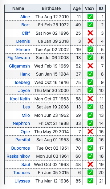
Let's take a look at an example that renders a column for each VaxData property:
| Name | Birthdate | Age | Vax? | ID |
|---|---|---|---|---|
| Alice | Thu Aug 12 2010 | 11 | 1 | |
| ... | ... | ... | ... | ... |
| Ulysses | Thu Mar 12 1936 | 85 | 21 |
The columnSettings prop that produces the table above must contain five ColumnSettings<VaxData> objects, and would be configured as follows:
// columnSettings.ts
import type { ColumnSettings } from '@a-luna/svelte-simple-tables/types';
import type { VaxData } from './data';

export const columnSettings: ColumnSettings<VaxData>[] = [
	{
		propName: 'name',
		propType: 'string',
		tooltip: 'First Name',
		colValue: (data: VaxData): string => `<a href="/person/${data.personId}">${data.name}</a>`,
	},
	{
		propName: 'birthdate',
		propType: 'date',
		colValue: (data: VaxData): string => data.birthdate.toDateString(),
	},
	{
		propName: 'age',
		propType: 'number',
	},
	{
		propName: 'vaccinated',
		propType: 'boolean',
		headerText: 'Vax?',
		tooltip: 'Vaccination Status',
		classList: ['text-center'],
		colValue: (data: VaxData): string => (data.vaccinated ? '✅' : '❌'),
	},
	{
		propName: 'personId',
		propType: 'number',
		headerText: 'ID',
		sortable: false,
	},
];
For each column, the only required values are propName and propType (all other properties have sane default values). In most cases, colValue is where the most 'interesting' settings are applied, since this controls the value that a column displays for each object.
For example, the first column is configured to display the name property of each object as a link to a hypothetical page. Since colValue is a function which accepts a single VaxData object and returns a string, we can easily construct an anchor element that incorporates properties of the VaxData object:
colValue: (data: VaxData): string => `<a href="/person/${data.personId}">${data.name}</a>`;This string will be rendered using the special @html tag available in svelte, resulting in a clickable link as shown in the table above.
The birthdate property is a Date value, and by default would be displayed by simply calling the Date.toString() method (e.g., Thu Aug 12 2010 00:00:00 GMT-0700 (Pacific Daylight Time)). By simply configuring colValue to instead call the Date.toDateString() method, the column will omit the time and time-zone information, displaying just the date portion (Thu Aug 12 2010):
colValue: (data: VaxData): string => data.birthdate.toDateString();The column for vaccinated contains boolean values, which by default will simply display 'true'/'false' strings. The easiest way to display something more interesting is with a ternary operator:
colValue: (data: VaxData): string => (data.vaccinated ? '✅' : '❌');This column also takes advantage of the classList property. In Tailwind CSS, text-center is a utility class that sets text-align: center on a HTML element. This would add the text-center class to each data cell in this column.
Finally, the last column displays the personId property. The sortable property is set to false, making this the only column that cannot be sorted by clicking on the column header.
♨️ HOT TIP You can definecolumnSettingsin the<script>tag of your.sveltefile, or in a separate.tsfile as demonstrated here. If your table has a large number of columns, moving it to its own file will make your.sveltefile easier to digest visually and make your component easier to maintain (IMO).
tableSettings
Strictly speaking, the final prop, tableSettings, isn't required. Without it, our table would be rendered like this:
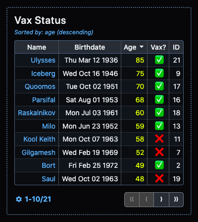
That's a very nice table, I'm sure you will agree. However, by customizing the tableSettings prop, the same data and columnSettings can produce the table below:
Now that's a table that you can be proud of! The tableSettings object specified at the beginning of this README will produce these changes.
The TableSettings interface exposes the following configuration settings:
| Property | Type | Required | Default | Description |
|---|---|---|---|---|
tableId |
string |
Randomly generated ID (e.g., table-79f3e496) |
This is the id attribute of the table HTML element |
|
showHeader |
boolean |
false |
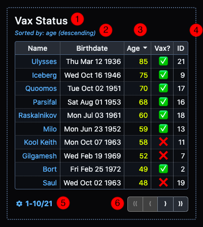
Display the headervalue above the table (#1 in the disgram below) |
|
header |
string |
'' (empty string) |
Table header/caption/title to display above the table | |
showSortDescription |
boolean |
false |
Display the sort column and sort direction currently applied (#2 in the diagram below) | |
sortBy |
string |
null |
propName of the column to sort the table by. If not specified, no sorting behavior will be applied when component is loaded. (#3 in the diagram below) |
|
sortDir |
SortDirection |
'asc' |
SortDirection is a string literal type = asc or desc. Determines if the sort behavior is applied in ascending or descending order. |
|
tableWrapper |
boolean |
false |
Display a border around the table (#4 in the diagram below) | |
themeName |
TableTheme |
'lighter' |
themeNameis a string literal type = 'light' | 'lighter' | 'dark' | 'darker' | 'custom’. You can check out all of the themes in the interactive docs. |
|
clickableRows |
boolean |
|
false |
The rowClicked event is raised when any row in the body of the table is clicked. The event contains the row data as an object of type T. |
animateSorting |
boolean |
|
false |
Changes in row order are reflected as a flip animation when the sort behavior is changed (e.g., by clicking on a column header) |
paginated |
boolean |
false |
Enables pagination. If false, all rows are displayed. |
|
pageSize |
number |
5 |
(If pagination is enabled) Number of rows to display per page. Must be one of the options in pageSizeOptions. |
|
pageSizeOptions |
number[] |
[5, 10, 15] |
(If pagination is enabled) Array of possible page sizes, user can switch between page sizes at any time. | |
pageRangeFormat |
PageRangeFormat |
'auto' |
(If pagination is enabled) PageRangeFormat is a string literal type = 'none' | 'compact' | 'verbose' | 'auto'. See interactive docs for examples. |
|
pageNavFormat |
PaginationLayout |
'auto' |
(If pagination is enabled) PaginationLayout is a string literal type = 'compact' | 'full' | 'auto'. See interactive docs for examples. |
|
rowType |
string |
'rows' |
(If pagination is enabled) Since the page range description in verbose mode displays as 'XX-YY of ZZ total rowType' you can customize the term used to dsescribe the tabular data (e.g., '1-10 of 21 patients' or '6-10 of 21 vax records' in our table). |
😲 LISTEN UP, CHIEF: As explained above, thetableIdprop is used as theidattribute of the table HTML element. Therefore, it is very important that you treat this value as a unique identifier, per HTML requirements. If you choose to provide your own value fortableId, it is extremely important that you do not reuse this value for anotherSimpleTablecomponent, or any HTML element in your project. Bad things will happen, trust me!
Themes
CSS Custom Properties
The following CSS custom properties can be applied either at the body element (if you want all tables throughout your site to use a single, uniform theme) or can be applied individually to each table. Detailed instructions and an interactive theme editor is a WIP, will be available ASAP:
--sst-font-size
--sst-table-wrapper-border-width
--sst-table-wrapper-border-style
--sst-table-wrapper-padding
--sst-sort-description-font-size
--sst-table-header-font-size
--sst-table-border-radius
--sst-col-header-padding
--sst-col-header-text-weight
--sst-col-header-highlight-text-weight
--sst-body-cell-padding
--sst-button-group-border-radius

--sst-table-wrapper-bg-color
--sst-table-wrapper-border-color

--sst-text-color
--sst-link-text-color
--sst-link-hover-text-color
--sst-table-outer-border-color
--sst-table-header-text-color
--sst-sort-description-text-color
--sst-page-range-description-text-color

--sst-col-header-bg-color
--sst-col-header-text-color
--sst-col-header-vert-border-color
--sst-col-header-horiz-border-color
--sst-col-header-highlight-sort-bg-color
--sst-col-header-highlight-sort-text-color
--sst-col-header-highlight-sort-vert-border-color
--sst-col-header-highlight-sort-horiz-border-color

--sst-body-even-row-bg-color
--sst-body-odd-row-bg-color
--sst-body-inner-vert-border-color
--sst-body-inner-horiz-border-color
--sst-body-highlight-sort-bg-color
--sst-body-highlight-sort-text-color
--sst-body-highlight-sort-border-color

--sst-button-text-color
--sst-button-bg-color
--sst-button-border-color

--sst-button-hover-text-color
--sst-button-hover-bg-color
--sst-button-hover-border-color

--sst-button-active-text-color
--sst-button-active-bg-color
--sst-button-active-border-color

--sst-button-disabled-text-color
--sst-button-disabled-bg-color
--sst-button-disabled-border-color

--sst-button-focus-border-color


