Z-Switch
Simple & stylish replacement for checkboxes, made with css only.
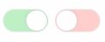
Demo
How to
Installation
npm i -S z-switch
Import the css stylesheet
// index.html
OR use the sass one
For example, you can include it via the sass includePath option of node-sass
// npm scripts
node-sass --include-path="node_modules/z-switch/sass/"  sass/style.sass css/style.css
// style.sassThe default one :
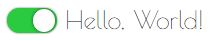
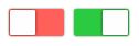
The simplest way to use it is with this html structure :
// text can go there // text can go there Hello, World!
Default checked ?
If you want the checkbox to be checked by default, add it the checked attribute.
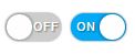
ON & OFF labels
It is possible to add some text on the switchs to illustrate theire states. (max 3 chars)
For exemple here we will add "ON" & "OFF" labels :
// text can go there // text can go there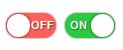
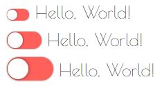
Different sizes
Z-Switchs will always fit the parent font size, but it'zs possible to ask for smaller or bigger ones
2 classes can be added to the z-switch element
z-switch-sm: smaller one (font-size * 2/3)z-switch-lg: larger one (font-size * 4/3)
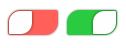
Different shapes
Z-Switchs are circled by default, you can add these classes to change the shape :
z-switch-square
z-switch-tictac
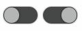
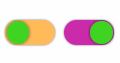
Different colors
The classes way
Two alternative colors are available for the switches, you can use it by adding classes
z-switch-color1
z-switch-color2
The sass way
You can override the sass variables to change the switches colors, default ones are :
// default colors // color1 alternative // color2 alternativeHere is an example with custom colors :
Disabled
When the checkbox is disabled, switches will become transparent and no action is possible on it: