
YsDashboard 


This component is only for angular N framework, not for angularJS
Demo Page (I use htmlpreview to show the page, so it may take some time to load the page.)
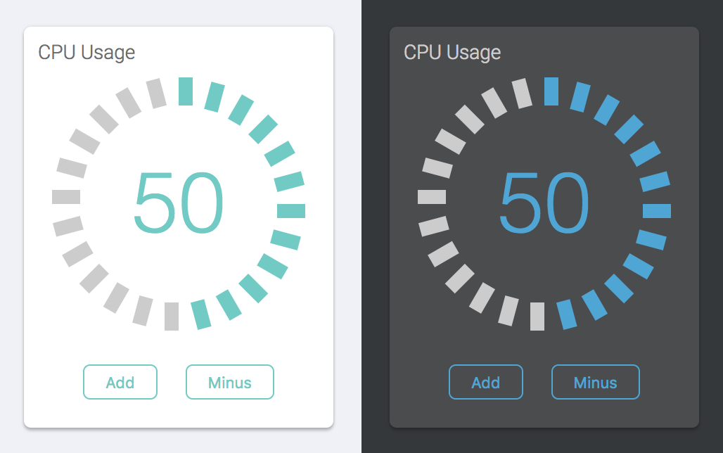
Pie / Spin / Speed / Measure UI
Required Libs
- @angular/core
- @angular/common
Usage
1. Import module
;2. Use component
API Document
| Attribute | Type | Description |
|---|---|---|
| size | integer number | The size of the component. It will change both height and width with same value. |
| percentage | number (0-100) |
The UI will be filled color based on the percentage. |
| color | Hex Color Codes | Define a filled color. |
| label | string | The label will be showed on the center of UI |
| direction | string: bottom top |
The start point will be bottom or top. |