yet-another-calendar
A simple yet highly customizable calendar library for React.
Prides itself on having both a very simple API, but also extreme flexibility.
Installation
npm i yet-another-calendar or yarn add yet-another-calendar
Usage
import { useState } from "react";
import { Calendar, Page, nextPage } from "yet-another-calendar";

const Date = ({ date }) => <button>{date.getDate()}</button>;

const App = () => {
  const [page, setPage] = useState<Page>({ month: "may", year: 2022 });

  return (
    <div>
      {page.month} {page.year}
      <button onClick={() => setPage(nextPage)}>⮕</button>
      <Calendar page={page} renderDate={Date} />
    </div>
  );
};
Why this Calendar Library?
-
Complete behaviour flexibility, support for:
- date pickers
- Multiple range selectors
- Disabled dates
- & more!
-
Simple API
- Just 2 props!
- All styles can be controlled like any other React component
- For example, using
styled-components
- For example, using
- Fully controlled!
- Fully typed!
- Fully tested - 100% code coverage!
- Loads of examples!
- 32x smaller bundle size compared to the most popular competitors!
- Fully Internationalizable & right-to-left option
- Great support for accessibility
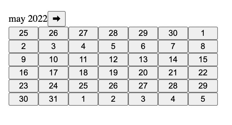
Looks like this - but don't worry, a little styling and it can look however you want!
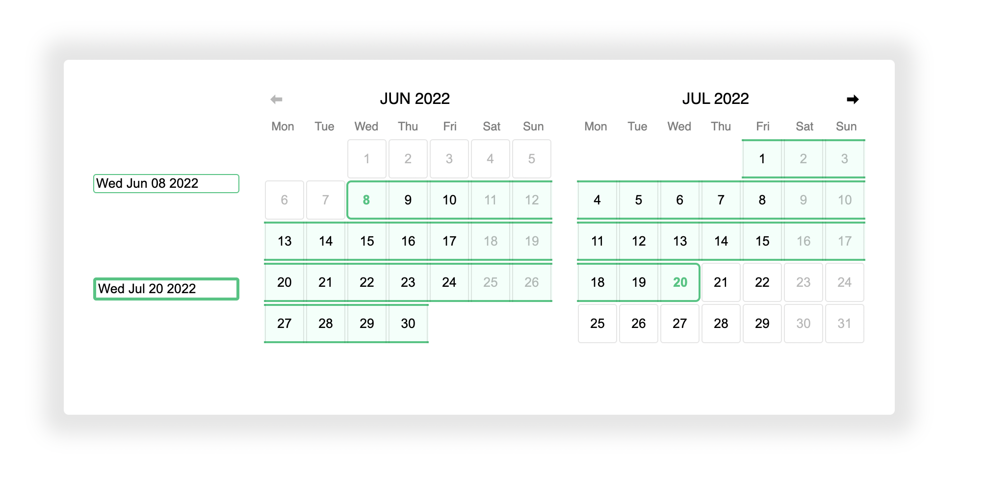
More Complex Example - "Date Range Picker"
When is this not the right library?
If you don't care what your calendar looks like, or how it behaves, and just want a calendar in your website ASAP - this library might not be for you.
API
<Calendar>
This is the only exported React Component. All the props are optional, but you'll probably want to set page and renderDate.
CalendarProps
| Prop | Type | Example |
|---|---|---|
page |
Page |
{ year: 2022, month: 'jan' } |
renderDate |
(props: DateRenderProps) => JSX.Element |
({date}) => <span>{date.getDate()}</span> |
calendarStartDay |
CalendarStartDay |
"sunday" |
All the props from div are also supported:
<Calendar dir="rtl" style={{ backgroundColor: "red" }} />DateRenderProps
For Calendar's renderDate prop (above).
| Prop | Type |
|---|---|
date |
Date |
belongsToPage |
"previous" | "current" | "next" |
Page
| Field | Type |
|---|---|
year |
number |
month |
"jan" | "feb" | ... | "dec" |
CalendarStartDay
Used to control if the calendar starts on a Monday or Sunday.
Utility Functions
| Function | Type |
|---|---|
nextPage |
(page: Page) => Page |
previousPage |
(page: Page) => Page |
firstDate |
(page: Page) => Date |
lastDate |
(page: Page) => Date |
pageForDate |
(date: Date) => Page |
Motivation
Calendars shouldn't have a mind of their own.
Developers should be able to control their calendars with props!
This way the behaviour of the calendar is predictable and customisable.
This library was built with the idea that the developer should have complete control over their components state. It is proof that 'dumb' components only allow for greater flexibility, but also make interfaces simpler!


