winjet
Make elements window-like: a floating titled container, draggable and resizable.

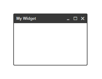
const widget = ; const myElm = document; ;When the first parameter is a string, your widget will get a default header (like in the image above) and the string will be used as the title text. The default header comes with 3 action buttons for closing, maximizing and minimizing the widget.
When the first parameter is an HTMLElement, it will be used as the widget's whole header. Action buttons are not included.
;
IMPORTANT NOTE: Widget is based on classnames & css. Meaning, some of the API methods only manipulate the widget classnames and results can only be seen by using a matching css. You can use
./default-style.cssas a starting point.
Options
minWidth- Number. Resize minimum width in pixels. (default =0)minHeight- Number. Resize minimum height in pixels. (default =0)top- Number. Initial top position in pixels.bottom- Number. Initial bottom position in pixels.left- Number. Initial left position in pixels.right- Number. Initial right position in pixels.id- String. The widgetidattribute. No default.classname- String. The widgetclassattribute. No default.showActions- Boolean. Show action buttons (maximize, minimize, close). (default =true)showClose- Boolean. Show theclosebutton. (default =true)showMinimize- Boolean. Show theminimizebutton. (default =true)showMaximize- Boolean. Show themaximizebutton. (default =true)showHeader- Boolean. Show the widget header. (default =true)toggleHeader- Boolean. Toggle the header visibility on hover. Show on enter, hide on leave. (default =false)toggleActions- Boolean. Toggle the action buttons visibility on hover. Show on enter, hide on leave. (default =false)
API
Calling the widget() function returns a Widget instance:
const w = ;It has the following methods:
.mount()
Appends the widget to the <body> and binds event listeners.
.unmount()
Removes the widget from the DOM and unbinds event listeners.
.show() / .hide()
Toggle widget visibility.
.showHeader(optionalGrip) / .hideHeader(optionalGrip)
Toggle widget header visibility. If you pass an element or an element selector string, it will be used as the drag grip handle. By default it's the widget title, or the widget body (if there's no header or it's hidden).
.showActions() / .hideActions()
Toggle widget action buttons visibility.
.minimize()
Minimizes the widget by hiding its body, only the header is visible.
.unMinimize()
Reverts the .minimize() by showing the body. Does not maximize.
.maximize()
Maximizes the widget (fullscreen). Disables drag & resize.
.unMaximize()
Reverts the .maximize() to previous widget size. Does not minimize.
.restoreSize()
Reverts both .minimize() & .maximize().
.setTitle(String)
Sets a new widget title.
.setHeader(HTMLElement)
Sets a new custom header. Replaces the default header.
.setBody(HTMLElement)
Sets a new widget body.
.setView(title, body)
Sets a new widget title and body (or header and body).
.destroy()
Kills the Widget instance for good, unbinds events, releases element references.
Position:
On initialization, the target element will be placed inside the
<body>element and will be given an inline style ofposition: absolute.
Events
A widget instance holds two instances of draggable-elm & resizable-elm. You can listen to their different events. Check out their docs to learn more.
