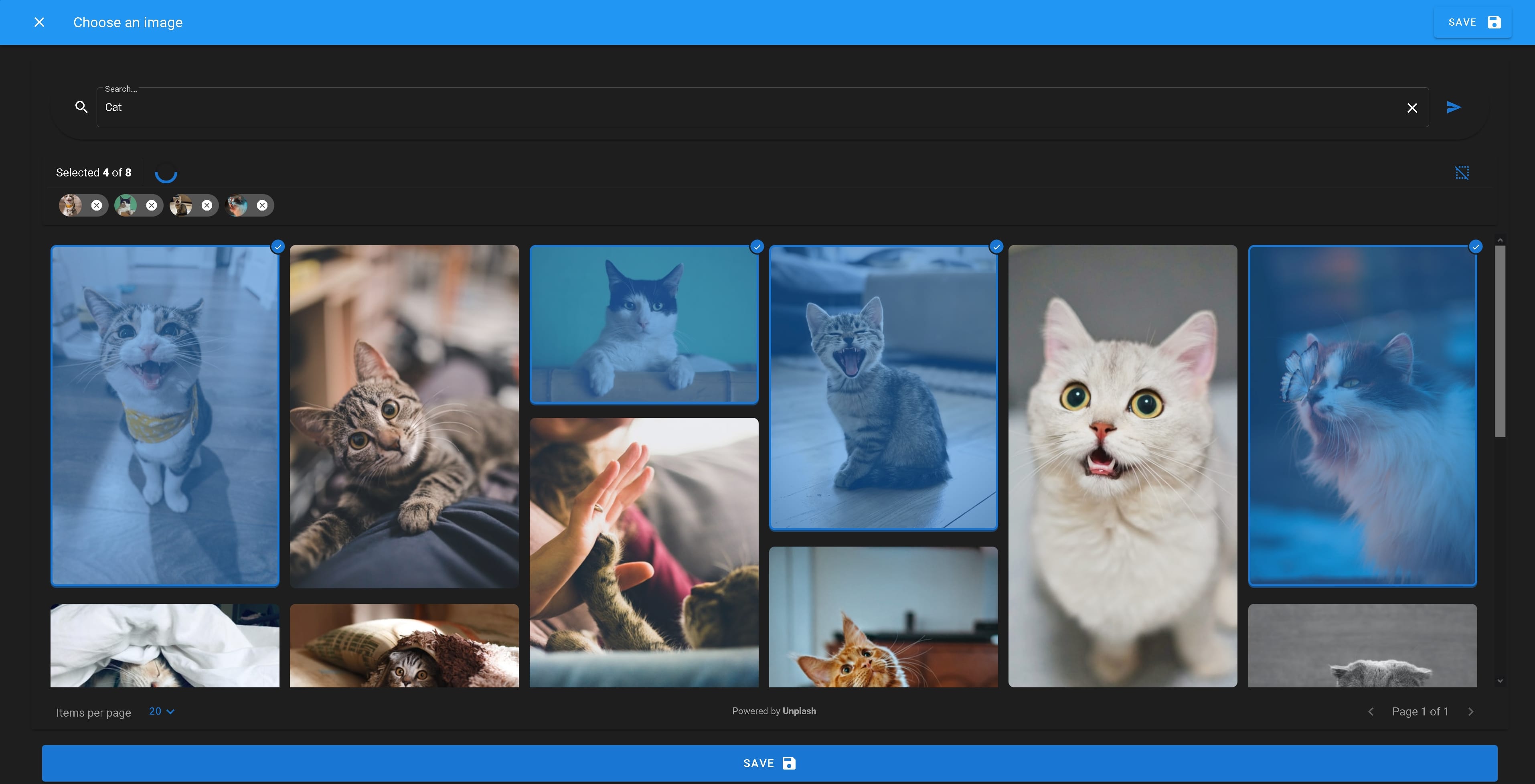
vuetify-unsplash
Vue dialog component for image search and selection from Unsplash based on Vuetfiy with high customizability thanks to over 30 properties. ⚙️
LIVE DEMO
Navigation
Features
- Overlay dialog designed as single component for easy integration
- Material design thanks to vuetify components
- flexible use as the number of images and the return object can be configured
- Adjustable to your own design through various properties
- Internationalizable by overwriting the standard labels with properties
Installation
npm install --save vuetify-unsplash
or
yarn add vuetify-unsplash
You must import the material design icons, if you are not using them already.
Note: If you use Vuetify, this is not necessary.
<!-- index.html -->Getting started
ES module
Register the component globally:
// main.js ;; Vue;or locally (in the scope of another component):
; components: VUnsplash ;! Attention, if you use Vuetify in your project and you use the components in the context of a v-app tag, set the property existing-vuetify-instance to true, otherwise rendering errors may occur !
Example Usage
The visibility of the dialog is managed by the v-model attribute.
Once the user has selected the required number of images and clicked save, the @result event with the resulting array of image objects is emitted.
Properties
Required Properties
| Property | Type | Default | Description |
|---|---|---|---|
unsplash-api-key |
String |
Register your application with Unplash to use the free unlimited API. |
Functional Properties
| Property | Type | Default | Description |
|---|---|---|---|
select-multiple |
Boolean |
false |
Set to true if you want to allow the user to select more than one image. The result array could than contain more than 1 element. |
min-multiple-select |
Number |
1 |
Number of images the user has to choose to proceed. Has no affect if select-multiple = false |
max-multiple-select |
Number |
1 |
Number of images that the user can select at maximum. Has no affect if select-multiple = false |
full-picture-object-result |
Boolean |
false |
By default, the image object that Unplash sends in a search query is returned as the result. If this information is not sufficient, this property can be set, then image objects of a query are returned for the respective image IDs. For more information about the object structure, check the documentation of the Unsplash API. If this property is set, however, a request is made to the Unsplash API not only for each search query, but also for each selected image when the "save" button is clicked. This depends on the hourly quota (5000 requests/hour) of the API key. |
number-of-images |
Number |
20 |
Number of image objects that are sent by the API in a search query and displayed in VUnsplash. The maximum number is 30. |
images-per-page |
Number |
20 |
Number of images to be displayed per grid page by default. The user can overwrite this value from a dropdown menu to customize the view according to his preferences. The maximum number is 30. |
existing-vuetify-instance |
Boolean |
false |
Set this property to true if you use the component in the context of a v-app tag of Vuetify. |
Design Properties
| Property | Type | Default | Description |
|---|---|---|---|
dark |
Boolean |
false |
Set to true if you want the component in dark mode. You could pass your global dark mode variable here if you have one. |
accent-color |
String |
"#1976d2" |
Accent color for the buttons and other elements. Please pass only a hex color code here! Note: For more customizability, the App Bar is not affected by this property. The properties of the App Bar can be set using the app-bar-props property. |
error-color |
String |
"#C62828" |
Background color for the snack bar, which notifies the user about the selection limits if he wants to exceed them. Please pass only a hex color code here! |
main-card-props |
Object |
{} |
Here Vuetify properties for cards can be passed as an object. Example: :main-card-props="{flat:true, img:"YOUR_IMAGE_LINK"}"This may overwrite the default values of the main background card of the component and change the view. |
app-bar-props |
Object |
{} |
Here Vuetify properties for app bars can be passed as an object. Example: :app-bar-props="{ color:'#1976d2', dark:true}" (The dark property will make the text and buttons appear white.) This may overwrite the default values of the app bar of the component and change the view. |
save-btn-icon |
String |
"mdi-content-save" |
Material design icon that appears in the "save" button. Choose any one by adding the prefix "mdi-" to the name of the icon, just like the default value. |
save-btn-outlined |
Boolean |
false |
Gives the "save" buttons the outlined look |
Label Property
The Label property allows you to use an object with the appropriate translations for the used words. You can pass the i18n strings directly to the object. In this way, the component is translated into exactly the languages that you require and does not contain a second translation system.
Attention! If you set the label property with your own strings, you must replace all elements of the object , because the whole object will be overwritten!
| Property | Type |
|---|---|
label |
Object |
The object elements are listed below.
| Object element | Default value |
|---|---|
appBarTitle |
"Choose an image" |
save |
"Save" |
searchTextFieldPlaceholder |
"Search..." |
noMatchingPictures |
"No matching pictures were found." |
itemsPerPage |
"Items per page" |
page |
"Page" |
of |
"of" |
loading |
"Loading..." |
selectAll |
"Select all" |
cancelSelection |
"Cancel selection" |
maxNumberSelectedError |
"You have already selected the maximum number of images." |
alreadySelectedError |
"You have already selected an image. " |
close |
"Close" |
selected |
"Selected" |
poweredBy |
"Powered by" |
Full default label object:
label = appBarTitle: "Choose an image" save: "Save" searchTextFieldPlaceholder: "Search..." noMatchingPictures: "No matching pictures were found." itemsPerPage: "Items per page" page: "Page" of: "of" loading: "Loading..." selectAll: "Select all" cancelSelection: "Cancel selection" maxNumberSelectedError: "You have already selected the maximum number of images." alreadySelectedError: "You have already selected an image. " close: "Close" selected: "Selected" poweredBy: "Powered by";As property:
Events
result
Called when the user has selected the required number of images and clicked on "save".
Usage: