
Vue 3 OTP Input is a 5.0 KB fully customizable OTP (one-time password) input component for OTPs, transaction pins, and passwords built with Vue 3.x and Vue Composition API..
To install the latest stable version:
npm i vue3-otp-inputOR
yarn add vue3-otp-inputOR
Without Build Tools
<script src="https://unpkg.com/vue3-otp-input"></script>📖 Usage Demo
<script setup lang="ts">
import { ref } from "vue";
import VOtpInput from "vue3-otp-input";

const otpInput = ref<InstanceType<typeof VOtpInput> | null>(null);
const bindModal = ref("");

const handleOnComplete = (value: string) => {
  console.log("OTP completed: ", value);
};

const handleOnChange = (value: string) => {
  console.log("OTP changed: ", value);
};

const clearInput = () => {
  otpInput.value?.clearInput();
};

const fillInput = (value: string) => {
  console.log(value);
  otpInput.value?.fillInput(value);
};
</script>
//  main.js or main.ts
import { createApp } from 'vue'
import App from './App.vue'

import VOtpInput from "vue3-otp-input";

const app = createApp(App)

app.component('v-otp-input', VOtpInput).mount('#app')<template>
<div style="display: flex; flex-direction: row">
<v-otp-input
ref="otpInput"
input-classes="otp-input"
:conditionalClass="['one', 'two', 'three', 'four']"
separator="-"
inputType="letter-numeric"
:num-inputs="4"
v-model:value="bindValue"
:should-auto-focus="true"
:should-focus-order="true"
@on-change="handleOnChange"
@on-complete="handleOnComplete"
:placeholder="['*', '*', '*', '*']"
/>
</div>
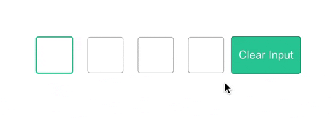
<button @click="clearInput()">Clear Input</button>
<button @click="fillInput('2929')">Fill Input</button>
</template><style>
.otp-input {
width: 40px;
height: 40px;
padding: 5px;
margin: 0 10px;
font-size: 20px;
border-radius: 4px;
border: 1px solid rgba(0, 0, 0, 0.3);
text-align: center;
}
/* Background colour of an input field with value */
.otp-input.is-complete {
background-color: #e4e4e4;
}
.otp-input::-webkit-inner-spin-button,
.otp-input::-webkit-outer-spin-button {
-webkit-appearance: none;
margin: 0;
}
input::placeholder {
font-size: 15px;
text-align: center;
font-weight: 600;
}
</style>| Name |
Type | Required | Default | Description |
|---|---|---|---|---|
| value | string | false | "" | v-modal:value for bind dynamic value |
| num-inputs | number | true | 4 | Number of OTP inputs to be rendered. |
| separator | component |
false | Provide a custom separator between inputs by passing a component. For instance, <span>-</span> would add - between each input |
|
| input-classes | className (string) | false | none | Style applied or class passed to each input. |
| input-type | string | false | "tel" | Input type. Optional value: "password", "number", "tel", "letter-numeric". |
| inputmode | string | false | "numeric" | This allows a browser to display an appropriate virtual keyboard. Optional value: "numeric", "text", "tel". [Learn More](https://developer.mozilla.org/en-US/docs/Web/HTML/Global_attributes/inputmode) |
| should-auto-focus | boolean | false | false | Auto focuses input on inital page load. |
| should-focus-order | boolean | false | false | Auto correct the input order. See https://github.com/ejirocodes/vue3-otp-input/pull/39 |
| placeholder | array | false | [] | Specify an expected value for each input. Example: :placeholder="['*', '*', '*', '*']". The length of this array should be equal to num-inputs. |
| conditionalClass | array | false | [] | Specify a class to be applied to each input based on the value of the input. Example: :conditionalClass="['one', 'two', 'three', 'four']". The length of this array should be equal to num-inputs. |
| is-disabled | boolean | false | false | Disables all the input fields. |
| Name |
Description |
|---|---|
| clearInput() | Use with ref for clearing all otp inputs, see code example section. |
| fillInput() | Use with ref for fill otp inputs. The value should be same length as `numInputs` length. See code example section. |
| Name |
Description |
|---|---|
| on-change | Return OTP code was changing when we made a change in inputs. |
| on-complete | Return OTP code typed in inputs. |
Contributions are always welcome!
See contributing.md for ways to get started.
Please adhere to this project's code of conduct.
This component is a rewite of vue-otp-input component to support Vue 3.x. Feel free to use it in your project, report bugs and make PR 👏🏽.