
前言
[在线预览]](https://vue3-cute-component.netlify.app/)
- timeline
- button
Env
vue >= @v3
Install
pnpm i vue3-cute-component or npm i vue3-cute-component or yarn add vue3-cute-component
Usage
局部引入
main.ts
import 'vue3-cute-component/dist/style.css'<script lang="ts" setup>
import { Timeline, TimelineTitle, TimelineItem } from 'vue3-cute-component'
</script>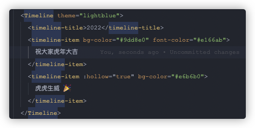
全局引入
main.ts
import { plugin } from 'vue3-cute-component'
import 'vue3-cute-component/dist/style.css'
const app = createApp(App)
app.use(plugin)
Timeline
翻遍github没有找到 vue3 可以使用的 timeline 组件,只找到了一个vue2的
但是看原作者(luyilin)没有升级vue3的计划,我就自己升级了一下,感谢luyilin大佬
API
<timeline> props
使用连字符的属性比使用驼峰大小写的属性更好。The discussion 解释了原因。
-
theme时间轴组件的主题颜色,设置线和圆的颜色
Type: string Default: #dbdde0 -
background设置空圆和其他时间轴符号的默认背景颜色
Type: string
Default: #dbdde0
<timeline-item> / <timeline-title> props
-
bg-color设置圆和圆的边框颜色
Type: string Default: #dbdde0 -
line-color只设置圆的边框颜色
Type: string Default: #dbdde0 -
hollow控制圆是否是空心的。
注意:不能与bg-color一起使用,除非您希望更改空背景色
Type: boolean Default: false -
font-color设置时间轴文字或者标题文字颜色。
或者可以用className自行设置,因为内部本身是插槽
Type: string Default: #37414a -
icon-size设置圆形图标大小
slots="others".Type: string ('small'| 'medium'|'large') Default: ''
Slots
-
othersDon't like the circle? You can set it to a image, iconfont or anything you want.
<timeline-item>
  <template #others>
    <img
      src="https://user-images.githubusercontent.com/12069729/36057805-80cfc3d2-0e4e-11e8-8851-6fda091ff389.png"
      class="icon-heart"
  />
  </template>
</timeline-item>
Button
全局引入同上
局部引入
main.ts
import 'vue3-cute-component/dist/style.css'<script lang="ts" setup>
import { GdButton } from 'vue3-cute-component'
</script>-
text按钮文字
Type: string Default: 按钮 -
icon按钮左边的小图标,必须是一个类似这样的字体 这里提供几个:✪ ✆ ✰ ✿
✍ ☺ ✪ ✔ Type: string Default: ✿ -
color按钮整体颜色,有物种颜色供你选择
- blue
- pink
- glass
- orange
- gray
Type: string Default: blue -
fontSize按钮文字大小
Type: string Default: 16px -
padding按钮padding
Type: string Default: .5em 1.2em .4em 1.2em -
padding按钮padding
Type: string Default: .5em 1.2em .4em 1.2em -
type按钮类型
- bracket
- arc
- flat
Type: string Default: bracket -
only-icon是否只能有图标
Type: boolean
Default: false
License
MIT © xiaojieajie
漆黑之牙 · GitHub @xiaojieajie