Vue Select Sides


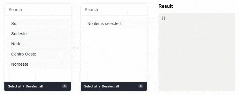
A component for Vue.js to select double-sided data. The customer can select one or more items and ship them from side to side. Values can be displayed grouped or ungrouped.
Live DEMO
Installation
First install it using:
npm install --save vue-select-sidesor
yarn add vue-select-sidesThen you can either use it as a component:
; components: vueSelectSides ;Global component:
;Vue;Vue;Or if you wish to include it in a script tag, just include the vueSelectSides.umd.min.js file located in the dist folder as so:
Usage
The component has support for two types: mirror and grouped.
Import a theme
// modern ;// or dark ;// or light ;Grouped
Warning: v-model must be of type Object
; components: vueSelectSides { return selected: {} list: value: "sul" label: "Sul" disabled: false children: value: "santa-catarina" label: "Santa Catarina" disabled: false ... value: "sudeste" label: "Sudeste" disabled: false children: value: "minas-gerais" label: "Minas Gerais" disabled: false ... ; };Mirror
Warning: v-model must be of type Array
; components: vueSelectSides { return selected: list: value: "afghanistan" label: "Afghanistan" disabled: true value: "brazil" label: "Brazil" value: "fiji" label: "Fiji" disabled: true value: "ghana" label: "Ghana" ... ; };Language/locales
List of locales available for the plugin:
en_US- [English] - Defaultpt_BR- [Portuguese] - Contributed by @juliorosseties_ES- [Spanish] - Contributed by @etrepatfr_FR- [French] - Contributed by @MajuTotr_TR- [Turkey] - Contributed by @Abdulsametileripl_PL- [Polish] - Contributed by @jzapal
Use global locale
; Vue; Vue;Props
These are all the props you can pass to the component:
| name | type | example | notes |
|---|---|---|---|
| v-model | Array or Object |
["xyz"] or {xyz: ["abc", "def"]} |
Use Object if type is grouped else uses Array |
| type | String |
grouped or mirror |
|
| list | Array |
[{ value: "xyz", label: "Label xyz 01", disabled: true/false }] |
You can add the children key to type grouped |
| search | Boolean |
true or false |
To show/hide search input. Default is visible (true) |
| total | Boolean |
true or false |
To show/hide total selected in footer. Default is visible (true) |
| toggle-all | Boolean |
true or false |
To show/hide toggle in footer. Default is visible (true) |
| sort-selected-up | Boolean |
true or false |
Show first the pre-selected. Default does not visible (false). Available only grouped type |
| order-by | String |
asc or desc |
Show first the pre-selected. Default is natural order |
String |
en_US, pt_BR, es_ES or fr_FR |
Use Use global locale |
|
| placeholder-search-left | String |
"Yay! Search items..." | Placeholder on the left search field. Default is "" |
| placeholder-search-right | String |
"Or search children items..." | Placeholder on the right search field. Default is "" |
Bugs and feature requests
If your problem or idea is not addressed yet, please open a new issue.
Sponsor / Creator

Contribution / Development
Install dependencies
yarn install
Devserver
yarn run serve
Bundling
yarn run build
Donate
You can help with a donation on Paypal
License
Vue select sides is open-sourced software licensed under the the MIT license.