
VueSelectInputUi
A vue component for select dates (range mode available) & time
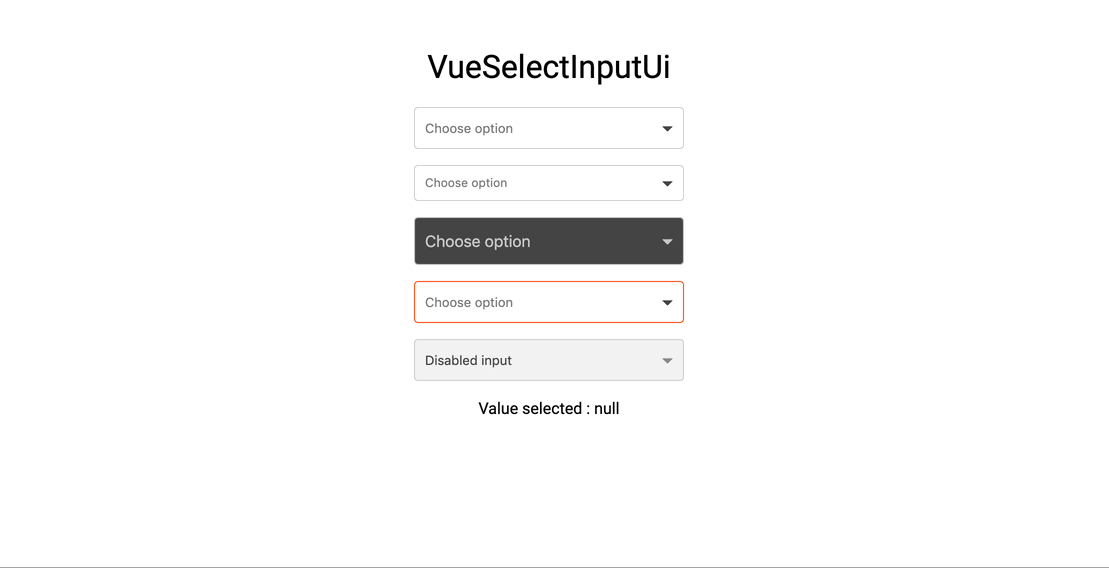
Demo
Installation
Yarn
yarn add vue-select-input-uiNPM
npm i --save vue-select-input-uiUsage
ES6 Modules / CommonJS
;; Vue; UMD
Props API
| Props | Type | Required | Default |
|---|---|---|---|
| v-model | String | yes | - |
| id | String | no | VueSelectInputUi |
| name | String | no | VueSelectInputUi |
| label | String | no | Select option |
| hint (1) | String | no | - |
| error (2) | Boolean | no | false |
| color (3) | String (hex) | no | dodgerblue |
| dark-color (4) | String (hex) | no | #424242 |
| item-height (4) | Int | no | 30 |
| list-height | Int | no | 210 |
| size | String ['sm', 'lg'] | no | null |
| disabled | Boolean | no | false |
| required | Boolean | no | false |
| dark | Boolean | no | false |
| valid | Boolean | no | false |
| validColor | String (hex) | no | false |
| options (5) | String (hex) | no | false |
| border-radius | Number | no | 8 |
(1) hint : Is a text that replaces the label/placeholder (Ex : Error designation)
(2) error : When is true --> Input border & label are red
(3) color: Replace color for the hint, the borders & picker color
(4) Height of items in option list
(5) Options should be an Array of object like that :
label: 'None' label: 'First option' value: 'first' label: 'Second option' value: 'second' label: 'Third option' value: 'third' Feature list
- You can search the option on taping the label
- Keyboard accessibilty
- Valid state ui
- Error state ui
- Message error state ui
Events API
| Event | Return |
|---|---|
| input | value (formatted with 'format' props) |
| click | when you click on the component |
| focus | when the component is focused |
| blur | when the component is blur |
Keyboard Accessible
| Key | Action |
|---|---|
| Arrow Down | Next option |
| Arrow Up | Previous option |
| Escape | Close list |
| Enter | Select option |
Upcoming features (Todo)
- Position list (left, right, top, bottom)
Contribute
Setting up development server
Ensure you have Node and npm in your machine. Minimal config is:
- node >= 6.0
- npm >= 3.0
This project is built with
node@10.x.
Install the development dependencies by running:
npm installor
npm ci # Recommanded if you have node > 10.x Once your dependencies are installed, start the development server with:
npm run serveThis will start the development server available at http://localhost:8080.
Compiles and hot-reloads for development
npm run serveLinter
npm run lintTests
Work in progress
License
This project is licensed under MIT License