

A highly customizable round slider for vue js with more flexibility
Like it? Then give a star. 
Table of contents
Features
- Great look and feel with lots of customization
- Supports two-way data binding
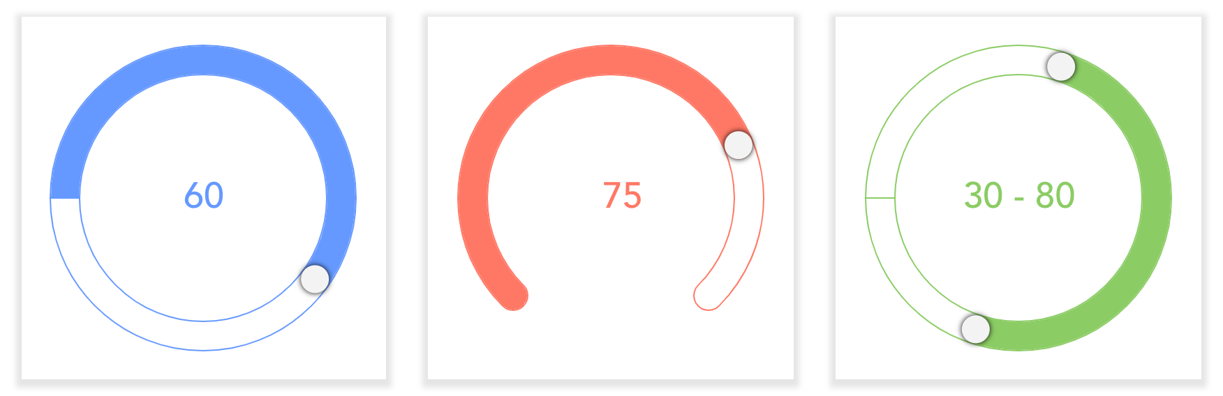
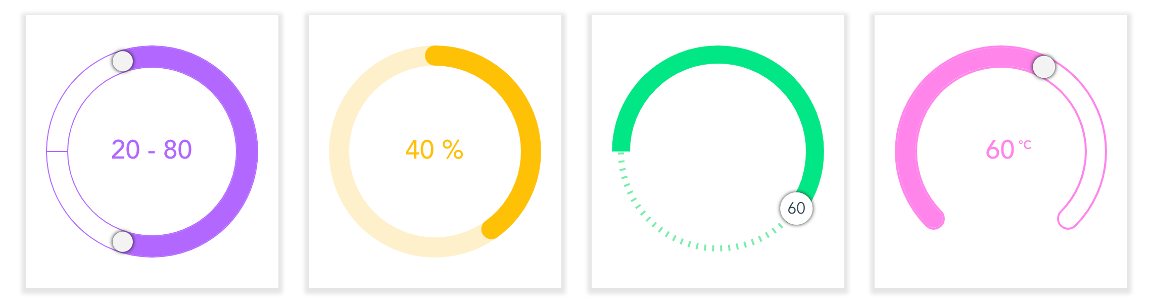
- Range slider support
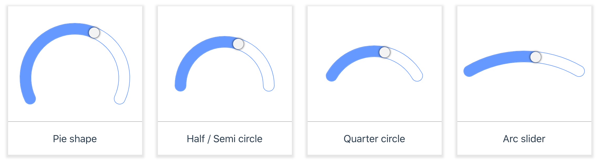
- Different circle shapes (pie, half, quarter) support
- Touch support
- Keyboard support
- Mouse scroll support
- Supports all CSS3 animations
Getting started
Installation
You can install the vue-round-slider package from NPM through the below command.
npm install vue-round-slider --saveUsage
Without any configuration you can simply render the slider, with the default props.
<round-slider />Or, you can render with your own customizaition:
<round-slider v-model="sliderValue" start-angle="315" end-angle="+270" line-cap="round" radius="120"/>And then import and initialize the component:
import Vue from 'vue'import RoundSlider from 'vue-round-slider' new Vue({ el: '#app', components: { RoundSlider, }, data() { return { sliderValue: 60 } },})Quick Start
The easiest way to try and start using vue-round-slider is using JSFiddle or CodeSandbox. For round-slider projects,
- based on vue-cli 3 you can try the below CodeSandbox
- based on CDN you can try the below JSFiddle
APIs
Props
For better understanding the props was arranged based on some categories such as Basic props (frequently used), UI appearance related, Behaviour related, Miscellaneous and some Usecase related props.
Note: All the props supports
Stringdata type as well as their own type.
| name | type | default | description |
|---|---|---|---|
| min | Number | 0 | The min property indicates the minimum value of the slider. |
| max | Number | 100 | The max property indicates the maximum value of the slider. |
| step | Number | 1 | Decides the number of steps or value should take while we move the handle. |
| value | String, Number | null | Sets or gets the value of the slider. Instead, by using `v-modal` you can enable the two-way data binding. |
| radius | Number | 105 | The radius property indicates the radius of the slider's circle. |
| width | Number | 20 | Indicates the width (or thickness) of the slider. |
| lineCap | String | "butt" | The lineCap property mentions the shape at the edge of the path and range bars. |
| startAngle | Number | 0 | Indicates the starting angle of the slider. |
| endAngle | String, Number | "+360" | Indicates the end angle of the slider arc. So, endAngle 90 means it's a quarter circle, like wise 180 - half circle and 270 pie circle |
| borderWidth | Number | 0 | Indicates the border width of the slider. |
| borderColor | String | "inherit" | Sets the border color of the slider. By default it will inherits the `rangeColor` value. |
| pathColor | String | "#EEE" | Sets the path color of the slider. |
| rangeColor | String | "#69F" | Sets the range color of the slider. |
| tooltipColor | String | "inherit" | Sets the tooltip color of the slider. By default it will inherits the `rangeColor` value. |
| sliderType | String | "min-range" | Indicates the slider type to be render. By setting "range" it will becomes a range slider. |
| circleShape | String | "full" | Indicates the circle shape to be render. |
| animation | Boolean | true | Enables or disables the slider animation while value change. |
| readOnly | Boolean | false | This enables the control into the readOnly mode, so we can't interact with the control when readOnly enabled. |
| disabled | Boolean | false | Enables or disables the control. |
| handleSize | String, Number | "+0" | The handleSize property mentions the size of the handle. |
| handleShape | String | "round" | The handleShape property mentions the shape of the handle. |
| showTooltip | Boolean | true | Enables or disables the tooltip inside the slider. |
| editableTooltip | Boolean | true | Enables the editable option of tooltip. When this property set as true, we can change the value by editing the tooltip. |
| keyboardAction | Boolean | true | Enables or disables the keyboard functionality. |
| mouseScrollAction | Boolean | false | Enables or disables the mouse scroll functionality. |
| startValue | Number | null | This property decides at which point the slider should start. Otherwise, by default the slider starts with min value. |
Events
Note: The event hanlders should be passed like
v-bind:change="handler"or:change="handler"as same as the props, instead ofv-on:. Since this acts like a wrapper of roundSlider, so the events will be treated as props.
| name | description |
|---|---|
| create | This event triggered after the control creation or initialization. |
| beforeValueChange | This event will be triggered before the value change happens. And this event can be cancellable. |
| change | This event triggered when the slider's value gets changed. |
| update | This event triggered when the slider value updated such as during change as well as the handle drag. Simply it is the combination of "change" and "drag". |
| valueChange | This event is similar to 'update' event, in addition it will trigger even the value was changed through programmatically also. |
| tooltipFormat | This event will act as a callback. So you can customize the tooltip template by returning with the custom values here. |
Screenshots
Different appearances
Different circle shapes