alert | confirm | toast | loading for Vue.js
Installation
npm i vue-mobile-message
Project startup
Full register( this.$alert | this.$confirm | this.$toast | this.$loading )
import Vue from 'vue'
import MobileMessage from 'vue-mobile-message'
Vue.use(MobileMessage, options)
new Vue({
render: h => h(App)
}).$mount('#app')
Partial register
import Vue from 'vue'
import { MessageBox, Toast, Loading } from 'vue-mobile-message'
Vue.use(MessageBox, options) //( this.$alert | this.$confirm )
Vue.use(Toast, options) //( this.$toast )
Vue.use(Loading, options) //( this.$loading )
new Vue({
render: h => h(App)
}).$mount('#app')
About options
| name |
description |
描述 |
value |
default |
| maskColor |
mask color |
蒙层颜色 |
String |
rgba(0, 0, 0, 0.4) |
| htmlSupport |
Pop-up content support html |
弹窗内容是否支持html |
Boolean |
false |
| background |
Pop-up background color |
弹窗的背景色 |
String |
#ffffff |
| titleColor |
Pop-up title color |
弹窗标题颜色 |
String |
#111111 |
| messageColor |
Pop-up content color |
弹窗内容颜色 |
String |
#343434 |
| borderColor |
Pop-up split line color |
弹窗分割线颜色 |
String |
#c0c4cc |
| alertBtn |
Pop-up alert button |
alert弹窗按钮 |
String | Object |
{text: '确定', color: '#007aff'} |
| confirmLeftBtn |
Pop-up confirm left button |
confirm弹窗左侧按钮 |
String | Object |
{text: '确定', color: '#007aff'} |
| confirmRightBtn |
Pop-up confirm right button |
confirm弹窗右侧按钮 |
String | Object |
{text: '取消', color: '#007aff'} |
| duration |
Toast show time |
Toast弹窗显示时长 |
Number |
1500 |
| loadingText |
Loading default text |
Loading默认显示文字 |
String |
正在加载 |
Example-1
Vue.use(MobileMessage, {
alertBtn: 'Yes',
confirmLeftBtn: {
text: 'Yes'
},
confirmRightBtn: {
text: 'No',
color: '#007aff'
},
loadingText: 'Loading...'
})
Example-2
Vue.use(MobileMessage, {
htmlSupport: true
})
<script>
export default {
methods:{
test(){
this.$alert.message(`
<div>this a message</div>
<div style="color:red">html is supported now</div>
`).then(() => {
console.log('the button was clicked')
})
}
}
}
</script>
Usage
Loading

this.$loading.show();
this.$loading.show('loading...');
this.$loading.hide();
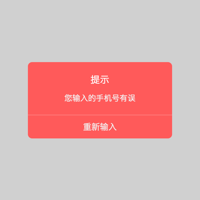
Show Alert common
<template>
<div id="app">
<div @click="test1">click me</div>
</div>
</template>
<script>
export default {
methods: {
test1(){
this.$alert({
styles:{
maskColor: 'rgba(40, 40, 40, .3)',
background: '#ff5a5a',
titleColor: '#fff',
messageColor: '#f3f3f3',
borderColor: '#ffb6b6'
},
htmlSupport: true,
content: `<div>您输入的手机号有误</div>`,
title: `<div>提示</div>`,
btn: {
text: '重新输入',
color: '#f1f1f1'
}
}).then(() => {
console.log('The button was clicked')
});
},
test2(){
this.$alert({
content: 'This is a message',
title: 'title'
}).then();
},
test3(){
this.$alert({
content: 'This is a message',
type: 'success'
}).then();
}
}
}
</script>
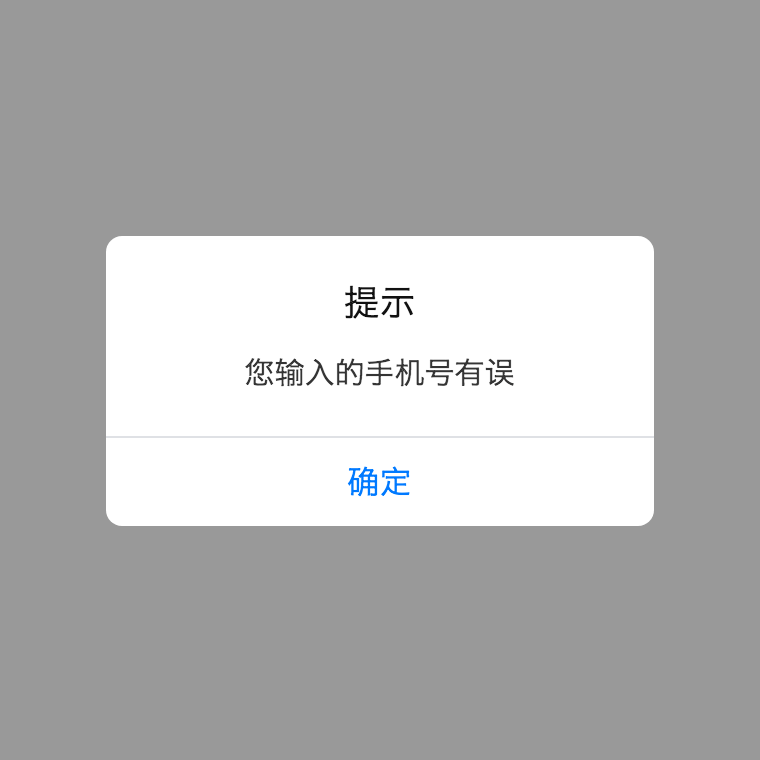
Show Alert with a title
<script>
export default {
methods: {
test1(){
this.$alert.message('您输入的手机号有误').then(() => {
console.log('The button was clicked')
});
},
test2(){
this.$alert.message('This is a message', 'I am a title')
},
test3(){
this.$alert.message('This is a message', null, 'I am button')
},
test4(){
this.$alert.message('This is a message', null, {
text: 'I am button',
color: '#f00'
})
}
}
}
</script>
Show Alert with a icon without title, four types are supported (success | warning | error | info)
<script>
export default {
methods: {
test1(){
this.$alert.success('Login success').then(() => {
console.log('The button was clicked')
});
},
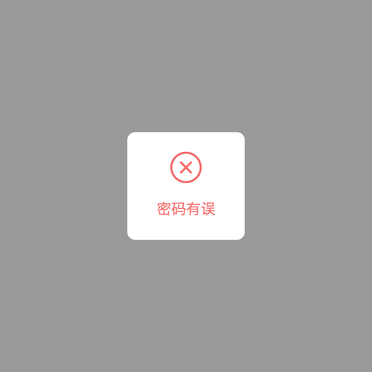
test2(){
this.$alert.error('Password is not correct', 'I am a button')
},
test3(){
this.$alert.warning('Something is wrong, but I am not going to tell you.', {
text: 'I am a button',
color: '#f00'
})
}
}
}
</script>
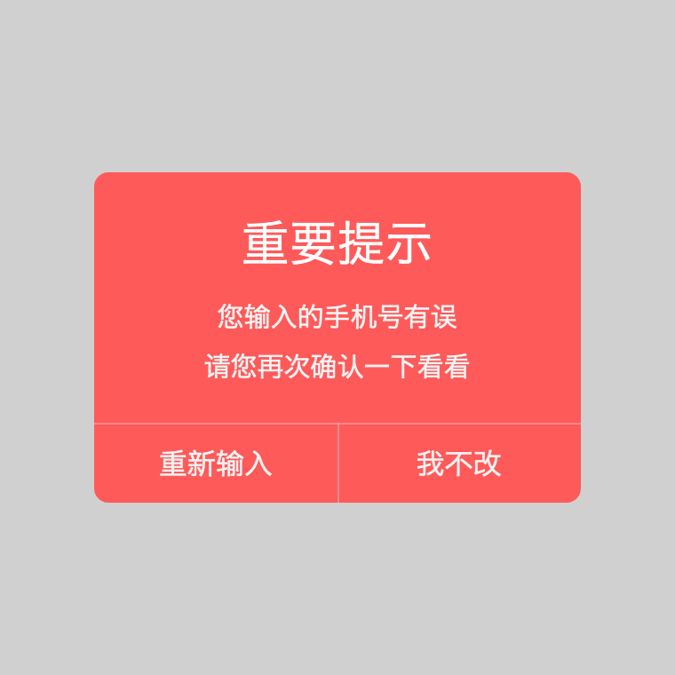
Show Confirm common
<template>
<div id="app">
<div @click="test1">click me</div>
</div>
</template>
<script>
export default {
methods: {
test1(){
this.$confirm({
styles:{
maskColor: 'rgba(100,100,100,.3)',
background: '#ff5a5a',
titleColor: '#fff',
messageColor: '#f3f3f3',
borderColor: '#ffb6b6'
},
htmlSupport: true,
content: `
<div>您输入的手机号有误</div>
<div style="margin-top:5px">请您再次确认一下看看</div>`,
title: '<div style="font-size:1.5em;">重要提示</div>',
btnArr: [{
text: '重新输入',
color: '#f1f1f1'
},{
text: '我不改',
color: '#f1f1f1'
}]
}).then(isLeft => {
if(isLeft){
console.log('Left button was clicked')
}else{
console.log('Right button was clicked')
}
});
},
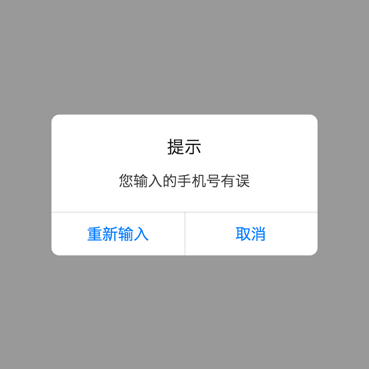
test2(){
this.$confirm({
content: '您输入的手机号有误',
title: '提示',
btn: '重新输入'
}).then();
},
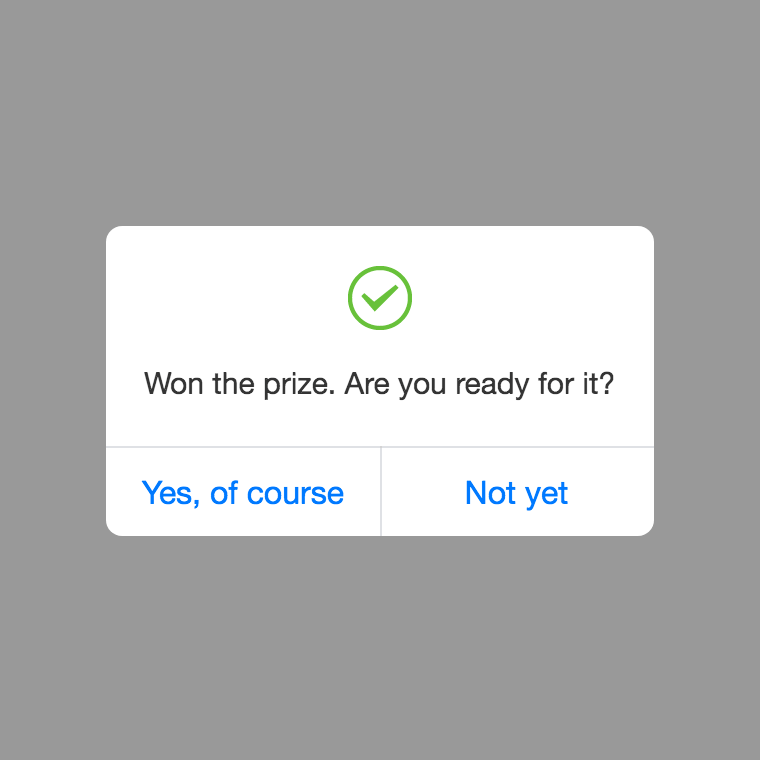
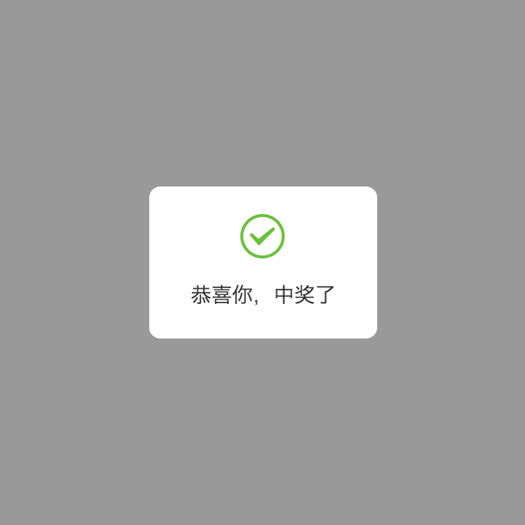
test3(){
this.$confirm({
content: 'Won the prize. Are you ready for it?',
type: 'success',
btnArr: ['Yes, of course', 'Not yet']
}).then();
}
}
}
</script>
Show Confirm with a title
<script>
export default {
methods: {
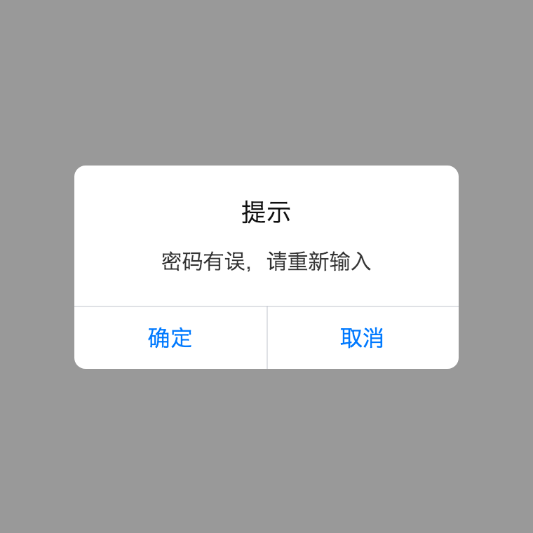
test1(){
this.$confirm.message('密码有误,请重新输入').then(isLeft => {});
},
test2(){
this.$confirm.message('This is a message', 'I am a title').then();
},
test3(){
this.$confirm.message('This is a message', null, 'left button').then();
},
test4(){
this.$confirm.message('This is a message', null, {
text: 'left button',
color: '#f00'
}).then();
},
test5(){
this.$confirm.message('This is a message', null, [{
text: 'left button',
color: '#f00'
},{
text: 'right button',
color: '#0ff'
}]).then();
}
}
}
</script>
Show Confirm with a icon without title, four types are supported (success | warning | error | info)
<script>
export default {
methods: {
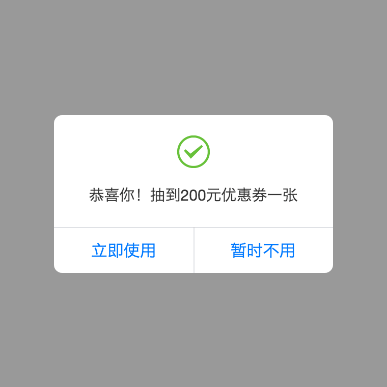
test1(){
this.$confirm.success('恭喜你!抽到200元优惠券一张', ['立即使用', '暂时不用']).then(isLeft => {});
},
test2(){
this.$confirm.error('Are you really going to die?', 'Yes').then(ifLeft => {
if(ifLeft){
console.log("You're dead. God's waiting for you.")
}else{
console.log('You are alive, do you still want to die?')
}
});
},
test3(){
this.$confirm.info('This is a message', {
text: 'left button',
color: '#f00'
}).then(isLeft => {});
},
test4(){
this.$confirm.info('This is a message', [{
text: 'left button',
color: '#f00'
},{
text: 'right button',
color: '#0ff'
}]).then(isLeft => {});
}
}
}
</script>
Show Toast
<script>
export default {
methods: {
test1(){
this.$toast({
styles:{
maskColor: '#000',
background: '#fff',
titleColor: '#000',
messageColor: '#000'
},
content: 'this is a message',
title: 'title',
duration: 2000
}).then(() => {
console.log('toast finished');
})
},
test2(){
this.$toast.message('This is a message', 'title');
},
test3(){
this.$toast.message('This is a message', null, 2000);
},
test2(){
this.$toast.success('This is a message', 2000);
}
}
}
</script>
Contact
The project's website is located at https://github.com/Haycher/vue-mobile-message.git
Author: Haycher, Lyu (spring_falling@163.com)