An advanced Vue.js Grid Component
This Vue grid is currently under active development. If you fancy contributing to this project then contact me on github or fork the project.
Demo
Have a look at the demo-page to check it out!
A quick look at the VGrid
The grid is written using Vue.js calling upon a number of supporting libraries such as Ramda, Lodash and jQuery. The only way to activate the grid is through code as shown in the examples below. There are simply too many options to use the grid in a 'Vue-like' component.
A simple grid can be created in code like this:
let settings = ; // the actual DOM element the grid will be injected into (or a selector)settingsel = ".test-grid-1"; // hand over a set of predefined columnssettingscolumns = ; // Specifies the column that will be interpreted as the unique ID column. If none exists then leave this blank and a 'pkvalue' will be generated guaranteeing a unique reference for each row. settingsidColumn = "code"; // when the grid is fully constructed the given function is called backsettings { // the grid is ready so create some sample data let tempData = ; // and pass it to the grid grid;}; // create a new VGrid (based on the settings)let vgrid = settings; // get informed when the user selects a row (or rows)vgrid { console;};That's all.
A VGridSettings object has to be created and passed to the constructor of the VGrid when it is created.
This VGridSettings object contains all settings and any callbacks the Grid might need whilst it configures itself.
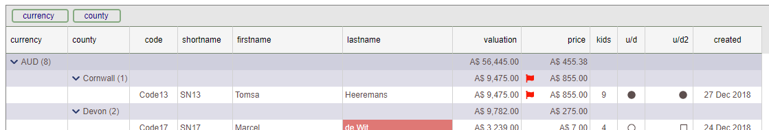
The above grid settings object specifies the minimum that is required for the grid to function resulting in a grid like the below:
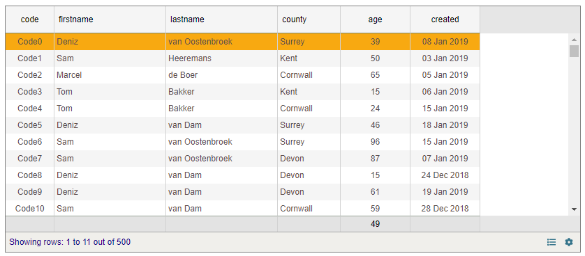
Defining the GridColumns
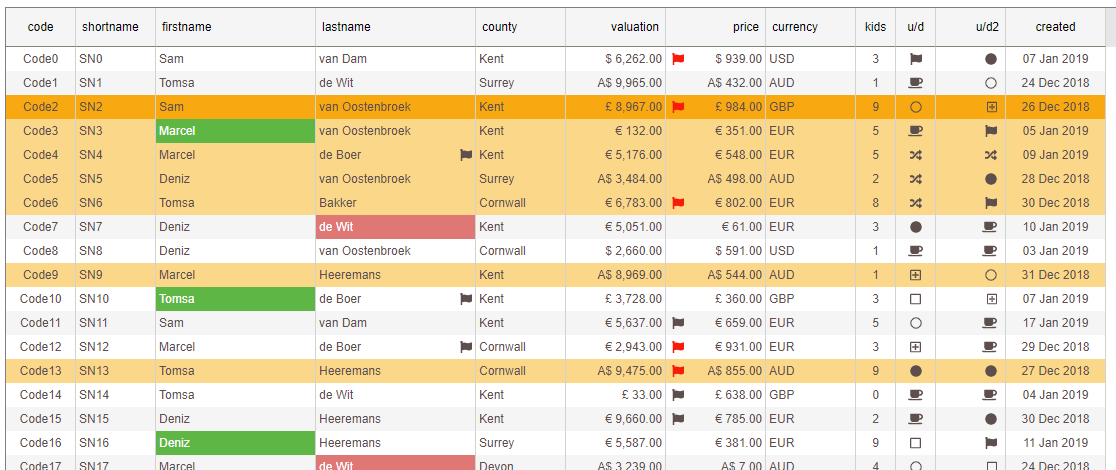
First off, we need to tell the grid what columns should be shown. This is done by defining a set of GridColumns that allow each column to set any properties such as alignment, formatting etc. If no columns are defined before data is passed to the grid it will create a 'best guess' columns for each field it encounters.
Note that when defining the columns we also provide an aggregate position ('average') for the 'age' column.
static : GridColumn // define some columns let cols: GridColumn = ; //cols.push(new GridColumn("pkvalue", 120)); cols; cols; cols; cols; let col = "age" 100 "" "number" "right" "#,##0"; colaggregate = "avg"; cols; cols; return cols;Create some sample data
Creating some sample data (the example below requires 'moment' and 'ramda' to be installed) - feel free to use your own!
static : any let rows: any = ; // lookup arrays let firstNames = "Marcel" "Deniz" "Sam" "Tom"; let lastNames = "Heeremans" "de Wit" "van Dam" "Bakker" "van Oostenbroek" "de Boer"; let counties = "Kent" "Surrey" "Devon" "Cornwall"; // helper functions let randomEntry = arr: string: arrMath; let Math; // helper function to create a single row let { var row: any = {}; rowindex = i; rowcode = "Code" + i; rowfirstname = ; rowlastname = ; rowcounty = ; rowage = ; rowcreated = return row; } // create a number of random rows R; return rows;Last Refresh indicator
The last updated date/time stamp is shown when the showLastRefreshTime property is set to true.
By providing a refresh handler through the requestFreshData prop the user can click the 'last refresh' date/time for the data to be refreshed.
// shows the label indicating how long the data has been displayed forsettingsshowLastRefreshTime = true; // what to do when the user wishes to refresh by clicking the last refresh date indicatorsettings { // wait for a little while then provide 1000 new rows ; // if all went well return true else return false (this will update the date/time stamp) return true; }Now a 'last refresh' indicator is shown.
Styling Cells
The grid allows each cell to be individually styled by supplying a handler to the cellStyling property on the VGridSettings.
Note that each row is initially fully styled by the grid according to the column definitions and the underlying data and is ready to be shown. However, just before they are displayed each cell is allowed to be altered by the user through the given cellStyling callback.
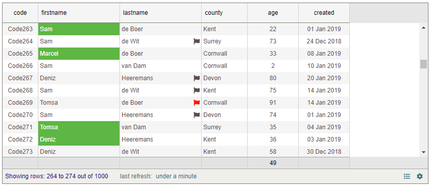
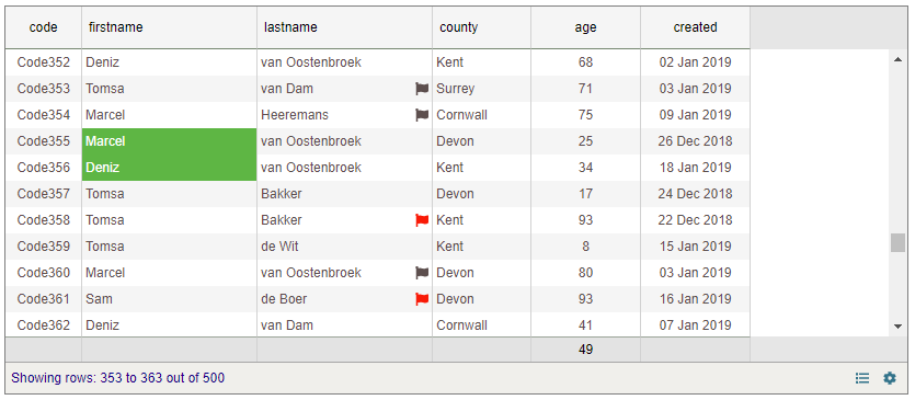
An example of styling is show below:
// allow for some custom styling...settings { let row: any = stylerow; let col: GridColumn = stylecol; // highlight people aged between 20 and 40 if coldbName == "firstname" && row"age" >= 20 && row"age" <= 40 stylebackgroundColor = "rgb(97, 181, 61)"; stylecolor = "white"; // flag all person over the age of 70 if coldbName == "lastname" && row"age" > 70 stylefaImage = "flag"; if row"age" > 85 stylefaImageColour = "red"; // change the actual text (Tom -> Tomsa) if coldbName == "firstname" && styletextDisplay == "Tom" styletextDisplay = "Tomsa"; // return the adjusted cell-style return style;}Three things happen here.
- The firstname cell is coloured green with white text for anyone below the ages of 20 and 40.
- Anyone over the age of 70 has a flag assigned which gets coloured red when the age is over 85.
- Thirdly, the raw text of 'Tom' is displayed as 'Tomsa' without changing the underlying source.
This results in a grid that looks like this:
The CellStyleInfo exposes the following properties
Note that for each cell a callback is made
| property | purpose |
|---|---|
| row | the data row of this cell |
| col | the GridColumn of this cell |
| style | the style that will be applied |
| state | the Vuex Store this grid is based on |
| textRaw | the raw (unformatted text) |
| isTotalRow | are we painting the bottom 'totals' row |
| isGroupRow | are we painting a (sub) totals grouping row |
| groupLevel | the level (depth) of the nested grouping (0 is a normal row, 1 is the level above, 2 one above that, etc.) |
| groupCurrencyCode | the curr code the grouping rows have in common if all the same, else 'mixed' |
| groupRowCount | the number of rows in the sub group |
| rows | all raw rows that would be shown |
Below are the properties that can be overwritten and will adjust the final styling of the cell.
| property | purpose |
|---|---|
| backgroundColor | the background colour of the cell |
| color | the text colour of the cell |
| faImage | the font-awesome image the cell needs to show - the image will be placed opposite from the text (i.e. if the text is left aligned, the image will be right-aligned) |
| faImageColour | the colour of the above fa image |
| textDisplay | the text that will be shown |
More image styling
The following examples show the grid performing a few more features such as using an 'image' column that displays font-awesome codes and use these to show the actual iamge.
// allow for some custom styling...settings { let row: any = stylerow; let col: GridColumn = stylecol; ... // when dealing with the 'updown' columns we use the fa-** raw data and supply that to the faImage property on the incoming style object. if coldbName == "updown" stylefaImage = row"updown"; if coldbName == "updown2" stylefaImage = row"updown2"; ... // return the adjusted cell-style return style;} 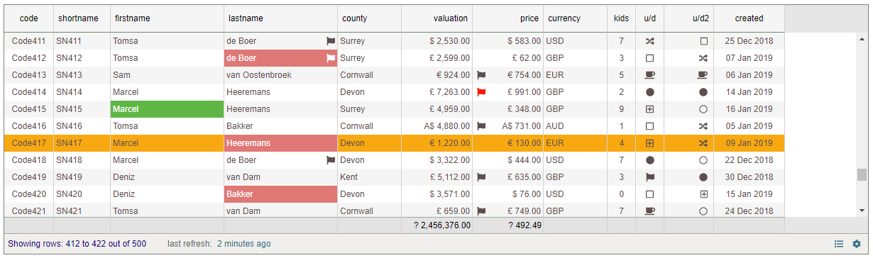
Grouping
The grid supports grouping through the UI but also programmatically.
The UI provides a standard 'drag/drop' to the grouping bar (made visible by using the cog icon):
Or we can group through code by simply calling setGroupColumns handing an array of columns to group on. This can be helpful by not allowing the user to alter the groups set through code.
// once the grid is created we can 'group' on any columnvgrid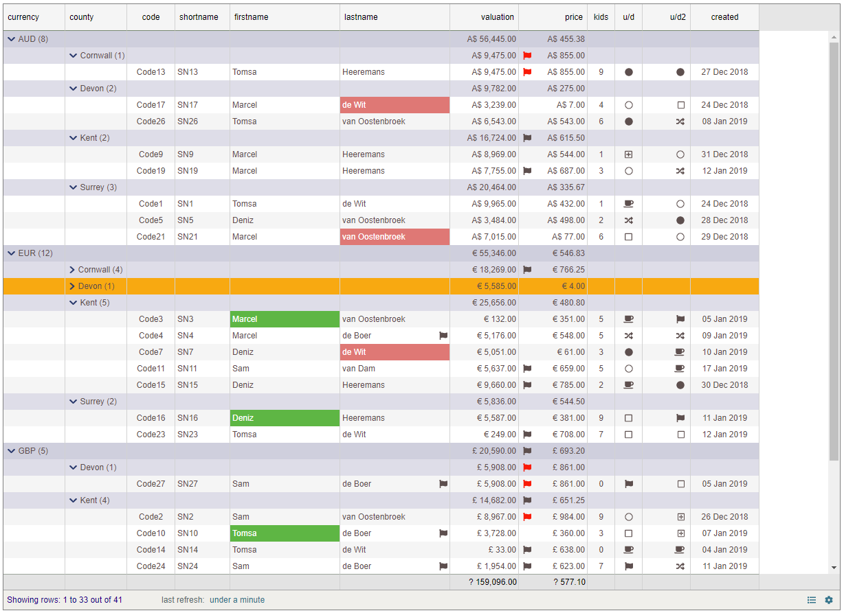
Selecting rows
By settings allowRowMultiSelect property to true one can select a range of rows. Each time the selection changes the onChanged handler is called.
When a row is selected (or any activity has taken place to the grid) it will raise the onChanged event.
This event provides a GridStateInfo object that informs the user a plethora of information about the grid. Not only will it tell which row was clicked but it provides a list of 'checked' items, 'selected' rows, the column the click to place in whether it was as a result of a double click and much more.
// get informed when the user selects a row (or rows)vgrid { console;};The GridStateInfo exposes the following
| property | purpose |
|---|---|
| idColumn | |
| context | |
| contextSub | |
| isGroupHeader | |
| groupLevel | |
| selectedPKValue | the selected pkValue |
| selectedIDValue | the selected IDValue (based on the idColumn) |
| selectedRow | the selected rowitem |
| selectedRowHasChanged | has the rowItem changed from the last time we raised? |
| origin | what/who caused this event being raised |
| selectedRows | |
| checkedRows | |
| totalRowCount | |
| column | |
| dblClickedColumn | row was double clicked |
| gridDisplayMode | ** coming up ** |
Frozen Columns and multiple headers
By setting the frozenLeft or the frozenRight property on a GridColumn to true you can 'freeze' any column either on the left or right hand side.
Column headers are now defined through an array of HeaderInfo objects. These allow the header text to be shown vertically or horizontally (default). When these are not supplied the main given header text is transformed into single HeaderInfo objects for each column.
In future versions any header with the same text as its adjacent cell will be merged.
// NOTE - here we already have a GridSettings object that contains our columns// lets freeze the 'code' column to the left and the 'dob' to the right!// (isSame is a String prototype extended property testing for case-insensitive equality )settingscolumnsfrozenLeft = true;settingscolumnsfrozenRight = true; // add some random secondary headers (keep the height to be 50 pixels of the second (now top) row)let headerSamples = "AAA" "BBB" "CCC" "DDD";settingscolumns; 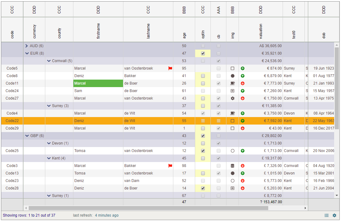
VGridSettings - essential properties
| property | args/value (default) | purpose |
|---|---|---|
| el | DOM element | Specifies the DOM element the grid will be injected into. This can be a real element or a class |
| columns | array | Accepts an array of pre-defined GridColumn objects |
| idColumn | string | Specifies the column that will be interpreted as the unique ID column. If none exists then leave this blank and a 'pkvalue' will be generated guaranteeing a unique reference for each row. |
| createdGridStructure | Accepts a callback that is called once the grid is created and mounted into the DOM | |
| more | more.. | more.. |
VGrid -
The table below describes all properties and events exposed by the DropDownControl.
| Type | Name | args/value (default) | Description |
|---|---|---|---|
| event | onChanged | (GridStateInfo) => void | raised when row(s) are selected |
| method | setData | rows array | the actual data for the grid to display |
| more | more.. | more.. | much more.. |
History
Note this grid is actively worked on (hence a version number of 0.*.*)
| version | date | notes |
|---|---|---|
| v 0.0.9 | 01 Mar 2019 | style/settings enhancements |
| v 0.0.8 | 27 Feb 2018 | getStyle & setStyle so 'snapshots' can be taken and reapplied of the state of the grid |
| v 0.0.7 | 22 Feb 2018 | implemented getSettings and handing these with setData rather than in VGridSettings |
| v 0.0.6 | 21 Feb 2018 | implemented 'allowRowMultiSelect' and collect selected rows (in GridStateInfo) |
| v 0.0.5 | 09 Feb 2018 | Export the HeaderInfo... |
| v 0.0.4 | 08 Feb 2018 | Frozen columns and multiple headers |
| v 0.0.3 | 23 Jan 2018 | project structure changes - some api updates |
| v 0.0.2 | 20 Jan 2018 | minor changes |
| v 0.0.1 | 20 Jan 2018 | Initial release - many more features to follow shortly |