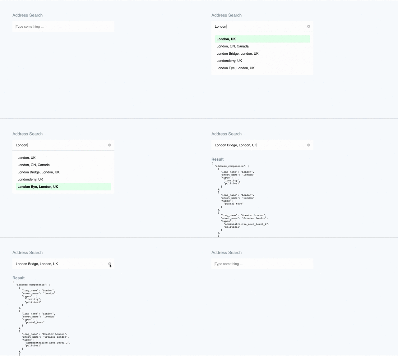
Better Google Places Autocomplete implementation for Vue.js
A Vue components to provide address search functionality with improved user experience and advanced customisation options.

Example implementations can be found in our demo repository
Key Improvements
- Allow enter key to select the first search result
- Keyboard navigation
- Customisability
- Simplified events handling
Installation
npm i vue-better-google-places-autocompleteYou can either import the package as a plugin or the components.
Plugin usage
VueComponent usage
VuePrerequisites
The plugin assumes that the Google Maps API has been loaded and is accessible via window.google.
Usage
The component itself comes with very basic defaults and assumes that you will either style the default output or use the named scoped slots to customise each element.
Basic usage will output an input text box and an unordered list for returned entries.
Dealing with results
The component emits events which you can use to respond to address search selection.
resultChanged
This event is fired when a user has selected an address from a search. This will include the PlaceDetails as the event payload.
resultCleared
This event is fired when the user has removed all text from the search box or clicked the clear icon. Useful for re-centering the results map for example.
Pre-populating search and results
Sometimes you may with to pre define the search query and/or result as defaults for the component. E.g. if you have multiple search components on different screen and need to maintain the same results for both.
Customisation
Two scoped-slots are provided to customise the search input box and the results
Search Input
Address Search Search Results
The underlying ul and li are not accessible via slots but you can style them using the provided css class on the ul, .vbga-results. Additionally, the currently selected list item will receive a highlighted class.
{{ place.description }} {{ place.description }}