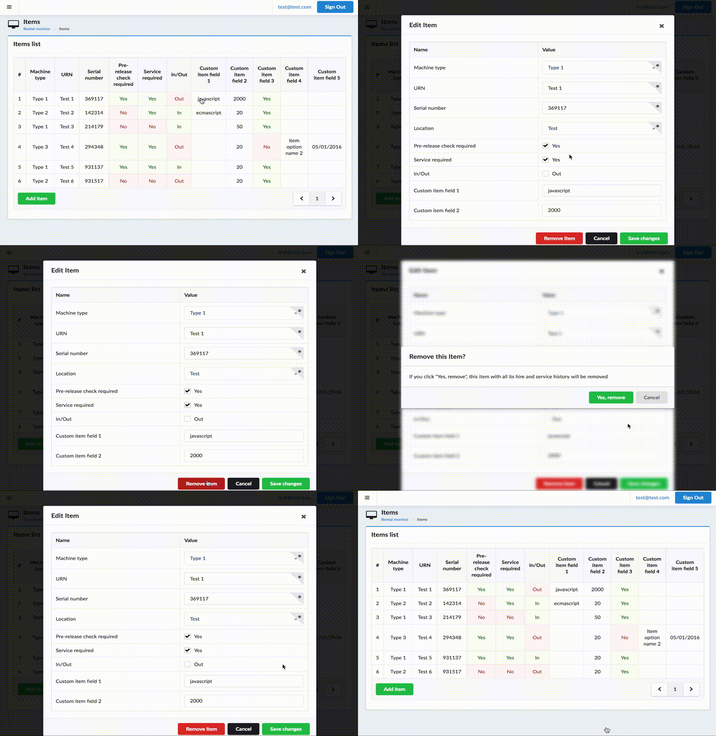
Vudal
Modal window component based on Semantic UI design. (Does not require semantic ui, it is completely independent)

Install plugin
import { VudalPlugin } from 'vudal';

Vue.use(VudalPlugin);
Possible options:
- hideModalsOnDimmerClick (defaults to true) lets control whether clicking on dimmer will hide opened modals
Inside your component make preparations
import Vudal from 'vudal';

...
components: { Vudal }
...
Component usage example
<vudal name="myModal">
  <div class="header">
    <i class="close icon"></i>
    Title
  </div>
  <div class="content">
    Content
  </div>
  <div class="actions">
    <div class="ui cancel button">Cancel</div>
    <div class="ui button">Ok</div>
  </div>
</vudal>
Params:
- name modal name
- parent parent modal name (if any)
- close-by-esc close by
ESCbutton (true by default) - stickyHeader set sticky header block (class .header) (false by default)
- stickyActions set sticky actions block (class .actions) (false by default)
Parent-child relationship is needed when second (child) modals is opened, but you close first modal (parent), child should also be closed. Also parent modal is blurred when child is opened.
Events:
- show fired when modal is starting to show
- hide fired when modal is starting to hide
- hidden fired when modal finished hiding animation
- visible fired when modal finished show animation
Methods:
- $toggle toggle visibility
- $show self explanatory
- $hide self explanatory
- $isActive check whether modal is visible
- $remove destroy modal
Selector '.actions .cancel' call method $hide on click.
Also global $modals object is available to control modals.
You can access modals by name, for example this.$modals.myModal.
Example: this.$modals.myModal.$show() to show modal.
Use this.$modals.hideAll() to hide all active modals.
Custom modals
If you need to create your own custom looking modal, you can use modalMixin that will drive your modal.
It adds everything specified above, except .actions selector thing.
It also adds .vudal class to root element and .show, .hide and .mobile class for visible, hidden
and opened on mobile device accordingly.