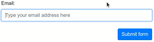
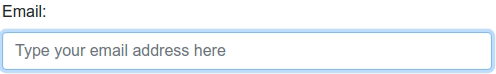
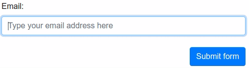
Verifalia provides a powerful and lightning-fast service for real-time email address validation and
deliverability checks; once included in a web page, this Javascript widget automatically binds to every input field
of type email (or those with the email word in their names or IDs or anything else, based on a configured XPath
selector) it finds and prevents form submission, unless the field contains a valid email address that points to
an active and deliverable mailbox which can accept messages. The widget comes as a lightweight (9KB gzipped) single
Javascript file, with no external dependencies and a wide range of customization options.
The widget includes default settings that automatically prevent form submission for email addresses that are invalid, unreachable, disposable, and throw-away; however, you can easily configure it to include or exclude different types of addresses (for instance, those provided by free email service providers like Gmail or Yahoo). It provides out-of-the-box, automatic support for all HTML5 forms, including mobile ones: just drop it into any web page and it will automatically validate every email address entered into its field in real-time.
It also integrates automatically with the following validation libraries and landing page / form building services, if they are detected upon loading: Adobe Marketo Engage, FormSite, FormStack, FormValidation, HubSpot, Instapage, jQuery Validation Plugin, Kendo UI for jQuery, KickoffLabs, Leadpages, Pardot, Parsley, Unbounce, Validate.js, and Zoho Sites. You may find that form validation libraries other than these are compatible with the Verifalia email verification widget; however, we make no claims to support those libraries, and will not troubleshoot issues that arise when using those libraries.
While this widget is well-suited for many integration scenarios, it exclusively runs in the browser and comes with a limited set of extension points for developers: check out the Verifalia SDK library for JavaScript for a more advanced solution with support for Node.js (in addition to the browser!), as well as a vastly extended set of features.
For advanced configuration options, please read below.
- Installing the widget on your page
- How it works
-
Configuring the widget
- Using Javascript
- Using data-verifalia-* attributes
-
Advanced settings
- inputBindings
- inputBindings.appendHiddenFields
- inputBindings.autoWireup
- inputBindings.classNames
- inputBindings.debounceTime
- inputBindings.events
- inputBindings.preventSubmission
- inputBindings.selector
- inputBindings.squiggles
- inputBindings.styling
- emailValidations
- emailValidations.allow
- emailValidations.block
- emailValidations.memoize
- emailValidations.messages
- Widget methods
- Widget events
- Known limitations
- Changelog / What's new
First things first: using the Verifalia email verification service requires having a Verifalia account: if you don't have one, simply register for a free account. Additionally, this widget requires a browser app key (a sequence of alphanumeric characters): create a browser app, if you don't have one already. Once you are on the Verifalia dashboard, you can easily generate the necessary embedding code from the Embeddable widget tab, which will include the HTML code snippet needed to embed the Verifalia widget along with your browser app key. Paste this code onto your page or form, and you will be all set! For specific instructions on installing the widget with the validation libraries and landing page / form building services we support, please refer to the guidelines below.
As an alternative to using the code generation feature provided by the Verifalia dashboard, you have the option to manually copy the following HTML block and place it just before the closing </body> tag. Make sure to specify the script source as the verifalia-widget.js file, which you can obtain from one of the CDNs serving projects hosted on npm (as shown hereafter). Remember to set the data-verifalia-appkey attribute to match your browser app key, which you can acquire from the Verifalia dashboard as explained above. Alternatively, you can also set your browser app key using JavaScript, as detailed in the next section.
  ...

  <script defer
    src="https://unpkg.com/verifalia-widget@1.11.0/dist/verifalia-widget.js"
    data-verifalia-appkey="YOUR BROWSER APP KEY HERE"
    integrity="sha512-mD5u2YymIj8DfI6BFQyyBMcxMkb8LUcpubiK8TJCWLDfNvoKoD3hYm6eFZF5IyvkYVulE+kAF9rhJRiTHI7KEA=="
    crossorigin="anonymous"></script>
  <div style="display: none">Powered by Verifalia <a href="https://verifalia.com/">email verifier</a></div>

</body>
</html>
or
  ...

  <script defer
    src="https://cdn.jsdelivr.net/npm/verifalia-widget@1.11.0/dist/verifalia-widget.js"
    data-verifalia-appkey="YOUR BROWSER APP KEY HERE"
    integrity="sha512-mD5u2YymIj8DfI6BFQyyBMcxMkb8LUcpubiK8TJCWLDfNvoKoD3hYm6eFZF5IyvkYVulE+kAF9rhJRiTHI7KEA=="
    crossorigin="anonymous"></script>
  <div style="display: none">Powered by Verifalia <a href="https://verifalia.com/">email verifier</a></div>

</body>
</html>
CDNs courtesy of unpkg and jsDelivr.
Alternatively, you can host the Javascript file yourself: to do that, use npm to automatically download and install the required files. With npm installed, run the following from your project root:
$ npm install verifalia-widgetOnce done, the verifalia-widget.js file will be available on the ./node_modules/verifalia-widget/dist/verifalia-widget.js folder.
While the widget is free from any dependencies, it offers built-in support for standard HTML5 forms, including those designed for mobile devices. Moreover, it seamlessly integrates with various form validation libraries and form-building services, such as Adobe Marketo Engage, FormSite, FormStack, FormValidation, HubSpot, Instapage, jQuery Validation Plugin, Kendo UI for jQuery, KickoffLabs, Leadpages, Pardot, Parsley, Unbounce, Validate.js and Zoho Sites.
The widget intelligently adjusts its behavior based on the presence of these JavaScript libraries and form builders, ensuring harmonious interaction with the existing validation logic and styles of your webpage. You can further customize the widget's default behavior using the numerous settings described below.
At loading time, if no supported validation libraries are detected then the widget works using plain HTML5 forms methods and automatically binds itself to every input field of type email it finds in the page as well as to every input field whose name or ID contains the word email (see the autoWireup setting below to turn off this behavior and the selector property to set which fields will be automatically bound). As soon as the containing form is submitted or while the user is typing into one of the bound fields, the widget performs an email verification on the typed value and eventually blocks the submission if the email address is invalid or points to an inactive mailbox or is disposable / throw-away (see the emailValidations setting to change the validation logic and the events setting to change the events which trigger the email verification).
The widget automatically appends some hidden fields to the document to hold the response its gets from the Verifalia email verification service, including the job ID (a string representing the unique identifier for the job which Verifalia generates upon receiving an email validation request), the email validation classification and its status.
It names each added hidden field according to the original field name, appending one of these suffixes:
-
-verifalia-id, where the hidden field contains the Verifalia job ID; -
-verifalia-classification, where the hidden field contains the result classification (Deliverable,Undeliverable,RiskyandUnknown); -
-verifalia-status, where the hidden field contains the result status (Success,MailboxDoesNotExist,MailboxHasInsufficientStorage, etc. - see complete list);
For security reasons, it is strongly advisable to avoid relying only on the data you get from the client and, instead, always double-check the input values on your back-end: you may want to retrieve the validation on the server side using the aforementioned job ID and check whether the input email address, its classification and status matches the ones you have received along with your posted form. Verifalia comes with a powerful API and free and open source SDKs for the most common development platforms and programming languages, check out the developers documentation to learn more.
Upon loading, the widget adds the CSS class verifalia-field to the input fields it binds to; while the email validation is in progress it also adds the CSS class verifalia-field-processing and adds either the CSS class verifalia-field-valid or verifalia-field-invalid according to the validation outcome.
In the event the request is throttled, it adds the CSS class verifalia-field-throttled to the field.
These CSS classes offer a basic visual feedback for the email validation process and can be changed by way of the classNames setting mentioned below.
The widget automatically displays these feedback texts in response to the standard HTML5 form validation process:
-
Please hold on for a second, until we verify this email address..., during the validation process; -
Please enter a valid email address., if the email address is invalid; -
Too many attempts, please try again later., if the request gets throttled.
To change these texts, use the messages setting described below.
For a better user experience, the widget also shows error squiggles upon completing an email verification, to call attention to a typo or other kinds of error:
Error squiggles can be turned off by way of the squiggles setting mentioned below. Beware of the limitations of error squiggles coupled with <input type="email" /> fields and emails with non-ASCII symbols.
The widget automatically recognizes the directionality of each input element it binds to and adapts its visual feedback accordingly: its default CSS classes display a visual indicator about the validity of the email address at either the right or the left side, in the event the input element has a computed dir value of either ltr (for language written from left to right (ltr), like Latin, Cyrillic, (Modern) Greek, Indic and Southeast Asian scripts) or rtl (for languages written from right to left (rtl) - like Arabic, Hebrew, Persian, Urdu and Sindhi). Error squiggles are also shown according to that directionality.
Since the widget reacts according to the the computed dir value, it automatically obeys to closest dir value set for any of its ancestors: the most common scenario is the one where the dir value is applied only once at the root html element, as shown in the example below:
<html dir="rtl">
  ...
  <div>
    ...
    <input type="email" ...>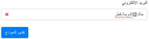
It is also possible to instruct the Verifalia widget to handle directionality for content whose direction is not known in advance, like in the event an input field must accept both left to right and right to left email addresses. For this, it is necessary to explicitly specify a dir attribute at the input field level, with a value of auto, as shown in the example below:
<html>
  ...
  <div>
    ...
    <input type="email" dir="auto" ...>
In that case, the widget automatically adapts the directionality of its visual feedback based on the actual content of the input field, as it is filled by the user:
For further advanced customization, the widget also adds an attribute named verifalia-field-dir to the attached input element with a value which reflects the computed directionality (which can be any of ltr or rtl) of that element, so that it is possible to customize the CSS rules for its visual feedback according to that value.
Here is, for example, how one may redefine the verifalia-field-invalid CSS class for right to left languages:
.verifalia-field-invalid[verifalia-field-dir=rtl] {
  background-color: #f00;
}While this widget does not have any dependency on any external validation library, it automatically detects the presence of the most widely used ones and seamlessly provides its email verification logic to them; the same holds true for several form building providers. We currently provide out-of-the-box support for: Adobe Marketo Engage, FormSite, FormStack, FormValidation, HubSpot, Instapage, jQuery Validation Plugin, Kendo UI for jQuery, KickoffLabs, Leadpages, Pardot, Parsley, Unbounce, Validate.js, and Zoho Sites.
This widget also supports Adobe Marketo Engage (formerly Marketo) out of the box; whenever it detects it is running on a page hosted by Adobe Marketo Engage, it automatically provides the Verifalia email validation logic to the form. To add the Verifalia widget to a Adobe Marketo Engage form, just edit the related page in the Marketo UI, drag in the HTML element, paste the code snippet you can copy from the Verifalia dashboard into the custom HTML editor and click Save.
This widget works with the FormSite platform: whenever it detects it is running on a page hosted by FormSite, it automatically provides the Verifalia email validation logic to the form. To add the Verifalia widget to a FormSite form, just place the code snippet you can retrieve from the Verifalia dashboard into a Custom Code item, which can be found in the Formatting Items tab in the FormSite's Form Editor.
The widget also works with the FormStack service: whenever it detects it is running on a page hosted by FormStack, it automatically provides the Verifalia email validation logic to the form. To add the Verifalia widget to a FormStack form, just paste the code snippet you can copy from the Verifalia dashboard into the Footer HTML editor , which can be found in the Advanced Code Editor in the FormStack's editor.
Support for the FormValidation library is provided out of the box as well. If the widget detects that library is loaded on the page, it automatically replaces the default FormValidation.validators.emailAddress validation logic. In this case, no additional binding is done for input fields, in order to comply with the existing library behavior.
HubSpot's landing pages are also supported: whenever this widget detects it is running on a page hosted by HubSpot, it automatically provides the Verifalia email verification logic to every email field contained in the page. To add the Verifalia widget to a HubSpot landing page, just edit it in the HubSpot UI and click the Settings button shown in the header: from there, scroll down until you reach the Advanced settings section and paste the code snippet you can copy from the Verifalia dashboard into the Footer HTML text area, then dismiss the Settings dialog (pages should be automatically saved in HubSpot whenever changes are made). Click the Publish button to go live with the updated HubSpot landing page.
To learn more, follow our step-by-step guide: how to block invalid emails in a HubSpot website page or landing page
This widget also supports the Instapage platform: whenever it detects it is running on a page hosted by Instapage, it automatically provides the Verifalia email verification logic to the form. To add the Verifalia widget to an Instapage page, just edit it in the Instapage UI and click the HTML/CSS link shown in the sidebar: from there, click the BODY link and paste the code snippet you can copy from the Verifalia dashboard into the HTML editor and click Save. Once saved, click the UPDATE button to publish the updated Instapage page.
To learn more, follow our step-by-step guide: how to block invalid emails in Instapage landing pages
The widget supports jQuery Validation Plugin out of the box. If it detects jQuery Validation Plugin is loaded on the page, it automatically overrides the default email validation logic. Also no additional binding is done for input fields, in order to comply with the existing jQuery Validation Plugin configuration.
Under this mode, the widget does not add any CSS class to the fields, in order to play nicely with the existing jQuery Validation Plugin visual feedback; to override this behavior, just set the styling property as explained below.
Kendo UI for jQuery's Validator is supported out of the box and the widget automatically replaces the default
email validation logic provided by that library: no additional binding is done for input fields, in order to play
nicely with the existing validation logic provided by Kendo UI.
Note: Kendo UI for jQuery gives precedence to any validation error message set through either the data-<rulekey>-msg
or validationMessage field attributes. When present, these attributes interfere with the text shown while the widget
is asynchronously processing emails and this may be misleading to the user.
To learn more, read this blog post: improving Email Verification with Kendo UI and Verifalia
KickoffLabs pages are also supported out of the box and this widget automatically provides the Verifalia email verification logic to every email field. To add the Verifalia widget to a KickoffLabs page just click the Edit drop-down menu in the KickoffLabs UI and, from there, pick the Tracking Codes menu item. Once done, paste the code snippet you can copy from the Verifalia dashboard into the Footer Scripts area and click Save Script Changes.
To learn more, follow our step-by-step guide: how to block invalid emails in KickoffLabs landing pages
Support for Leadpages is provided out of the box too: once embedded on a landing page, this widget automatically provides the Verifalia email verification logic to every email field. To add the Verifalia widget to a Leadpages landing page just click the Edit button in the Leadpages UI and, from the editor window, click the Settings button in the sidebar and go to the Analytics tab. Once there, paste the code snippet you can copy from the Verifalia dashboard into the Immediately before the closing </body> tag area and click Save.
If your page hosts a pop-up form, you need to click the Edit pop-up that appears when you hover the activation button, then click the Settings button in the sidebar and paste the code snippet you can copy from the Verifalia dashboard into the Immediately before the closing </body> tag area and click Save.
In both cases, to publish the page just click Update in the header.
To learn more, follow our step-by-step guide: how to block invalid emails in Leadpages landing pages and pop-up forms
The widget integrates with Pardot automatically: when it is added to a Pardot landing page, it embeds Verifalia's email verification logic for every email field. To integrate the widget into your Pardot landing page's form, click the Look and Feel link in the classic editor and click the Below Form tab. Once there, click on the HTML button within the WYSIWYG editor and paste the code snippet you can copy from the Verifalia dashboard.
The Verifalia widget supports the Parsley form validation library out of the box. If it detects Parsley is loaded on the page, it automatically participates to the Parsley validation process and binds to input fields according to the HTML5 forms scaffolding logic mentioned above.
Under this mode, the widget does not add any CSS class to the fields, in order to play nicely with the existing Parsley visual feedback; to override this behavior, just set the styling property as explained below.
The widget also supports Unbounce landing pages and automatically provides the Verifalia email verification logic to every email field. To add the Verifalia widget to an Unbounce page just edit the page in the Unbounce UI and, from there, click the Javascripts menu shown at the bottom of the page and click the Add New Javascript item. From the Manage Scripts window which pops up, set the placement as Before Body End Tag and paste the code snippet you can copy from the Verifalia dashboard into the code area, then click Done. Finally, click the Save button in the header to save the updated Unbounce page and click the Republish button to go live with the updated page.
To learn more, follow our step-by-step guide: how to block invalid emails in Unbounce landing pages
This widget supports the Validate.js library out of the box. If it detects Validate.js is loaded on the page, it automatically overrides the default email validation logic. Also no additional binding is done for input fields and no additional CSS classes are added to them, in order to play nicely with any existing Validate.js configuration.
The widget also seamlessly integrates with Zoho Sites: when it is added to a Zoho Sites website, it automatically incorporates Verifalia's email verification logic for every email field. To integrate the Verifalia widget into your Zoho Sites website, click the Settings button in the Builder UI and click the Header and Footer Code in the General section. Once there, paste the code snippet you can copy from the Verifalia dashboard into the Header Code text area and click Save.
To publish the website click Back to Builder link in the header, and then click the Publish button in the header.
The Verifalia widget comes with a default configuration which should suit the most common needs. For advances usage scenarios, it is possible to customize the behavior of the widget using either Javascript or through certain HTML attributes applied to the document markup. For a complete list of the settings available to this widget, please see the Advanced settings section below.
This method requires you to add a small configuration script before the inclusion of the verifalia-widget.js mentioned above, where you add a new property named VerifaliaWidgetConfig to the window object. This property will be read by the widget at its loading and allows to adjust its settings; modifying the VerifaliaWidgetConfig object after the widget is loaded won't have any effect.
Here is how to set, for example, your browser app key through the VerifaliaWidgetConfig global object:
<script>
  window.VerifaliaWidgetConfig = {
    appKey: 'YOUR-APPKEY-HERE'
  };
</script>Alternatively, you can configure your widget by way of certain attributes whose names begin with data-verifalia-, which you can apply to the specific input field you wish the widget to bind to or to any of its ascendant elements, including the parent form and the document body. As a final fall-back element, the widget also looks for any data-verifalia-* attribute in the script element which loaded it.
Here is, for example, how to set your browser app key at the body level:
<body data-verifalia-appkey="YOUR-APPKEY-HERE">
...This section provides a reference for the available configuration settings for the Verifalia widget.
You can configure how the widget binds to the input fields through the inputBindings property. Here is the object structure and a type definition of the available properties, with each item being optional and coming with a default value as mentioned in the next sections:
inputBindings: {
  appendHiddenFields: boolean;
  autoWireup: boolean;
  classNames: {
    base: string;
    exception: string;
    invalid: string;
    valid: string;
    throttled: string;
    processing: string;
    insufficientBalance: string;
  }
  debounceTime: number;
  events: string;
  preventSubmission: string;
  selector: string;
  squiggles: boolean;
  styling: boolean;
}
See below for details about each setting.
inputBindings.appendHiddenFields
If true appends the hidden input fields to the form upon completing an email validation, with the validation outcome. Defaults to true.
These input fields may be useful to double-check the verification results in the back-end of the webapp through the Verifalia API and exclude data tampering in the front-end.
As an alternative to the configuration script, it is also possible to adjust this setting by way of the data-verifalia-inputBindings-appendHiddenFields
attribute (see Using data-verifalia-* attributes).
If true enables the automatic binding of input fields as described above. Defaults to true.
As an alternative to the configuration script, it is also possible to adjust this setting by way of the data-verifalia-inputBindings-autoWireup
attribute (see Using data-verifalia-* attributes).
The CSS class names to add to the fields, according to the logic explained above:
-
basecontains the CSS class name to apply to each field the Verifalia widget attaches to, defaults toverifalia-field; -
processingcontains the CSS class name to apply while the email validation is in progress, defaults toverifalia-field-processing; -
validcontains the CSS class name to apply for fields containing a valid email address, defaults toverifalia-field-valid; -
invalidcontains the CSS class name to apply for fields containing an invalid email address, defaults toverifalia-field-invalid; -
throttledcontains the CSS class name to apply if the email validation request has been throttled, defaults toverifalia-field-throttled; -
exceptioncontains the CSS class name to apply in the event of a network or code error, defaults toverifalia-field-exception; -
insufficientBalancecontains the CSS class name to apply in the event the Verifalia account is out of credits, defaults toverifalia-field-insufficient-balance.
As an alternative to the configuration script, it is also possible to set the CSS class names by way of the data-verifalia-inputBindings-classNames-base,
data-verifalia-inputBindings-classNames-processing, data-verifalia-inputBindings-classNames-valid, data-verifalia-inputBindings-classNames-invalid, data-verifalia-inputBindings-classNames-throttled, data-verifalia-inputBindings-classNames-exception and data-verifalia-inputBindings-classNames-insufficientBalance attributes, respectively. See Using data-verifalia-* attributes.
The time we allow between keystrokes before attempting to verify the input value for the field, expressed in milliseconds. Defaults to 500.
As an alternative to the configuration script, it is also possible to adjust this setting by way of the data-verifalia-inputBindings-debounceTime
attribute (see Using data-verifalia-* attributes).
Zero or more input field events the widget binds to and triggers the email verification for, separated by a comma (,). Defaults to input, meaning
the widget will start verifying email addresses on any change made in the input field text content. When no events are set (such as when the configured
value is an empty string), the widget starts verifying email addresses only upon submitting the parent form.
Tip: set the value to blur to make the widget verify emails as soon as the related input field loses focus.
As an alternative to the configuration script, it is also possible to adjust this setting by way of the data-verifalia-inputBindings-events
attribute (see Using data-verifalia-* attributes).
A string with the condition(s) which must prevent a form to be submitted, separated by a comma (,); the allowed conditions are:
-
invalid, which means a field containing an invalid email address should not allow the parent form to be submitted; -
throttled, meaning an email validation request which exceeds the maximum limit (as configured in the Verifalia client area) should prevent the form submission; -
exception, which causes email validation requests resulting in an error (such as a network error because of no connectivity to the Internet, for example) to prevent the form submission; -
insufficientBalance, which prevents the form submission for a Verifalia account that is out of credits or a browser app which has consumed its maximum daily quota.
Defaults to invalid, throttled.
As an alternative to the configuration script, it is also possible to adjust this setting by way of the data-verifalia-inputBindings-preventSubmission
attribute (see Using data-verifalia-* attributes).
An string which allows to specify an XPath selector for the input fields the widget will bind itself to.
Defaults to //input[@type="email" or ((not(@type) or @type!="hidden") and contains(@name, "email")) or @*[starts-with(name(), "data-verifalia")]],
which means it will match any input field that:
- has its
typeequal toemail; or, - has its
typenot equal tohiddenand includes the wordemailin itsnameattribute; or, - has a
data-verifalia-*attribute.
As an alternative to the configuration script, it is also possible to adjust this setting by way of the data-verifalia-inputBindings-selector
attribute (see Using data-verifalia-* attributes).
If true displays squiggles within the input field upon completing an email validation, in the event the widget detects typos
or in other cases where an additional error indicator could make sense for the user. Defaults to true. Beware of the
limitations of error squiggles coupled with <input type="email" /> fields and emails with non-ASCII symbols.
Also, error squiggles will never appear if the styling property is set to false.
As an alternative to the configuration script, it is also possible to adjust this setting by way of the data-verifalia-inputBindings-squiggles
attribute (see Using data-verifalia-* attributes).
If true forces the widget to apply the predefined styles and CSS classes to the attached input fields, where possible; if false, forces the widget
to avoid doing that. If undefined, allows the widget to choose the best solution, depending on the specific host (some hosts already comes with a predefined styling behavior and, in those cases, the widget just play nicely and avoid styling the attached fields). Defaults to undefined.
As an alternative to the configuration script, it is also possible to adjust this setting by way of the data-verifalia-inputBindings-styling
attribute (see Using data-verifalia-* attributes).
Defines the email validation logic and preferences for the Verifalia widget. Here is the object structure and a type definition of the available properties, with each item being optional and coming with a default value as mentioned in the next sections:
emailValidations: {
  allow: string;
  block: string;
  memoize: boolean | number;
  messages: {
    invalid: string;
    processing: string;
    throttled: string;
    insufficientBalance: string;
  }
};
The widget only allows the email addresses which pass the allow rule and do not pass the block rule.
A string with one or more classifications, status codes or attributes (free and role) the widget will allow to pass the form validation, separated by a comma (,). Classifications must appear using their names, status codes must use the prefix status: plus the actual status code value and attributes must use the @ prefix and either the free, role or disposable values. All the string is processed in a case-insensitive way.
Here is, for example, how to define the allow rule for a widget which allows Deliverable and Unknown classification as well as role accounts and catch-all mailboxes:
allow: 'deliverable, unknown, @role, status:ServerIsCatchAll'The allow rule has a default value of deliverable, risky, unknown.
As an alternative to the configuration script, it is also possible to adjust this setting by way of the data-verifalia-emailValidations-allow
attribute (see Using data-verifalia-* attributes).
A string with the same format of the allow rule mentioned above.
Here is, for example, how to define the block rule for a widget which does not allow free email addresses (like those provided by Gmail and Yahoo):
block: '@free'The block rule has a default value of @disposable.
As an alternative to the configuration script, it is also possible to adjust this setting by way of the data-verifalia-emailValidations-block
attribute (see Using data-verifalia-* attributes).
A value which allows to configure the memoization of email validation results, improving the widget response time in certain cases. If true, the widget automatically memoize email validation results for 60 seconds, when possible. If false, the widget does not memoize any validation result. It is also possible to pass a number to memoize: in this case, the value is considered as the number of memoization seconds the widget must apply. Defaults to true.
As an alternative to the configuration script, it is also possible to adjust this setting by way of the data-verifalia-emailValidations-memoize
attribute (see Using data-verifalia-* attributes).
The texts for the messages the widget uses to provide feedback to the underlying form validation system:
-
invaliddefaults toPlease enter a valid email address.; -
processingdefaults toPlease hold on for a second, until we verify this email address...; -
throttleddefaults toToo many attempts, please try again later.; -
insufficientBalancedefaults toThe verification failed because of insufficient balance: please notify the website owner about this issue..
As an alternative to the configuration script, it is also possible to set each message text by way of the data-verifalia-emailValidations-messages-invalid,
data-verifalia-emailValidations-messages-processing, data-verifalia-emailValidations-messages-throttled and
data-verifalia-emailValidations-messages-insufficientBalance attributes, respectively. See Using data-verifalia-* attributes.
Once installed, the widget adds a VerifaliaWidget object to the window global object, which can be used to perform certain advanced operations whenever a customized behavior is needed.
The wireup() method allows to manually attach the widget to a certain portion of the DOM and can be used whenever autoWireup has been manually set to false. The method is defined as (TypeScript syntax):
wireup(rootNode: Node, live: boolean): voidwhere:
-
rootNodeis the DOM node which the widget will scaffold in order to bind to child (or even self)inputfields; -
liveis a boolean value that, if set, will make the widget constantly monitor the DOM for new additions.
For example, the default autoWireup value of true will have the same outcome of running the following block of code, once the widget has been loaded:
window.VerifaliaWidget.wireup(document, true);During its lifecycle, the widget triggers some synthetic events which allow listeners to be notified of notable activities and eventually react accordingly; all these events are named with the verifalia-widget: prefix, to ease their handling.
The verifalia-widget:initializing event is fired exactly one time, upon initializing the widget script, from the document object. It is cancelable, allowing
listeners to abort the widget initialization by way of the preventDefault() method if desired.
<script>
  document.addEventListener('verifalia-widget:initializing', (event) => {
    console.log('The Verifalia widget is initializing, drum roll...');

    // Uncomment the line below to abort the widget initialization
    // event.preventDefault();
  });
</script>The verifalia-widget:initialized event is fired exactly one time, as soon as the widget finishes initializing: the event is triggered from the document object and bubbles up.
<script>
  document.addEventListener('verifalia-widget:initialized', (event) => {
    console.log('The Verifalia widget is initialized: enjoy!');
  });
</script>The verifalia-widget:field-validation-started event is fired whenever the widget starts verifying an input field; it
is triggered from the target field's element object and bubbles up the DOM hierarchy.
<script>
  document.addEventListener('verifalia-widget:field-validation-started', (event) => {
    console.log('Email verification started for field', event.target);
  });
</script>The verifalia-widget:field-validation-completed event is fired whenever the verification process for an input field ends; it is triggered from the target field's element object and bubbles up the DOM hierarchy. Its detail field contains important details about the verification process, which include a status
field with the overall process status and an optional validation object with the actual email validation data, where available.
The status field contains one of the following values:
-
Allowedwhenever the email verification passes the allow/block settings (default to allowing Deliverable, Risky and Unknown emails and blocking disposable mails); -
NotAllowed- the opposite of the value above - means the email verification does not pass the allow/block settings; -
Throttledif the request exceeded the maximum limit, as configured in the Verifalia client area; -
Exceptionin the rare event of an unhandled exception; -
Canceledwhenever the verification is canceled (for example, if the field value is changed in the middle of an existing email verification). -
InsufficientBalanceif the Verifalia account is out of credits or the browser app has consumed its maximum daily quota.
The validation field is present only when the status field is Allowed or NotAllowed and contains an object with
the full job snapshot structure returned by the Verifalia API, which includes every possible result detail about
the email verification.
<script>
  document.addEventListener('verifalia-widget:field-validation-completed', (event) => {
    console.log('Email verification completed for field', event.target);
    console.log('Status', event.detail.status);
    console.log('Validation', event.detail.validation);
  });
</script>If Verifalia detects potential typos during the email verification process, it offers suggested corrections for the input data. The widget allows you to display these potential corrections according on your specific preferences and logic: to do that, it is possible to add an handler for the verifalia-widget:field-validation-completed event which deals with those suggestions, if applicable.
In the example below, the first potential correction provided by Verifalia is displayed within a customized DIV element:
<div id="didYouMean"></div>

<script>
  document.addEventListener('verifalia-widget:field-validation-completed', event => {
    const didYouMean = document.getElementById('didYouMean');
    const entries = event?.detail?.validation?.entries;

    didYouMean.innerHTML = (entries && entries[0].suggestions)
        ? `Did you mean <strong>${entries[0].suggestions[0]}?</strong>`
        : '';
  });
</script>No scripts can run on sites hosted at Google Sites, including the Verifalia widget: even if
their web page wizard allows to embed custom html, they place every embedded code block in a distinct sandboxed iframe,
which can't access other sections of the page for security reasons. Thus if one embeds the widget, it won't be able to
access the email fields in a form defined in another iframe.
Due to how badly <input type="email" /> fields are currently handling emails with non-ASCII symbols
(see https://www.grepular.com/The_Sad_State_of_HTML_Email_Input_Fields_and_IDNs if you wish to learn more and cry),
error squiggles may be placed incorrectly in such cases. To overcome the issue, we suggest to just avoid using
type="email" and fall back to the good old type="text", which works correctly in all browsers (and remember
to double-check the widget is attaching to the intended fields through the selector setting, as
<input type="text" /> are not included by default).
While rendering error squiggles, the widget applies some styling to the background CSS property of the target fields,
which is automatically reset upon loading if this feature is enabled. Also, funny styling conflicts can occur when CSS transitions are
applied to the background CSS property of the email fields that the widget is connected to. Therefore, we recommend
refraining from including background and transition: background (and affine) declarations in the styles of the designated input fields when error squiggles
are enabled.
Released on March 21, 2024
- Added support for the Pardot marketing automation platform by SalesForce.
- Added configurable styling support and validation message for insufficient account balance conditions.
- Added new
insufficientBalancevalue to theinputBindings.preventSubmissionconfiguration. - Improved the display of error squiggles, in the event there are existing styles applied to the target input fields.
- Fixed an issue which caused the widget to not respect the
inputBindings.preventSubmissionconfiguration on exceptions. - Improved README.
Released on February 1, 2024
- Added support for Verifalia API v2.5, featuring custom classification schemes and override rules.
- Added support for advanced typo detection, powered by AI suggestions.
- Added support for the Zoho Sites website builder.
- Improved README.
Released on September 14, 2023
- Added support for the HubSpot CRM platform.
- Added support for the Instapage landing page platform.
- Added support for the Kendo UI for jQuery's Validator component.
- Added support for the KickoffLabs landing page builder and referral engine.
- Added support for the Leadpages website and landing page builder.
- Added support for the Unbounce landing page builder and platform.
- Improved README.
Released on August 10, 2023
- Added support for the Verifalia API v2.4, now with improved email verification speed.
- Added the
selectorconfiguration field, which allows to specify an XPath expression for the fields the widget will bind itself to. - Added the
stylingconfiguration field, which allows to enforce or disable applying CSS classes and styles to the attachedinputfields. - Added support for the Adobe Marketo Engage form building service.
- Improved support of immutable elements, now ignoring disabled and/or read-only fields (as per the HTML 5 W3C Working Draft 12).
- Improved implementation of visual feedback within the dark color scheme and on high resolution displays.
- Improved handling of cancelled
fetch()requests. - Fixed a problem with
inputfields added after the widget was loaded, which sometimes caused their CSS classes to be lost. - Fixed an issue that caused some
data-verifalia-*configuration attributes to fail to be read.
Released on March 26, 2021
- Added support for live binding of input fields (that is, the widget will attach itself to
inputfields created even after the containing page has been loaded and not just to the ones that exist at the loading time), which is now the default behavior for the autoWireup settings. - Added the
wireup()method, which allows to manually attach the widget to a specific set ofinputfields. - Added support for the FormValidation form validation library.
- Added support for the FormSite form building service.
- Added support for the FormStack form building service.
Released on November 12, 2020
- Added support for the Validate.js validation library.
- Added the ability to configure the widget through
data-verifalia-*attributes specified in the importingscriptelement. - Added configurable support for results memoization (a technique which allows to get validation results faster, in certain cases).
- Aligned the Verifalia widget to the Verifalia API v2.2.
- Improved the overall widget performance: the script now weights only 9KB (gzipped).
- Fixed a compatibility bug with the jQuery Validation plugin.
- Fixed a memory leak in the internal events manager.
Released on May 21, 2020
- Added support for right to left (rtl) directionality, allowing the widget to play nicely within HTML documents which use languages written from right to left (like Arabic, Hebrew, Persian, Urdu, Sindhi and others).
- Improved README.
Released on May 7, 2020
- Added support for squiggles.
- Fixed an issue which caused the widget to automatically focus on an invalid field on blur.
- Improved README.
Released on April 11, 2020
- Improved README with additional documentation.
Released on April 9, 2020
- Added support for widget events.
Released on February 27, 2020
- Aligned the Verifalia widget to the Verifalia API v2.1.
- Updated README with more exhaustive documentation.
Released on October 3, 2019
- Added support for IE11 and Edge.
- Added support for ES5.
- Added a console message in the event the widget configuration contains errors.
Released on September 27, 2019
- Fixed the default export of the script, for improved compatibility.
- Updated README with turn-key snippets for including the Verifalia widget from a CDN.
Released on September 26, 2019
- First public release of the Verifalia widget, aligned to the Verifalia API v2.0.