
utility-props
Utility CSS meets web components. Control your components using "utility" props that reflect changes to CSS custom properties. Style flexible and declarative components using it's props:
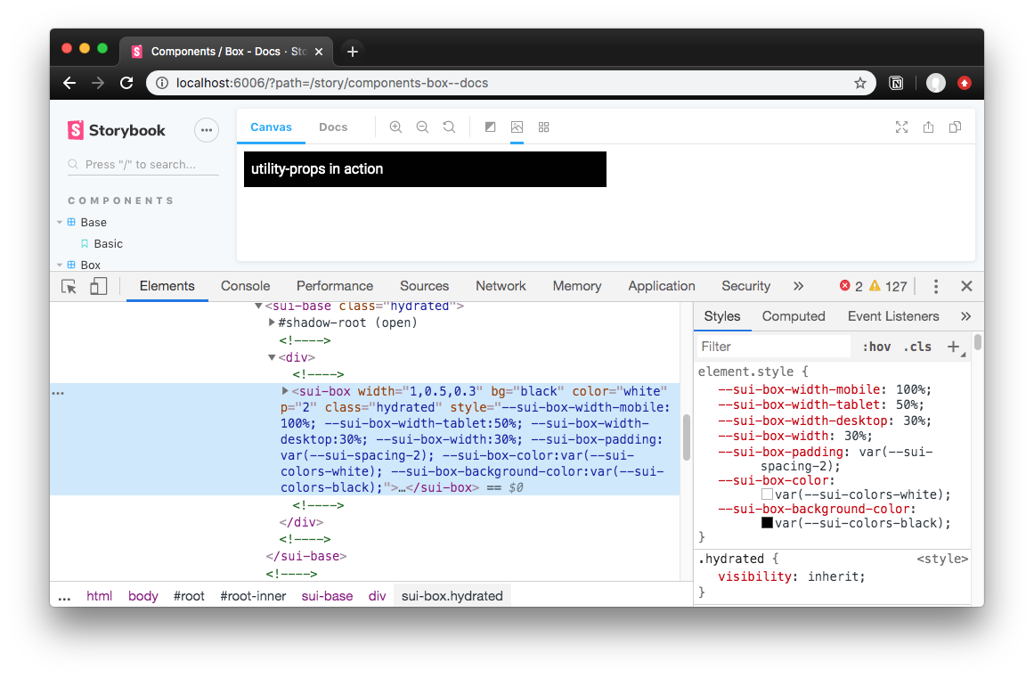
<x-box width=1 05 03 bg="black" color="white" p="2"></x-box>Helps enforce your design system or style guide's color and spacing guidelines by converting props to theme tokens if possible. Also supports responsive props that change styling based on viewport (see supported list below).
Getting Started
- Install the library as a dependency:
npm i utility-props- Use the setup function to give your web components utility props:
; // Somewhere inside your component:;// Parameters are:// Prop list (as array), component name, and a "ref" to the web component- Add CSS custom properties to your web component's CSS for each utility prop:
See the framework integration section for specific details on adding to your web component library.
Supported CSS Props
Here are the following CSS properties you can use a "utility props":
Responsive
- width
- max-width
- min-width
- height
- max-height
- min-height
- padding as
p - margin as
m - font-size
- text-align
Not Responsive
- font-family
- line-height
- font-weight
- letter-spacing
- color
- background-color
- border
- border-top as
bt - border-bottom as
bb - border-left as
bl - border-right as
br - border-width
- border-style
- border-color
- border-radius
- display
- position
- z-index
- top
- bottom
- left
- right
- align-items
- align-content
- justify-content
- flex-wrap
- flex-direction
Default CSS Custom Properties
How It Works
You call the setup function as part of the web component's lifecycle, ideally running each time a prop changes. The setup checks for each CSS prop you provide, parses the prop value into a CSS custom property, and attaches it to the web component's inline style block. The custom property is derived by the component name your provide, as well as an optional namespace parameter in the setup function. There's a bit more that happens behind the scenes to parse or convert your prop values, like handling colors or spacing, you can learn more about that below.
Inside your component's CSS, you setup your CSS to use each CSS custom property that this library creates and updates. For example, for the font-family prop, you need the following CSS: font-family: var(--sui-componentname-font-family);. So for every utility prop you use, you need a matching CSS property for it that uses the appropriate CSS custom property.
Converting Prop Values
All prop values go through a "conversion" process, based on the prop type. For example, the width prop uses the "sizing" conversion, versus the p (or padding) prop which uses "spacing" conversions.
The following are the type of props and how they're handled:
- Sizing: Converts any value less than 1 to a percent (e.g.
0.3becomes30%). Otherwise, the prop value is provided directly as the CSS custom property. - Color: Converts any value that is not hex, RGB, or HSL to a theme token (aka CSS custom property like
--sui-colors-red). Otherwise, the prop value is provided directly as the CSS custom property. - Spacing: Converts any number less than 8 to a spacing theme token (aka CSS custom property like
--sui-spacing-3). Otherwise, the prop value is provided directly as the CSS custom property. - Default: All prop values are provided directly as the CSS custom property.
Size props:
- width
- min-width
- max-width
- height
- min-height
- max-height
Color prop:
- color
- background-color
- border-color
Spacing prop:
- padding
- margin
- top
- bottom
- left
- right
- border-width
- border-top
- border-bottom
- border-left
- border-right
- line-height
- font-size
Responsive Props
For props that can be responsive, you can provide an array as a value to change styling based on breakpoints/viewports.
// Renders a box that's 100% on mobile, 50% on tablet, and 30% on desktop.<x-box width=1 05 03></x-box><x-box width='100%' '50%' '30%'></x-box>// If your app doesn't support array-based props, you can use comma-separated values<x-box width="1,0.5,0.3"></x-box><x-box width="100%,50%,30%"></x-box>To enable responsive props, you have to add CSS custom properties to your component for each breakpoint you define. By default the library uses mobile, tablet, and desktop viewports. You can define any name and any number of viewports you need. Here's an example of the required CSS for the default breakpoints:
your-component.css:
/* * Create media queries for each breakpoint (mobile, tablet, desktop by default)* You control your own breakpoint widths here.*/{} {} {}Theme Tokens
This library also defaults to using "theme tokens" if possible by way of CSS custom properties. For "color" based props for instance, if you use words, instead of hex codes, RGB, or HSL color values, the library will try to use a CSS custom property based on your word.
<x-box color="blue"></x-box>// Renders a box with text that references the CSS custom property for blue// Becomes: `--sui-componentname-color: var(--sui-colors-blue);`// Used in CSS: `color: var(--sui-componentname-color);`"Spacing" properties, on the other hand, will access the appropriate CSS custom property using the prop value if you provide a number from 1-10. For example, <x-box p="3"> would equate to --sui-componentname-padding: var(--sui-spacing-1). See the conversion section above for more details on how this works.
In order for the theme tokens to work, you must define them somewhere in your application. You can either put it in the :root of your global CSS or create a component (like a <theme-provider>) to pass the tokens (or CSS custom properties) down to nested components. Here's an example for the <theme-provider> component CSS:
Integrating with Frameworks
utility-props is framework agnostic and works with any web component framework that supports CSS, props, and lifecycle management (to re-render based on prop changes).
StencilJS
- Use the
setup()method in thecomponentWillRenderlifecycle. It accepts an array of CSS props, the component name (used for the CSS custom property), and thethisreference (to access props and styling):
componentWillRender - Add any CSS props from the setup to your component, as well as an
elprop that references the web component. Make sure they're camelCased and not snake-case:
- Add the following CSS to your web component's CSS file:
/** * Find and replace "box" with the component name you provided in the setup * If you use optional namespace in the setup function, find and replace "sui" with it*/ {} {} {}lit-element
Coming soon.
Local Development
Below is a list of commands you will probably find useful.
npm start or yarn start
Runs the project in development/watch mode. Your project will be rebuilt upon changes. TSDX has a special logger for you convenience. Error messages are pretty printed and formatted for compatibility VS Code's Problems tab.

Your library will be rebuilt if you make edits.
npm run build or yarn build
Bundles the package to the dist folder.
The package is optimized and bundled with Rollup into multiple formats (CommonJS, UMD, and ES Module).
npm test or yarn test
Runs the test watcher (Jest) in an interactive mode. By default, runs tests related to files changed since the last commit.
Release
CircleCI
This project is tested, built, and then released to NPM using CircleCI. You can find the configuration here: .circleci/config.yml.
Requires an environmental token in CircleCI for your NPM auth token. See their guide for more info.
References
- Bootstrapped with TSDX
- Styled System
- System UI
- Tachyons
- Semantic UI