uiswitch

1.1.1 • Public • Published

CSS3 UISwitch

npm npm

A pretty sweet and pure CSS3 iOS 7 UISwitch.
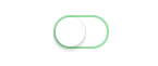
UISwitch Demo

See it in action!

Grab it

npm

npm install uiswitch

Bower

bower install uiswitch

Unpkg

Use it

CSS

The switch is very easy to customize. Using plain vanilla CSS it's just a matter of subclassing. Start styling your custom switch

/* Active Background Tint (when pressed and hold) */
.custom {
  background-color: #eadcbc;
}
 
/* Background Tint */
.custom::before {
  background-color: #f7f2e5;
}
 
/* Knob Tint */
.custom::after {
  background: #fff3a6;
}
 
/* Checked background tint */
.custom:checked {
  background-color: #ffca3f; /* fallback */
  background-image: linear-gradient(
    -180deg,
    #ffca3f 0%, /* top */
    #feca40 100% /* bottom */
  );
}

and your HTML would be something like this

  <input type="checkbox" class="uiswitch custom">

Sass

It's even easier with Sass. The class .uiswitch is provided out of the box but is also provided with a mixin and an extend (if you really want to customize it)

You can change the global style for all uiswitch classes with the following variables:

$uiswitch-thumb-tint: #ffffff !default;
$uiswitch-on-tint: #4CD964 !default;
 
$uiswitch-active-tint: #e5e5e5 !default;
$uiswitch-on-tint-start: $uiswitch-on-tint !default;
$uiswitch-on-tint-end: desaturate($uiswitch-on-tint-start, 1) !default;
$uiswitch-off-tint: #ffffff !default;
 
$uiswitch-size: 51px 31px !default;
$uiswitch-frame-size: 47px 27px !default;
$uiswitch-thumb-size: 27px !default;

If you'd like to create a custom class based on a switch:

.my-switch {
  @include uiswitch( 
    $on-tint: hotpink, 
    $thumb-tint: lime, 
    $off-tint: yellow, 
    $active-tint: gray, 
    $size: 24px 16px, 
    $frame-size: 20px 12px, 
    $thumb-size: 12px 
  );
}

And if you want to customize it even further you can extend the %uiswitch:

.my-switch {
  @extend %uiswitch;
 
  border-radius: 4px;
 
  // Background 
  &::before {
    border-radius: 2px;
  }
 
  // Thumb 
  &::after {
    border-radius: 1px;
  }
 
  // Checked background 
  &:checked {
    background: hotpink;
  }
 
  // Checked thumb 
  &:checked::after {
    background-color: #333;
  }
}

License

The MIT License

Package Sidebar

Install

npm i uiswitch

Weekly Downloads

3

Version

1.1.1

License

MIT

Unpacked Size

18.9 kB

Total Files

7

Last publish

Collaborators

  • fnky