
💾 Installation
npm install --save uigradients
or
yarn add uigradients
📚 Docs
Components
Utilities
Or, go to the interactive docs →
🏗 Usage Examples
Linear Gradient Component
// Import the component...import Gradient from 'uigradients';// Now, use it!// If no gradient preset is provided,// a random preset will be used.return<Gradient ="cherry"><h1>This will draw a div with a cherry gradient like the one looking at right now</h1></Gradient>;
cherryis only one of the many presets provided byuigradientsA complete list of the gradient presets can be previewed here. You can use your own preset library via
GradientProvider
Radial Gradient Component
import Gradient from 'uigradients';return// Add a "type" attribute on your component and// set it to "radial" for a radial gradient!// NOTE: If a "type" attribute is not on// your component, the gradient type will// default to linear<Gradient ="aubergine" ="radial"><h1>Wow a radial gradient!</h1></Gradient>;
Gradient Generator
import generator from 'uigradients';;/* The function above returns:background-color: ,#DA22FF,;background-image: -webkit-linear-gradient(left,,#DA22FF,,,#9733EE,);background-image: linear-gradient(to left,,#DA22FF,,,#9733EE,);*/
💅 Styled Components
Use the Generator in styled-components
import generator from 'uigradients';import styled from 'styled-components';const Pre = styledpre`border-radius: 4px;display: block;`;
And render the component

Or, you can override other properties on the Gradient component
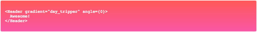
import Gradient from 'uigradients';import styled from 'styled-components';const Header = `min-height: 300px;text-align: center;width: 100%;`;
And render the component
Or, you can generate a radial gradient
;; const RadialComponent = styleddiv` `;And render the component

📜 License
This package is released under the MIT License
