node-twitter-card-image
A small library that creates Twitter card images using node-canvas.
It uses tinypng API to optimize the image if you provide an API key
Install
npm install twitter-card-image --save-dev
Quick Example
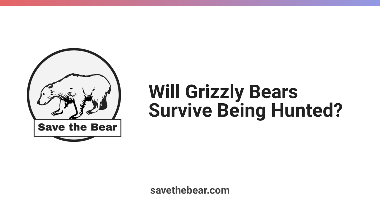
Creates a twitter card image, 1280x669, using a template image. Renders two texts using the Robot font. The top border is rendered with a gradient.
const makeCard = require('twitter-card-image');

makeCard({
    width: 1280,
    height: 669,
    tinypngApiKey: '',
    output: './card.png',
    templateImage: './twitter-card-template.png',
    fonts: [
        {
            file: 'Roboto-Bold.ttf',
            family: 'Roboto'
        }
    ],
    texts: [
        {
            text: 'Will Grizzly Bears Survive Being Hunted?',
            font: '64px "Roboto"',
            x: 500,
            y: 669 / 2,
            color: '#222',
            maxWidth: 700,
            lineHeight: 64
        },
        {
            text: 'savethebear.com',
            font: '26pt "Roboto"',
            x: 'center',
            y: 669 - 36,
            color: '#444',
        }
    ],
    backgroundColor: '#fff',
    borderTop: {
        gradient: [
            {
                color: '#e66465',
                stop: 0
            },
            {
                color: '#9198e5',
                stop: 50
            },
        ],
        width: 20
    }
});
Options
The following options are available:
width
The image width. Default 1280.
width: 1280height
The image height. Default 669.
height: 669tinypngApiKey
Your Tinypng API Key. You can get one for free here. Use this if you want to compress your images. Highly recommended.
output
The image name. Default test.jpeg It must include the extension: .png, .jpg or .jpeg.
output: './awesome.png'backgroundColor
The backround color to use. It will fill the entire image. All HTML color values are accepted.
backgroundColor: '#444'templateImage
The path to the image to use as a template. Default none. This should be the static part on all cards, like logo, patterns, etc. It will be drawn from the top left position of the image.
templateImage: './twitter-card-template.png'fonts
The fonts to use for the texts rendered on the card. Each font file must available locally on the machine.
For each font you specify the file and the family. The family you'll set later for texts.
Example:
fonts: [
    file: 'Roboto-Bold.ttf',
    family: 'Roboto'
]
texts
The texts to render on card. For each text entry the following parameters can be set:
- text: string, the actual text to render e.g. 'Hello,world!'
- font: string, the font size and family. e.g. '30pt "Open Sans"'
- x: horizontal start drawing position as number or spacial value 'center' (to put in on the horizontal middle on the image)
- y: vertical start drawing position as number or spacial value 'center' (to put in on the vertical middle on the image)
- maxWidth: the text maximum width, number. If the text si bigger it will be split and rendered on multiple lines.
- lineHeight: the text line height, number.
Example:
texts: [
    {
        text: 'Will Grizzly Bears Survive Being Hunted?',
        font: '64px "Roboto"',
        x: 500,
        y: 669 / 2,
        color: '#222',
        maxWidth: 700,
        lineHeight: 64
    },
    {
        text: 'savethebear.com',
        font: '26pt "Roboto"',
        x: 'center',
        y: 669 - 36,
        color: '#444',
    }
],
borderTop
The settings for the top border. You can provide either a color or a gradient and a width. It is rendered before all other borders.
borderTop: {
    color: '#ffc100',
    width: 20
}
Or using a gradient:
borderTop: {
    gradient: [
        {
            color: '#e66465',
            stop: 0
        },
        {
            color: '#9198e5',
            stop: 50
        },
    ],
    width: 20
}
borderRight
The settings for the right border. You can provide either a color or a gradient and a width. It is rendered after the top border but before the other borders, so it renders over the top border.
borderBottom
The settings for the bottom border. You can provide either a color or a gradient and a width. It is rendered after the top and right border but before the left border, so it renders over the right border.
borderLeft
The settings for the left border. You can provide either a color or a gradient and a width. It is rendered after all other borders, so it renders over the top and bottom borders.
roundedBorder
To render a rounded-corners border use this option with the following parameters:
- color or gradient.
- radius: the rounder-corner radius, number
- width: the border width, number.
roundedBorder: {
    color: 'red',
    gradient: [
        {
            color: '#e66465',
            stop: 0
        },
        {
            color: '#9198e5',
            stop: 50
        },
    ],
    radius: 20,
    width: 30
}
