tlx-editor
A single HTML component supporting multiple input types, select, textarea, radio groups, and star ratings.
Installation
npm install tlx-editor
Usage
Load the files you need from the node_modules/tlx/browser/tlx.js and ./browser/tlx-editor.js directories. Or, copy files around as you need to fit your file system structure.
Use the custom tag <tlx-input> in place of <input>, <select> and <textarea>. Fields will behave like they are in a form and use native validation styling even if you do not put them inside a form tag.
All the base values for the <input> attribute type supported by your browser will work. In addtion, you can use:
-
type="rating"for a star rating. It defaults to 5 stars, but you can add more by setting the attributemaxto a value. -
type="radiogroup"with the attributeoptions="[<some values>...]". Optionally provide avalueto have it pre-selected. -
type="select-one"with the attributeoptions="[<some values>...]"for a single value select. Optionally provide avalueto have it pre-selected. -
type="select-multiple", also with the attributeoptions. Optionally provide an array forvalueto have them pre-selected, e.g.value="[1,3]". -
type="textarea"where you you would normally use<textarea>.
Since not all browsers support custom elements, you must perform an initial transform on the page. Once all browsers support custom elements, tlx will be enhanced to take advantage of it. See the tlx documentation for more detail. For now, using onload will work:
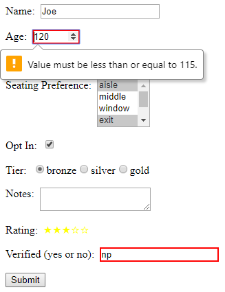
... your html here ...Below is an example screen showing several editors:
Below is the code from examples/index.html. The use of JavaScript template literals requring tlx processing is optional.
${honorific} ${name}, a ${rating} star customer, has opted ${(optIn ? "in" : "out")} and prefers the following seating: ${seatingPreferences.join(", ")} with ${tier} tier priority. Notes: ${notes} Rationale and Roadmap
-
We needed a simple way to put edit controls in a table in a uniform way to simulate a spreadsheet.
-
Over time we will enhance the control to provide cross browsers support for unsupported special types, e.g. date calendars are not supported in Firefox. we will also add additional types, e.g.
range, which will operate like a like a tow sides slider with an array as a value containing its selected min and max rather than absolute min and max.
Release History
2017-12-02 v0.1.1 Updated for compatibility with tlx v0.1.7
2017-11-07 v0.1.0 Initial public release