React-Thousanday
A list of reusable React UI components, will update weekly.
Project
Instagram-Like web app for pets by React
Instagram-Like mobile app for pets by React Native
Install
npm install thousanday-react --save
Components List
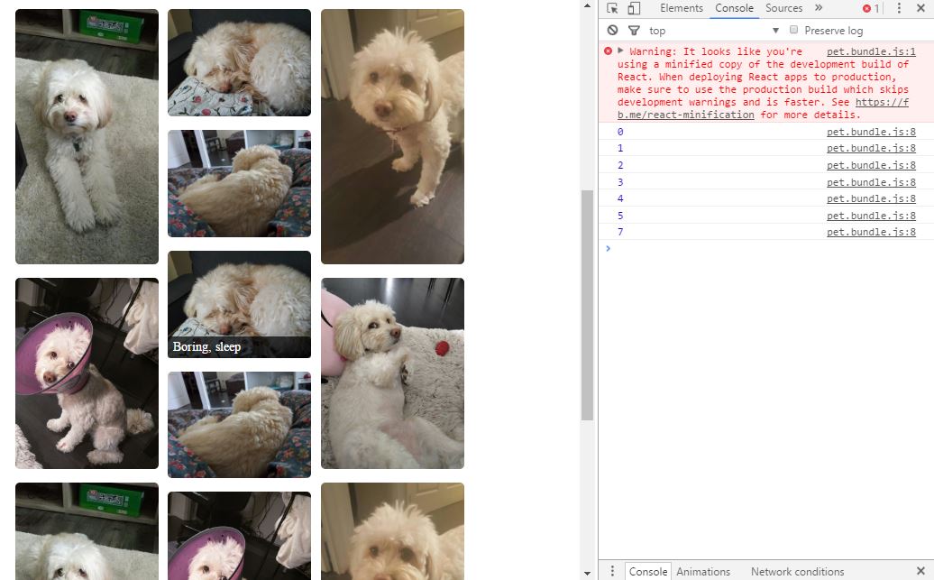
Waterfall: Responsive Pinterest-Stlye Image Gallery
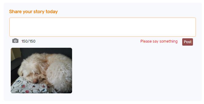
Postimg: Post Panel to send message with image
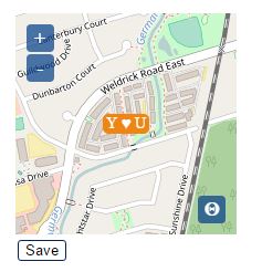
Getlocation: Display/Get users' geolocation
Delmember: Disapear images with shake effect
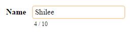
Inputbox: Text input with characters couting and restriction
Inputarea: Textarea with characters couting and restriction
Updateprofile: Update profile image
Confirmdel: Require user to confirm delete action by input
Commentlist: Show and load a list of comments
Pickgender: Let user choose a gender
Like: Show/Collect like from users
Facebooklogin: Button for Facebook Login
Googlelogin: Button for Google Login
Progress: Show/Update the progress bar
Selectbox: Select members from several options
Urltoprofile: Turn image from url to canvas for upload
Rate: Show/Collect rate form users by stars
Random: Show random content from a list of options
Droplist: Use a drop down list to make decision
Waterfall
Responsive Pinterest-Stlye Image Gallery
Example
import {Waterfall} from 'thousanday-react';
//Define an array
let images = [
    ["url/0.jpg", "message0", "http://href0"],
    ["url/1.jpg", "message1", "http://href1"],
    ["url/2.jpg", "message2", "http://href2"],
    ["url/3.jpg", "message3", "http://href3"],
    ["url/4.jpg", "message4", "http://href4"],
    ["url/5.jpg", "message5", "http://href5"],
    ...
];

//Init the component
<Waterfall column="5" image={images} />
Features:
- Automatically layout all the images based on the “column” param
- Show related message above each image when mouse hover.
Params:
| Params | Usage | Default | Example |
| image | Mandatory. Provie an array contains urls, messages, or hrefs of all the images you want to show. | [ ["url/0.jpg", "message0", "url0"], ["url/1.jpg", "message1", "url1"], ["url/2.jpg", "message2", "url2"], ... ] | |
| column | Mandatory. Define how many columns you want. | "3" | |
| height | Optional. Dedine the height of each image | "180px" | "200px" |
| fontFamily | Optional. Define the fontFamily. | "Times New Roman" | "Arial" |
Postimg
Post Panel to send message with image
Example
import {Postimg} from 'thousanday-react';
//Init the component
<Postimg content="" max="150" title="New post" submitImg={this.submitImg.bind(this)} reset={this.state.reset} />
//Define this.state.reset as 0
this.state = {
    //use to trigger reset Postimg
    reset: 0,
};
//Get the new post content and img by a function
submitImg(message, img) {
    console.log(message);
    console.log(img);
    //Then send by ajax to backend
    //If success, update this.state.reset to clear message and image of this component
    let reset = this.state.reset + 1;
    this.setState({reset: reset});
}
Features:
- Automatically calc and restrict user's input according to "max" param
- Show error message when there's no content or no image or file type is not image.
- Preview selected image
Notice:
This component used a GLYPHICONS png under CC BY 3.0 License
Reference
Params:
| Params | Usage | Default | Example |
| content | Optional. Init text box with content. | "" | "New update" |
| max | Mandatory. Define max number of characters users could input | "100" | |
| Title | Optional. Show a title message above text box | "" | "Create a new post:" |
| submitImg | Mandatory. Create a function to get the content and image. | submitImg={this.submitImg.bind(this)} | |
| reset | Mandatory. Init a reset code, update this code to indicate post success and reset component. | {this.state.reset} | |
| fontFamily | Optional. Define the fontFamily. | "Times New Roman" | "Arial" |
| width | Optional. Define the width of this component. | "100%" | "80%" |
| border | Optional. Define border style of the text box. | "2px solid #f7d7b4" | "1px solid black" |
| fontSize | Optional. Define fontsize of the text box. | "14px" | "16px" |
Getlocation
Display/Get users' geolocation.
Idea
Example
import {Getlocation} from 'thousanday-react';
//Init the component for display location only by define display="true"
<Getlocation center={[0,0]} zoom="1" display="true" />
//Init the component to get users' location
<Getlocation center={[-79, 43]} saveLocation={this.saveLocation.bind(this)} />
//Get new coordinate stand for user's location by a function
saveLocation(coordinate) {
    console.log(coordinate);
    //update db
}
Features:
- zoom in, zoom out, get location by GPS
- Preset zoom level for display
- Return coordinate ([lon, lat]) stand for user's location
Notice:
The map service is depend on openlayers under BSD License
Chrome and android require https for GPS locate feature
Params:
| Params | Usage | Default | Example |
| center | Optional. Set the center location at the starting point. | [-147, -31] (somewhere in Pacific) | [100, 30] (must be array) |
| zoom | Optional. Set the zoom level at the starting point | 15 (district level) | "1" (global level) |
| setZoom | Optional. Set the zoom level after users click save location | 15 | "10" |
| maxZoom | Optional. Set the maximum zoom level when user click "+" button | 15 | "17" |
| display | Optional. Set it as "true" to show map for display only. | "false" | "true" |
| width | Optional. Width of the map | 200 | 400 |
| height | Optional. Height of the map | 200 | 400 |
| id | Optional. If you want to show more than one map in same page, must define each one with different id | "thousandaymaplocation" | "something" |
| saveLocation | Optional. Mandatory to return the center of the map | {this.saveLocation.bind(this)} | |
| indicate | Optional. The content show on the save location button. | "Save" | "Update location" |
| fontFamily | Optional. Define the fontFamily. | "Times New Roman" | "Arial" |
Delmember
Disapear images with shake effect

Example
import {Delmember} from 'thousanday-react';
//Init components with clickDel function and index
<Delmember profile={"0.jpg"} index={0} clickDel={this.clickDel.bind(this)} />
<Delmember profile={"1.jpg"} index={1} clickDel={this.clickDel.bind(this)} />
//Create clickDel function to get index of the image has been clicked by users
clickDel(index) {
    console.log(index);
    //update db according to index
}
Features:
- Show a delete button on top-right corner of the image
- Image shakes after users click it then diaspear
- Return index to indicate which image has been clicked
Params:
| Params | Usage | Default | Example |
| profile | Mandatory. Define img src. | "0.jpg" | |
| index | Mandatory. An index to indicate current image | 0 | |
| clickDel | Mandatory. Use a function to receive the index of the image has been clicked | {this.clickDel.bind(this)} | |
| width | Optinal. Define the width of the image | 100 (will turn into 100 px) | 300 (will turn into 300 px) |
| height | Optinal. Define the height of the image | 100 (will turn into 100 px) | 300 (will turn into 300 px) |
| marginLR | Optional. Define the margin-left and margin-right | 10 (will turn into 10 px) | 30 (will turn into 30 px) |
| fontFamily | Optional. Define the font family of the button | "Times New Roman" | "Arial" |
Inputbox
Text input with characters couting and restriction
Simple Example
import {Inputbox} from 'thousanday-react';
//Init component with ref name
<Inputbox ref="newInput" content="" max="150" />
//Get the content from any function
submitInput(){
    console.log(this.refs.newInput.state.content);//this is users new input
}
<button onClick={this.submitInput.bind(this)} />
Features:
- Counting input characters
- Restrict input after reaching maximun characters
Params:
| Params | Usage | Default | Example |
| content | Mandatory. Define the input value at the starting point. Inital Empty by "" | "Initial content" | |
| max | Mandatory. Define the maximun number of characters users could input | "20" | |
| hint | Optional. Define the placehold attribute for input tag | "Your name here" | |
| font | Optional. Define the font size of the input | "15px" | "17px" |
| width | Optional. Define the width of this component | "100%" | "150px" |
| border | Optional. Define the border style | "2px solid #f7d7b4" | "1px dashed black" |
| fontFamily | Optional. Define the fontFamily. | "Times New Roman" | "Arial" |
Inputarea
Textarea with characters couting and restriction
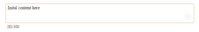
Simple Example
import {Inputarea} from 'thousanday-react';
//Init this component with ref name
<Inputarea ref="newInput" content="" max="300" />
//Get the input content from any function
submitInput(){
    console.log(this.refs.newInput.state.content);
}
<button onClick={this.submitInput.bind(this)} />
Features:
- Counting inputarea characters
- Restrict input after reaching maximun characters
Params:
| Params | Usage | Default | Example |
| content | Mandatory. Textarea value at the starting point. Inital Empty one by "" | "Initial content" | |
| max | Mandatory. Define the maximun number of characters users could input | "50" | |
| fontSize | Optional. Define the font size of the input | "14px" | "15px" |
| fontFamily | Optional. Define the font family of the input | "Times New Roman" | "Arial" |
| width | Optional. Define the width of this component | "100%" | "150px" |
| height | Optional. Define the height of this component | "50px" | "30px" |
| border | Optional. Define the border style | "2px solid #f7d7b4" | "1px dashed black" |
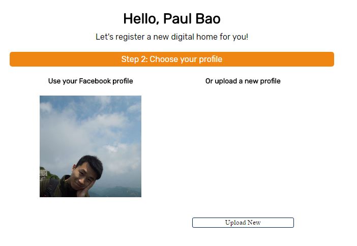
Updateprofile
Update profile image.
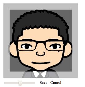
Example
import {Updateprofile} from 'thousanday-react';
//Init component with saveProfile function
<Updateprofile src="url/profile.png" width="200" saveProfile={this.saveProfile.bind(this)} />
saveProfile(finalUrl) {
    let formData = new FormData();
    formData.append('file', finalUrl, "profile_name.png");
    reqwest({
        url: "/upateProfile",
        method: "POST",
        data: formData,
        contentType: false,
        processData: false
    });
}
Features:
- Show new profile image
- Return new profile image information which could send and save to backend
Notice:
The image crop function is realized by react-avatar-editor under MIT
Params:
| Params | Usage | Default | Example |
| src | Mandatory. The image src at the starting point. | "/img/0/profile.png" | |
| width | Mandatory. Define the width and height of the profile image | "200" (Return into 200px) | |
| saveProfile | Mandatory. Use a function to send the new image | {this.saveProfile.bind(this)} | |
| indicate | Optional. Content show on the upload button. | "Upload new" | "Upload profile" |
| fontFamily | Optional. Define the fontFamily. | "Times New Roman" | "Arial" |
Confirmdel
Require user to confirm delete action by input
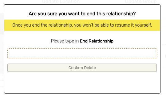
Example
import {Confirmdel} from 'thousanday-react';
//init component with a confirm message and confirmDel function
<Confirmdel message="End Relationship" confirmDel={this.confirmDel.bind(this)} />
//Whenever user inputed the same confirm message and click confirm delete
conformDel() {
   //any follow up actions
}
Features:
- Require users to input the preset confirm message
- Confirm button only available after the input is the same
- Get call back when users click confirm button
Params:
| Params | Usage | Default | Example |
| message | Mandatory. The confirm message the users need to input. | "Confirm delete it" | |
| confirmDel | Mandatory. Use a function to know when users click confirm delete button | {this.confirmDel.bind(this)} | |
| fontFamily | Optional. Font family of this component | "Times new roman" | "Arial" |
Commentlist
Show and load a list of comments
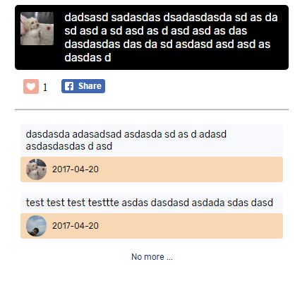
Example
import {Commentlist} from 'thousanday-react';
//prepare nested array contains comment information
let comments = [
    ["content 1", "avatar src 1", "avatar href 1", "comment time 1"],
    ["content 2", "avatar src 2", "avatar href 2", "comment time 2"],
    ["content 3", "avatar src 3", "avatar href 3", "comment time 3"],
    ......
];
this.state = {comments: comments}
//Leave load more locker as on
this.state = {locker: "off"}
//init component width comments
<Commentlist data={this.state.comments} locker={this.state.locker} loadMore={this.loadComment.bind(this)} />
//use a function to load more comment
loadComment() {
    //get new comments from ajax
    let newComments = this.state.comments.concat(ajaxResult);
    this.setState({comments: newComments});
    //To disable load more function
    this.setState({locker: "on"});
}
Features:
- Show a list of comments based on init data
- Catch load more events
Params:
| Params | Usage | Default | Example |
| data | Mandatory. Init a list of comments | [["content 1", "avatar src 1", "avatar href 1", "comment time 1"],...] | |
| locker | Mandatory. Determine user could load more comment or not | "off" | "on" |
| fontFamily | Optional. Font family of this component | "Times new roman" | "Arial" |
| loadMore | Optional. Use a function to create load more effect | loadMore={this.loadComment.bind(this)} |
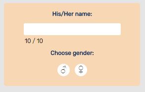
pickgender
Let user pick a gender
Example
import {Pickgender} from 'thousanday-react';
//init component with chooseGender function
 <Pickgender chooseGender={this.chooseGender.bind(this)} />
//Get user's choice by chooseGender function
chooseGender(choice) {
  console.log(choice);
  //0 for male, 1 for female, 2 for no choice
}
Features:
- Display male and female symbol
- Return user's choice after click
Params:
| Params | Usage | Default | Example |
| chooseGender | Mandatory. Use a function to catch user's choice | {this.chooseGender.bind(this)} |
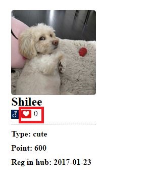
Like
Show/Collect like from users
Example
import {Like} from 'thousanday-react';
//init component with newTotal function
<Like agree={this.state.like} newTotal={this.updateLike.bind(this)}/>
//Get +1 or -1 based on users action
updateLike(change) {
  let like = this.state.like;
  this.setState({like: like + change});
}
Features:
- Show total like numbers
- Change total like numbers based on users action
Params:
| Params | Usage | Default | Example |
| agree | Mandatory. Initial total like numbers. | "0" | |
| liked | Optional. Indicate current user liked it before or not. | "false" | "true" |
| interact | Optional. Indicate accept click action or not. | "true" | "false" |
| newTotal | Mandatory. Use a function to update total like numbers after users clicked the like button | {this.updateLike.bind(this)} |
Facebooklogin
Button for Facebook Login

Example
import {Facebooklogin} from 'thousanday-react';
//Get your google client id
let id = "Your facebook client id";
//init component
<Facebooklogin clientId={id} fLogin={this.fLogin.bind(this)}/>
//Get users info by fLogin Function
fLogin(user, token) {
  console.log(user);
  console.log(token);
}
Features:
- Show Facebook Login button
- Get users information, and token after login successfully
Params:
| Params | Usage | Default | Example |
| clientId | Mandatory. Define your own client Id. | "string from Facebook" | |
| fLogin | Mandatory. Use a function to get user's info from Facebook | {this.fLogin.bind(this)} | |
| width | Optional. Define the with of the button image | 100% | "200px" |
Googlelogin
Button for Google Login

Example
import {Googlelogin} from 'thousanday-react';
//Get your google client id
let id = "Your google client id";
//init component
<Googlelogin clientId={id} gLogin={this.gLogin.bind(this)}/>
//Get users info by gLogin Function
gLogin(user) {
  console.log(user);
  //user.id, user.name, user.firstname, user.lastname, user.imageUrl, user.email, user.token
}
Features:
- Show Google Login button
- Get users information after login successfully
Params:
| Params | Usage | Default | Example |
| clientId | Mandatory. Define your own client Id. | "string from Google" | |
| gLogin | Mandatory. Use a function to get user's info from Google | {this.googleLogin.bind(this)} | |
| width | Optional. Define the with of the button image | 100% | "200px" |
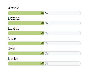
Progress
Show/Update the progress bar
Example
import {Progress} from 'thousanday-react';
//Init progress bar show progress by percentage
<Progress progress={this.state.progress} max="100" />
//Init progress bar set percentage="false" show progress by value
<Progress progress={this.state.progress} max="100" percentage="false" />
Features:
- Show progress by percentage or value
Params:
| Params | Usage | Default | Example |
| progress | Mandatory. Provie a number to stand for the default progress. | "20" | |
| max | Mandatory. Provide a number to stand for the maximum progress. | "100" | |
| percentage | Optional. Show the progress as percentage or value. | true | "false" |
| height | Optional. Define the height of this component. | "18px" | "false" |
| width | Optional. Define the width of the component. | "100%" | "200px" |
| fontFamily | Optional. Define the fontFamily. | "Times New Roman" | "Arial" |
| fontSize | Optional. Define the fontSize. | "9px" | "7px" |
| fontColor | Optional. Define the color of the font. | "black" | "blue" |
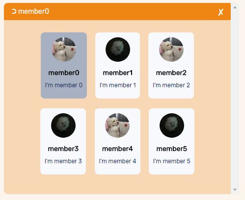
Selectbox
Select members from several options
Example
import {Selectbox} from 'thousanday-react';
//Prepare an array of members you want to display as options
let members = [
    ["member name 1", "image_src_1.jpg", "message1"],
    ["member name 2", "image_src_2.jpg", "message2"],
    ["member name 3", "image_src_3.jpg", "message3"],
    ...
]
//init component, which allow users choose 2 members
<Selectbox options={members} max="2" closeBox={this.closeTeam.bind(this)}  />
//init component with preset choice (members with index 0, 1 in the members array)
<Selectbox options={members} max="2" decisions={[0,1]} closeBox={this.closeBox.bind(this)}  />

//Catch user's closebox action
closeBox(newDecision, changed) {
    //newDecision is the array which contains users choice
    if (newDecision.length > 0) {
        firstChoice = members[newDecision[0]][3];
    }
    if (newDecision.length > 1) {
        secondChoice = members[newDecision[1]][3];
    }
    //changed stand for if users changed their choice
    if (changed) {
        //update db, close box
    } else {
        //do nothing, close box
    }
}
Features:
- Show list of options with name, profile, message from an array
- Return index of members in the option array, after users confirm choice
- Know if users changed their default choice
Params:
| Params | Usage | Default | Example |
| options | Mandatory. A nested array contains name, profile src, message. | [["name1","src1","message1"],["name2","src2","message2"]...] | |
| max | Optional. Maxinum choices from the list. | 1 | "2" |
| decisions | Optional. An array contain index of default choices. | {[0,1]} | |
| closeBox | Mandatory. Use a function to catch users confirm choice action | {this.closeBox.bind(this)} | |
| height | Optional. Define the height of this component. | "380px" | "400px" |
| width | Optional. Define the width of the component. | "100%" | "200px" |
| fontFamily | Optional. Define the fontFamily. | "Times New Roman" | "Arial" |
| scroll | Optional. Show scroll bar on the right or not | "on" | "off" |
Urltoprofile
Turn image url into canvas for upload
Example
import {Urltoprofile} from 'thousanday-react';
//Get user image url from social website
let url = "http://..........";
//Display user's image
<Urltoprofile ref="image" url={url} />
//use a function to send image to backend
saveProfile() {
    let file = this.refs.image.state.data;
    console.log(file);
}
Features:
- Display user image from social website
- Turn image from url into data could be send and save to backend
Params:
| Params | Usage | Default | Example |
| url | Mandatory. Provide image url from a web link. | "http://....." | |
| width | Optional. Adjust width of the canvas. | 200 | "100" |
| height | Optional. Adjust height of the canvas. | 200 | "100" |
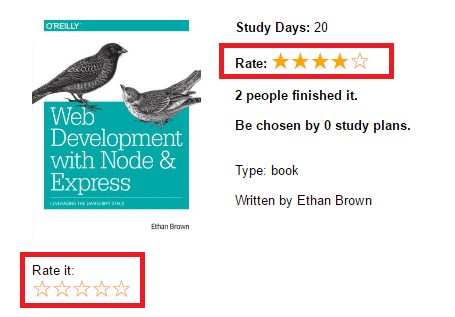
Rate
Show/Collect rate form users by stars
Example
import {Rate} from 'thousanday-react';
//Init component by define interact="true" with rateChange function
<Rate rate={this.state.currentRate} max="5" interact="true" rateChange={this.rateChange.bind(this)} />
//Update to new rate by rateChange function
rateChange(rateNum){
    this.setState({currentRate:rateNum});
}
//Init a display only rate
<Rate rate = "3" max = "5" />
Features:
- Show rate by stars
- Update rate after user add/update a new rate
Params:
| Params | Usage | Default | Example |
| rate | Mandatory. Define the default rates. 0 for unrated. | "4" | |
| max | Mandatory. Define the maximum number of stars | "5" | "6" |
| interact | Optinal. Define as "true" if users are allowed to change the rate | false | "true" |
| font | Optional. Adjust size of this component | "18px" | "14px" |
| color | Optional. Define color of this component | "orange" | "black" |
| rateChange | Optinal. Use a function to receive new rate from users | {this.rateChange.bind(this)} |
Random
Show random content from a list of options

Example
import {Random} from 'thousanday-react';
//Define a list of content in array
let randomContent = ["Slogan 1", "Slogan 2", "Slogan 3"];
//Init the component with the array
<Random random={randomContent} font="h3" />
Features:
- Randomly show content based on list of options
- Insert content into a desired html tag
Params:
| Params | Usage | Default | Example |
| content | Mandatory. Provide list of contents to show randomly. | ["123", "234", "345"] | |
| font | Mandatory. Provide a tag name to hold the output. | "h3" | |
| style | Optional. Define a style name could be used to styling this component in CSS. | "randomStyle" |
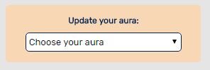
Droplist
Use drop-down list to make decision
Example
import {Droplist} from 'thousanday-react';
//Define a list of options in array
let options = ["Choice 1", "Choice 2", "Choice 3"];
//Init the component with the array
<Droplist options={options} title="Choose your option" showTitle="true" changeValue={this.getDecision.bind(this)}
//get users' decision by function
getDecision(value) {
    console.log(value)
}
Features:
- Show a list of options in drop-down list
- Return choice chosen by users
Params:
| Params | Usage | Default | Example |
| options | Mandatory. Provide list of choice. | ["option1", "option2", "option3"] | |
| showTitle | Optional. Display a title in drop-down list or not. | "false" | "true" |
| title | Optional. Define the content to show for the title. | "Please choose" | "Choose one option here" |
| default | Optional. Make one value chosen by default. | "option1" | |
| changeValue | Optinal. Use a function to receive new choice from users | {this.getValue.bind(this)} | |
| width | Optinal. Define the width of this component | "100%" | "300px" |
| fontFamily | Optinal. Define the font family of this component | "Arial" | "Times New Roman" |
License
MIT