

About Re-F|ex
Re-F|ex is a React flex-based layout component library which I created because none of the components I found out there could satisfy my requirements.
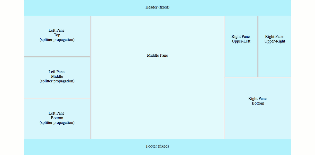
It intends to address in a simple way the needs of advanced React Web applications that require resizable layouts.
Here is a basic demo:
/////////////////////////////////////////////////////////// Basic vertical re-flex layout with splitter// Adding a splitter between two ReflexElements// will allow the user to resize them///////////////////////////////////////////////////////////Component { return <ReflexContainer orientation="vertical"> <ReflexElement className="left-pane"> <div className="pane-content"> Left </div> </ReflexElement> <ReflexSplitter/> <ReflexElement className="right-pane"> <div className="pane-content"> Right </div> </ReflexElement> </ReflexContainer> } ReactDOMInstallation
npm install react-reflexES6, CommonJS, and UMD builds are available with each distribution.
// You will need to import the styles separately// You probably want to do this just once during the bootstrapping phase of your application. // then you can import the componentsYou can also use the UMD build
React Support
React >= 0.13.x
Browser Support
Re-F|ex is responsive, mobile friendly and has been tested on the following browsers:
- Chrome
- Firefox
- Safari
- Opera
- Edge
Documentation & Samples
Re-F|ex is the most powerful React layout component out there ... Don't just trust me, try it!
Click here for code samples and live demos ...
Development
- Build the lib:
npm run build|npm run build-dev(dev mode non-minified with source-map) - Build the demo:
npm run build-demo|npm run build-demo-dev(dev mode non-minified with source-map + watch)
About the Author
Web Applications using Re-F|ex


(Feel free to add your own by submitting a pull request...)