TextShadowComponent
Use css text-shadow for react native
| Example Android | Example Ios |
|---|---|
 examples/App.js examples/App.js |
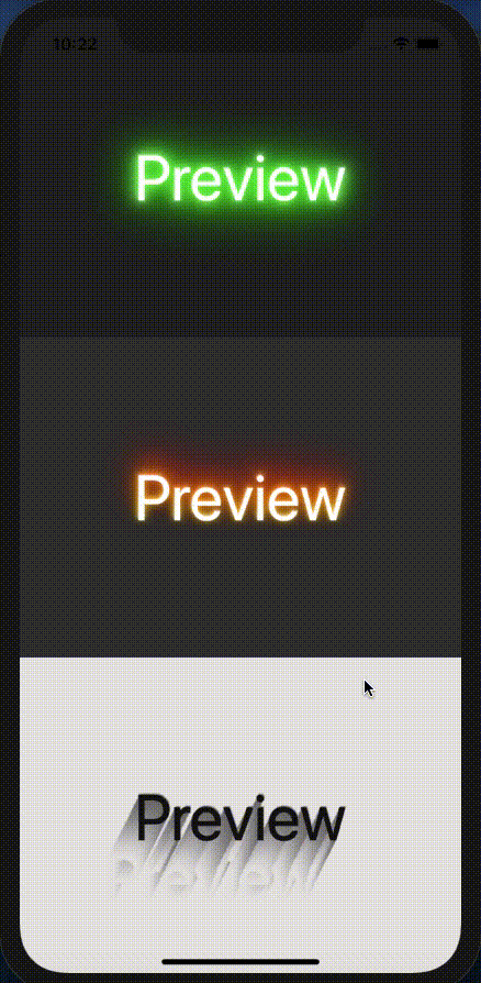 examples/App.js examples/App.js |
Table of contents
Installation
If using yarn:
yarn add text-shadow-component
If using npm:
npm i text-shadow-component
Usage
import { TextShadow } from 'text-shadow-component';
Basic Example
import TextShadow from 'text-shadow-component'; <View = > <TextShadow = = = /> </View>Documentation
TextShadow Component
| Name | Description | Default | Type |
|---|---|---|---|
| title | String title of text | Text Shadow | String |
| textShadow | String css text shadow | None | String |
| titleStyle | Style of text | Object Empty | Object Text Style |
Note
property textShadow still not support unit rem, em, percent. Only support px or none unit.
Inspired by
Contributing
Pull requests are always welcome! Feel free to open a new GitHub issue for any changes that can be made.
Working on your first Pull Request? You can learn how from this free series How to Contribute to an Open Source Project on GitHub
Author
Pham Minh Hai Au