Material Design 3's color system provides a set of guidelines to style buttons and other interactive surfaces.
They state that for each color that's to be used as a container color of an element, there's a corresponding on-color: the default color of content within that element.
There's also rules that define the interaction states of an element based on its container color and on-color.
This plugin will generate surface- and interactive-surface- classes for eacy pair of container color and on-color in the Tailwind config.
It will not build color themes for you (you can do that with the official theme builder) or my other TailwindCSS plugin: tailwind-material-colors.
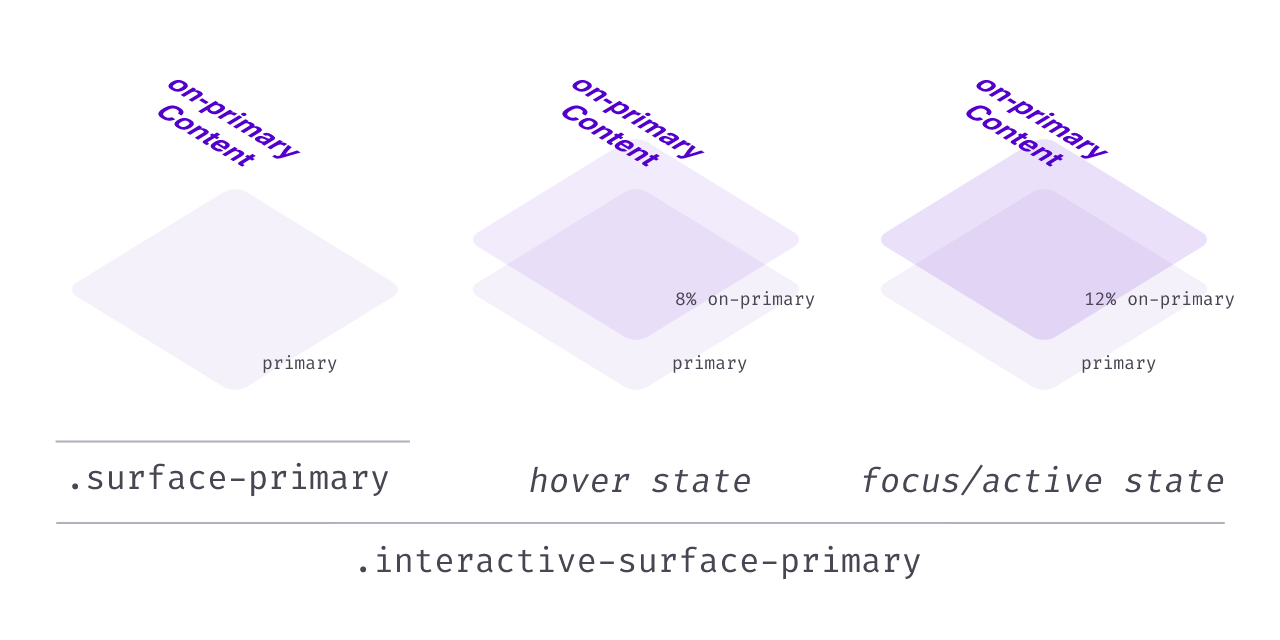
Let's say we have the colors primary and on-primary defined in our Tailwind config file.
The plugin will generate:
-
surface-primaryas a shorthand forbg-primary text-on-primary. -
interactive-surface-primary, which sets all of these:bg-primary text-on-primary- On hover, the background color will be a mix of 8%
on-primaryoverprimary. - On press, the background color will be a mix of 12%
on-primaryoverprimary. - On focus visible, the background color will be a mix of 12%
on-primaryoverprimary. - When disabled, the background color will be black at 12% opacity and the text color will be black at 38% opacity.
-
transition-colorsfor smooth color changes.
-
dragged-surface-primary, meant to be used instead ofinteractive-surface-primarywhen the element is being dragged (you'll need to toggle the classes with JavaScript if you need drag styles).
Here's a CodeSandbox demo of the plugin in action.
With default settings, make sure to have
blackdefined in your Tailwind color palette (it's used for disabled styles).
npm install --save-dev tailwind-material-surfaces
const tailwindMaterialSurfaces = require("tailwind-material-surfaces");

module.exports = {
  theme: {
    colors: {
      // colors with an 'on' counterpart will generate surfaces
      primary: "#abcd42",
      // ...
      on: {
        primary: "#123123",
        // ...
      },
    },
  },
  plugins: [
    // ...
    ...tailwindMaterialSurfaces() // internally, it's an array of two plugins, remember to destructure it
  ]
};If you wish to customize the default values, you may do so by passing an object as the second argument to the plugin, with any of these keys and your desired values. The values shown are the default ones.
  plugins: [
    ...tailwindMaterialSurfaces({
      hoverAmount: '8',
      pressAmount: '12',
      focusAmount: '12',
      dragAmount: '16',
      surfacePrefix: "surface", // for example, change to 'sf' if you prefer shorter names
      interactiveSurfacePrefix: "interactive-surface",
      draggedSurfacePrefix: "dragged-surface",
      disabledStyles: {
        textOpacity: 0.38,
        backgroundOpacity: 0.12,
        colorName: "black", // a color name in your Tailwind palette
        // pass false instead of this object if you don't want disabled styles
      },
      transition: {
        duration: 150, // transition duration in milliseconds
        // pass false instead of this object if you don't want any transition
      },
    }),
  ]
You may use bg as the surfacePrefix if you wish all bg-X classes to also set color: on-X. You can then overwrite the text color with text- utilities.
The text color won't be set if you use
bg-X/<alpha-value>. You can usebg-X bg-opacity-<alpha-value>instead.
This plugin uses tailwindcss-color-mix under the hood with default settings, so you may find that your editor autocomplete suggests its utilities. Of course, you may use them in your code if you wish.