A front-end improvement to Bootstrap forms with a Material design.
Supports Bootstrap versions 3, 4 and 5.
Documentation »
Report bug
·
Request feature


Table of contents
Quick start
-
Use a cdn:
- JavaScript (pick a provider):
- CSS (pick a provider):
-
Use npm:
npm install swapform
-
Download a zip:
What's included
swapform/
└── dist/
    ├── css/
    │   ├── swapform.css
    │   ├── swapform.css.map
    │   ├── swapform.min.css
    │   └── swapform.min.css.map
    └── js/
        ├── swapform.js
        ├── swapform.js.map
        ├── swapform.min.js
        └── swapform.min.js.map
Documentation
Quite simply, wrap an input or textarea in a <div> element with an sf-form class. Then add the sf-label class to the <label> element. Swapform will automatically perform everything else.
Input examples
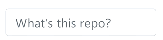
Basic
<div class="sf-form">
    <label class="sf-label">Enter username</label>
    <input type="text" class="form-control">
</div>

Swapping label when focused
<div class="sf-form">
    <label class="sf-label" data-description="Who are you?">Enter username</label>
    <input type="text" class="form-control">
</div>

Swapping multiple labels when focused and when input value is filled
<div class="sf-form">
    <label class="sf-label" data-description="Who are you?" data-filled="That's what she said">
        Enter username
    </label>
    <input type="text" class="form-control">
</div>

Textarea examples
The <textarea> element supports the same swapping methods outlined above, and also supports automatic height expansion, fixed heights and multiple sizes. Below is a table listing the available classes for a <textarea> depending on the features and size desired.

Classes for fixed heights and auto-expanding heights
| Class | Suffix | Sizes | Description |
|---|---|---|---|
sf-textarea- |
sm, md, lg | 160px, 320px, 640px | Automatically expands to a maximum height based on content |
sf-textarea-fixed- |
sm, md, lg | 160px, 320px, 640px | Has a fixed height |
Basic, medium, fixed height
Class: sf-textarea-fixed-md
<div class="sf-form">
    <label class="sf-label">Tell me a story</label>
    <textarea class="form-control sf-textarea-fixed-md"></textarea>
</div>
Basic, large, expanding height
Class: sf-textarea-lg
<div class="sf-form">
    <label class="sf-label">Tell me a story</label>
    <textarea class="form-control sf-textarea-lg"></textarea>
</div>
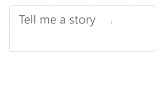
Basic, large, expanding height, with swapping texts
Class: sf-textarea-lg
Focused: Surprise me!
Filled: Cool story bro
<div class="sf-form">
    <label class="sf-label" data-description="Surprise me!" data-filled="Cool story bro">Tell me a story</label>
    <textarea class="form-control sf-textarea-lg"></textarea>
</div>
Supported classes
Basic
| Class | Description |
|---|---|
sf-form |
Used to wrap around a <label> with an accompanying <input> or <textarea>
|
Labels
| Class | Description |
|---|---|
sf-label-sm |
Should be used when using form-control-sm in your input/textarea elements |
sf-label |
Should be used when using regular form-control in your input/textarea elements |
sf-label-lg |
Should be used when using form-control-lg in your input/textarea elements |
Textarea
| Class | Description |
|---|---|
sf-textarea-sm |
Auto expanding height up to 160px |
sf-textarea-md |
Auto expanding height up to 320px |
sf-textarea-lg |
Auto expanding height up to 640px |
sf-textarea |
Auto expanding height infinitely |
sf-textarea-fixed-sm |
Fixed height, 160px |
sf-textarea-fixed-md |
Fixed height, 320px |
sf-textarea-fixed-lg |
Fixed height, 640px |
Supported data attributes
These are used on <input> or <textarea> elements. The color and file input types are not supported at this time.
| Option | Description |
|---|---|
data-description |
The value is swapped in when a form input or textarea is focused |
data-filled |
The value is swapped in when a form input or textarea has a value and is no longer focused |
Screenshots
Basic

Using HTML

Using emojis

Auto expanding textarea
Builds
If you are using the npm build, you can rebuild the compiled assets after making any desired changes by running any of the following commands:
| Option | Description |
|---|---|
css-compile |
Generates a non-minified version of the css and stores it in ./dist/css/swapform.css
|
css-minify |
Generates a minified version of the css and stores it in ./dist/css/swapform.min.css
|
js-compile-dev |
Generates a non-minified version of the javascript and stores it in ./js/dist/swapform.js
|
js-minify-dev |
Generates a minified version of the javascript and stores it in ./js/dist/swapform.min.js
|
js-compile-prod |
Generates a non-minified version of the javascript and stores it in ./dist/js/swapform.js
|
js-minify-prod |
Generates a minified version of the javascript and stores it in ./dist/js/swapform.min.js
|
All the above commands also generate source maps
Todo
- Add a new method to detect errors on form validation and allow handling
Creator
Robert Miller