


svelte-inputs
Basic Input Components for No Muss, No Fuss Plug and Play with Svelte
Features!
- Event Callbacks
- Data binding
- Input Masking
Contents:
Background
svelte-inputs was made on the idea that there should be simple, straightforward inputs, at a modular level for Svelte. No more fussing about!
svelte-inputs requires Svelte >= 3.0.0
Installation
The easiest and recommended way to install svelte-inputs is with the npm command line.
npm i svelte-inputs
Usage
At the moment, svelte-inputs comes with two (2) basic input modules.
All text inputs support the properties:
- value
- placeholder
- disabled
- className (see notes on styling)
- mask
All text inputs support the events:
- on:change
- on:focus
- on:blur
- on:keyup
Text Inputs are imported with the ES6 import, though Babel is also recommended.
It may also be helpful to alias imports for inputs with longer names.
Ex:
;TextInput
TextInput is a basic text input. It handles all of the basic properties of a regular input, but with direct bindings to the variables you provide it.
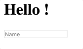
Ex: App.svelte
This passes myvar to the text input for modification. However, without additional properties supplied, any modification on the variable will not be able to be retrieved.
In order to get instant updates to myvar, it is recommended to bind the value property to your variable.
Ex:
Alternatively, for complex situations, you may not want the variable to be instantly updated - for example, if you needed additional processing.
In this situation, pass a callback method to the on:change property. The callback must be able to consume a custom Svelte event.
Ex:
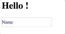
TextInputWithPlaceholder
Similar to the usage of the basic TextInput, it also provides a placeholder that collapses on focus/entry.
The placeholder property is not required, but it behaves much like a basic TextInput without it.
Ex:
In keeping with basic Svelte, the placeholder property also supports binding.
Masking
svelte-inputs comes with some basic masking.
A mask can be given to a component through the mask property.
This property accepts a config object in the given form below:
mask: "(xxx) xxx-xxxx" override: true enforceLength: true alwaysVisible: false defaultChar: ' 'Properties
mask:String; This is the actual mask that you want to use for the input.xcharacters denote user input characters. All other characters will be included as part of the mask.override:Boolean; This tells the component whether or not to override the bound value property with the mask (true) or return only the raw characters entered by the user (false). In either case, the mask will still display.enforceLength:Boolean; This determines if the mask should enforce the length of the input based on the length of the mask.alwaysVisible:Boolean; determines if the mask should be visible at all times. If false, the mask will only appear as characters are typed. Default isfalse.defaultChar:String; The default character (or string) used as a placeholder for eachxcharacter in the mask. This only applied to a mask that is also configured to bealwaysVisible: true.
Styling
Because of how Svelte handles scoping of styles in components, in order to override the styling of the elements in the svelte-inputs components,
you will need to either force style cascading with the :global style property;
or you will need to place your styles in a global stylesheet, such as the default global.css
in the sveltejs template (/public/global.css).
Example using :global
className
className is a special property that allows you to give special classes to the inputs.
Still, to use these classes will require use of one of the methods mentioned above.
Development
If you'd like to contribute to the development of this project and extend the svelte-inputs
library, please join us on GitHub!