Styled Loaders

Demo
NPM
Loaders Built with Preact and Styled Components ready for your next project because no one deserves to have to writes loadings all the time.
If you are looking for a React version you can find one here by the awesome Sai Sandeep Vaddi
Credits and inspiration also belong heavily to the awesome work at SpinKit
As I work on more projects over time more and more loaders will be added here.
Usage
npm i styled-loaders
or
yarn add styled-loaders
const Page = <main> loading ? <Cube/> : 'Your Content' </main> With Props
const Page = <main> loading ? <Block color="red" size="60px" duration="5s" /> : 'Your Content' </main> Loaders
-
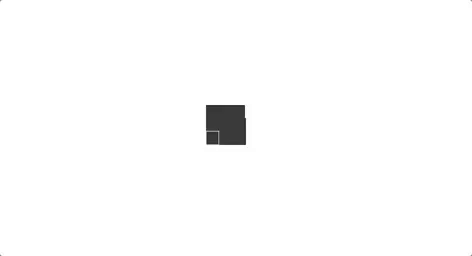
Block

- Props
- color - Background of the spinner default is #333
- duration - Animation duration default is 1.2s
- size - Size of the spinner default is 40px
- Props
-
Circular

- Props
- color - Background of the spinner default is #333
- size - Size of the spinner default is 40px
- Props
-
Cube
- Props
- color - Background of the spinner default is #333
- size - Size of the spinner default is 40px
- cubeSize - Size of the each cube default is 15
- duration - Animation duration default is 1.2s
- Props
-
CubeGrid
- Props
- color - Background of the spinner default is #333
- size - Size of the spinner default is 40px
- Props
-
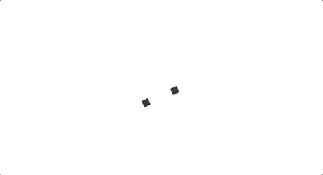
DotScale
- Props
- color - Background of the spinner default is #333
- duration - Animation duration default is 1.2s
- size - Size of the spinner default is 40px
- dotSize - Size of the dots default is 18px
- Props
-
Pulsate

- Props
- color - Background of the spinner default is #333
- duration - Animation duration default is 1.2s
- size - Size of the spinner default is 40px
- Props
-
RotateScale
- Props
- color - Background of the spinner default is #333
- duration - Animation duration default is 1.2s
- size - Size of the spinner default is 40px
- Props
-
Scale

- Props
- color - Background of the spinner default is #333
- duration - Animation duration default is 1.2s
- size - Size of the spinner default is 40px
- Props
-
Stretch
- Props
- color - Background of the spinner default is #333
- duration - Animation duration default is 1.2s
- size - Size of the spinner default is 40px
- rectWidth - Width of each rectangle default is 6px
- Props
License
MIT (2017 - Sara Vieira)