storybook-er-diagram
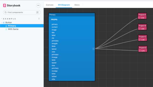
A Storybook addon useful when you have many projects built on top of a unique Design System.
A component can behave in different ways and storybook stories describe them. When your Design System is used by a lot of different projects we can lose sight of the whole picture.
Storybook ErDiagram manages links between component stories and projects that use them.
Getting started
1. Install
npm install --save-dev storybook-er-diagram
# yarn add -D storybook-er-diagram
2. Register the addon in main.js
module.exports = {
  addons: ["storybook-er-diagram"],
};
3. Add it to story!
add erDiagramList object to the story default export parameters and use the template name as key.
The name must be equal to the story template.
4. Example
export default {
  title: "Example/Button",
  component: Button,
  parameters: {
    erDiagramList: {
      Primary: ["Project-A", "Project-B", "Project-C", "Project-D"],
      ["Second Story"]: ["Project-B", "Project-C"],
      ["Another story"]: ["Project-A", "Project-D"],
    },
  },

const Template = (args) => <Button {...args} />;
export const Primary = Template.bind({});
export const secondStory = Template.bind({});
export const thirdStory = Template.bind({});
thirdStory.storyName = "Another story"
};

