


React Storybook Superficial Addon
A React Storybook addon for interacting with responsive Superficial looks.
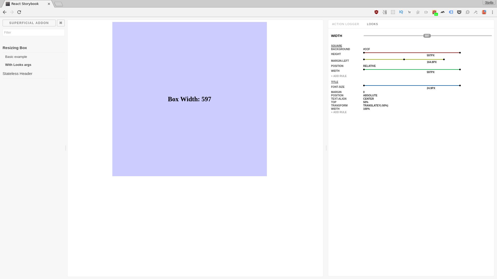
Example Storybook with Superficial addon
This addon is designed to be used with the Superficial library, which allows defining inline styles and automatic interpolation between breakpoints. The storybook addon allows you to review the breakpoints across your full supported design range.
Features:
- A slider to adjust the
widthproperty passed to the component under test - A visualization of each of the style properties associated with the component
- Click-to-edit properties and values, or even add your own!
- Specify default, minimum, and maximum width ranges to test
Install
npm install storybook-addon-superficial
Usage
Register the addon at .storybook/addons.js
;`Then wrap your component when creating your stories!
; ;You can also specify the minimum, maximum, and starting width values on the
<Looks> component itself:
;Contributing
Bug reports and pull requests are welcome on GitHub at https://github.com/gisikw/storybook-addon-superficial
License
The library is available as open source under the terms of the MIT License.