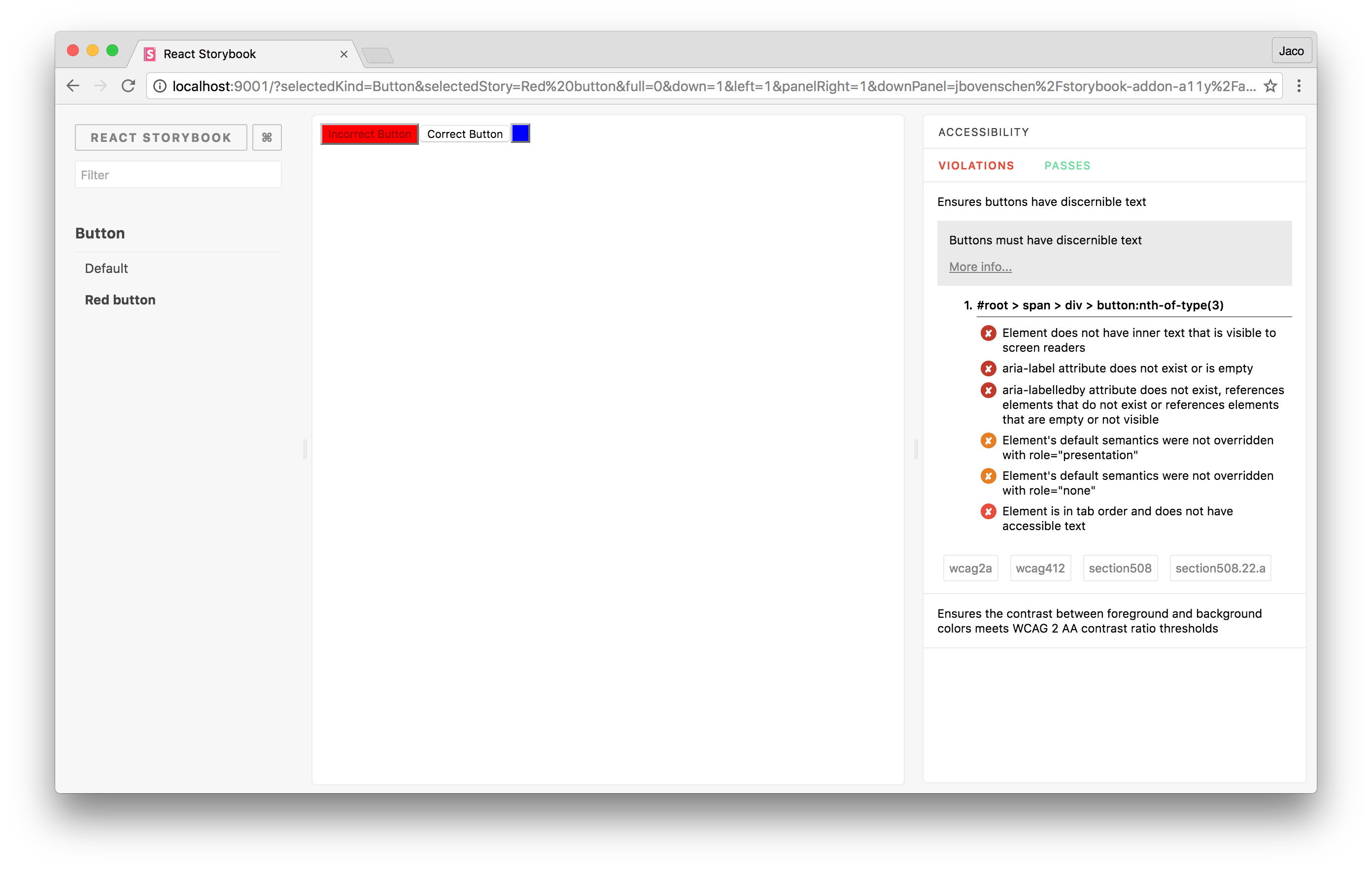
storybook-addon-a11y
This storybook addon can be helpfull to make you're UI components more accessibile.
Getting started
First, install the addon.
$ npm install -D storybook-addon-a11yAdd this line to your addons.js file (create this file inside your storybook config directory if needed).
;import the 'checkA11y' decorator to check you're stories for violations within your components.
;; ; ;