storybook-addon-a11y

3.1.9 • Public • Published

storybook-addon-a11y

This storybook addon can be helpfull to make you're UI components more accessibile.
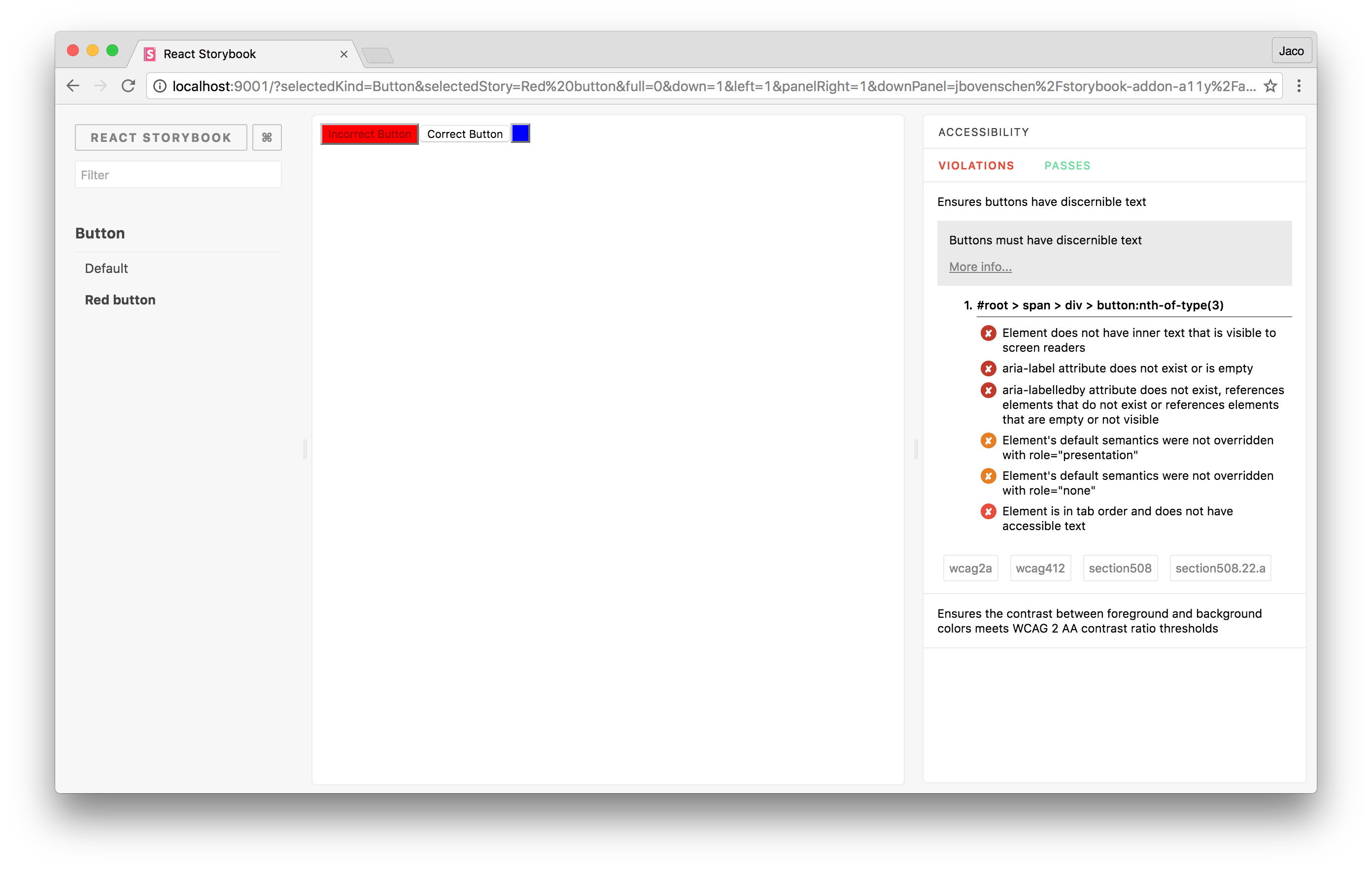
Getting started

First, install the addon.

$ npm install -D storybook-addon-a11y

Add this line to your addons.js file (create this file inside your storybook config directory if needed).

import 'storybook-addon-a11y/register';

import the 'checkA11y' decorator to check you're stories for violations within your components.

import React from 'react';
import { storiesOf } from '@storybook/react';
 
import { checkA11y } from 'storybook-addon-a11y';
 
storiesOf('button', module)
  .addDecorator(checkA11y)
  .add('Accessible', () => (
    <button>
      Accessible button
    </button>
  ))
  .add('Inaccessible', () => (
    <button style={{ backgroundColor: 'red', color: 'darkRed', }}>
      Inaccessible button
    </button>
  ));

/storybook-addon-a11y/

    Package Sidebar

    Install

    npm i storybook-addon-a11y

    Weekly Downloads

    142

    Version

    3.1.9

    License

    MIT

    Last publish

    Collaborators

    • usulpro
    • shilman
    • mnmtanish
    • aaronmcadam
    • ndelangen
    • jbovenschen