
<spinner-element>
Description.
varied set of spinners, you can choose any of the 10 types and additional you can edit the color, the time of activity and visibility.
Use visible to show the spinner:
Installation
npm install spinner-element"@0.0.4" --save
Polymer Element to display a spinner
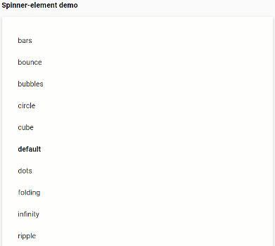
the polymer element shows a spinner, which we can select any of the 10 types, (default, bars, bubbles, circles, ripple, dots, folding, cube, bounce, infinity) but the type of spinner is specified, it will show the type 'default ', to activate it requires the' visible 'property
optionally we can set the activity time in milliseconds, if it is not set by default it is infinite
Styling
The following custom properties are available for styling
| Custom property | Description | Default |
|---|---|---|
| --background-color-spinner | The spinner-element background-color | #b9b5b524 |
| --background-border-infinity | background-color only for infinite spinner | #5d535314 |
| --background-center-infinity | background-color only for infinite spinner | #ffffff00 |
Usage
In an html file
In a Polymer 3 element
;; static { return html` `; }customElements;Credits
This repository is based on the CSS code of https://github.com/tobiasahlin/SpinKit You can also see a sample of the spinners in action http://tobiasahlin.com/spinkit/