
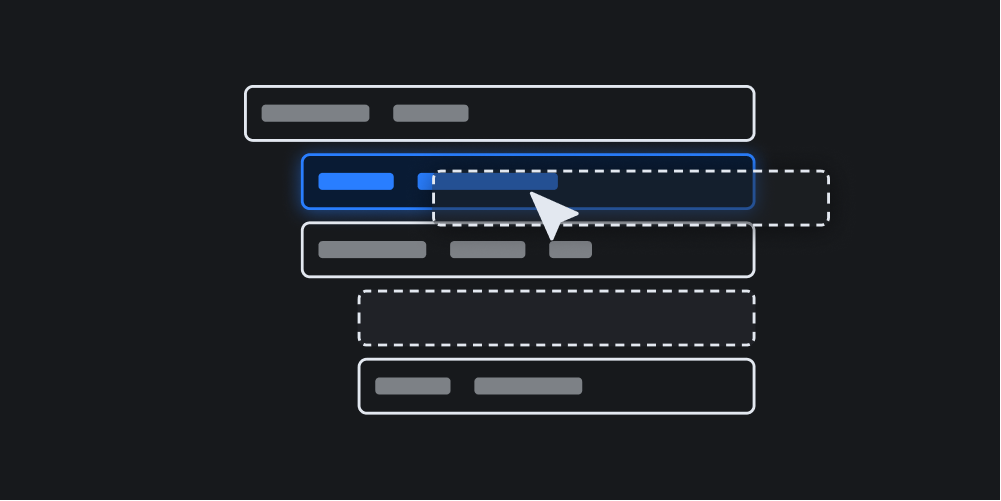
Sortable Tree


Easily create sortable, draggable and collapsible trees — vanilla TypeScript, lightweight and no dependencies.
Getting Started
You can either install this package with npm and import it into your JavaScript or TypeScript project or use it in a browser.
NPM
Install with npm:
npm i sortable-tree
Import into your project and create a tree as follows:
import SortableTree, { SortableTreeNodeData } from 'sortable-tree';
import 'sortable-tree/dist/sortable-tree.css'; // basic styles

const nodes: SortableTreeNodeData[] = [
  {
    data: { title: 'Home' },
    nodes: [
      { data: { title: 'Page 1' }, nodes: [] },
      {
        data: { title: 'Page 2' },
        nodes: [{ data: { title: 'Subpage' }, nodes: [] }],
      },
    ],
  },
];

const tree = new SortableTree({
  nodes: nodes,
  element: document.querySelector('#tree'),
  renderLabel: (data) => {
    return `<span>${data.title}</span>`;
  },
  onChange: ({ nodes, movedNode, srcParentNode, targetParentNode }) => {
    console.log(movedNode.data);
  },
  onClick: (event, node) => {
    console.log(node.data);
  },
});
CDN and Browser
In order to use this package in a browser just load add the following tags to your <head> section:
<script src="https://unpkg.com/sortable-tree/dist/sortable-tree.js"></script>
<link
  href="https://unpkg.com/sortable-tree/dist/sortable-tree.css"
  rel="stylesheet"
/>
Add use it in your body as follows:
<div id="tree" class="tree"></div>
<script>
  const nodes = [
    {
      data: { title: 'Home' },
      nodes: [
        { data: { title: 'Page 1' }, nodes: [] },
        {
          data: { title: 'Page 2' },
          nodes: [{ data: { title: 'Subpage' }, nodes: [] }],
        },
      ],
    },
  ];

  const tree = new SortableTree({
    nodes: nodes,
    element: document.querySelector('#tree'),
    renderLabel: (data) => {
      return `<span>${data.title}</span>`;
    },
    onChange: ({ nodes, movedNode, srcParentNode, targetParentNode }) => {
      console.log(movedNode.data);
    },
    onClick: (event, node) => {
      console.log(node.data);
    },
  });
</script>
In both scenarios, a sortable tree is rendered based on an array of node objects. Every node must consist of a data and a nodes property. While the data object is nothing more than a collection of key/value pairs that are passed to the renderLabel() function, the nodes property represents the array of subnodes that have the same recursive structure.
Options
The following options can be used when creating a new tree object:
const tree = new SortableTree({
  nodes: nodes,
  element: document.querySelector('#tree'),
  icons: {
    collapsed: '+',
    open: '-',
  },
  styles: {
    tree: 'tree',
    node: 'tree__node',
    nodeHover: 'tree__node--hover',
    nodeDragging: 'tree__node--dragging',
    nodeDropBefore: 'tree__node--drop-before',
    nodeDropInside: 'tree__node--drop-inside',
    nodeDropAfter: 'tree__node--drop-after',
    label: 'tree__label',
    subnodes: 'tree__subnodes',
    collapse: 'tree__collapse',
  },
  stateId: 'some-tree',
  lockRootLevel: true,
  disableSorting: false,
  initCollapseLevel: 2,
  renderLabel: async (data) => {
    return `<span>${data.title}</span>`;
  },
  confirm: async (moved, parentNode) => {
    return true;
  },
  onChange: async ({ nodes, movedNode, srcParentNode, targetParentNode }) => {
    console.log(movedNode.data);
  },
  onClick: async (event, node) => {
    console.log(node.data);
  },
});| Name | Description |
|---|---|
nodes |
An array of node objects (required) |
element |
The container element where the tree will be created in (required) |
icons |
An object of custom icons in the shape of { collapsed: '+', open: '-' } to indicate that a node is open or collapsed |
styles |
An optional object of CSS classes that are used for the tree elements |
lockRootLevel |
Prevent moving nodes to the root level (default: true) |
disableSorting |
Disable sorting functionality |
initCollapseLevel |
The level of nesting that will be initially collapsed (default: 2) |
stateId |
The id that is used to persist the folding state of the tree across browser reloads (optional) |
renderLabel |
A function that will be used to render a node's label |
onChange |
An async function that is called when the tree has changed |
onClick |
An async function that is called when a node label has been clicked |
confirm |
An async function that is used to confirm any changes in the tree |
The nodes Object in Detail
The nodes object contains the initial array of nodes that is used to construct the tree. A node is a recursive object that contains itself other (sub)nodes and must contain the following two items:
-
data: AnSortableTreeKeyValueobject that is passed to therenderLabelfunction -
nodes: An array of subnodes that have the same shape as the node itself
Rendering Nodes
The renderLabel function controls the HTML of the actual node label that is clickable and draggable. As mentioned before, the data object of the rendered noded is passed as argument. Asumming the following nodes object:
const nodes = [
  data: {
    title: 'Homepage',
    path: '/'
  },
  nodes: []
]
A typical implementation that uses the title and path fields could look like:
const tree = SortableTree({
  nodes,
  element: document.querySelector('#tree'),
  renderLabel: (data) => {
    return `
      <span data-path="${data.path}">
        ${data.title}
      </span>`;
  },
});
Customizing Styles and Icons
It is possible to override the class names that are used when rendering the tree. The following fields can be defined in the object that used with the styles option:
const tree = new SortableTree({
  nodes: nodes,
  element: document.querySelector('#tree'),
  icons: {
    collapsed: '<span class="my-icon">+</span>',
    open: '<span class="my-icon">-</span>',
  },
  styles: {
    tree: 'my-tree',
    node: 'my-tree__node',
    nodeHover: 'my-tree__node--hover',
    nodeDragging: 'my-tree__node--dragging',
    nodeDropBefore: 'my-tree__node--drop-before',
    nodeDropInside: 'my-tree__node--drop-inside',
    nodeDropAfter: 'my-tree__node--drop-after',
    label: 'my-tree__label',
    subnodes: 'my-tree__subnodes',
    collapse: 'my-tree__collapse',
  },
});
The onChange Function
The onChange function is called whenever a node is dropped successfully somewhere in the tree and a SortableTreeDropResultData object is passed as argument.
A SortableTreeDropResultData object consists of three items:
-
nodes: The tree structure that contains aid,elementandsubnodesfor each node -
movedNode: The node that has been moved -
srcParentNode: The original parent node -
targetParentNode: The new parent node
const tree = SortableTree({
  nodes,
  element: document.querySelector('#tree'),
  onChange: async ({ nodes, movedNode, srcParentNode, targetParentNode }) => {
    const data = movedNode.data;
    const src = srcParentNode.data;
    const target = targetParentNode.data;

    console.log(data, src, target);
    console.log(nodes);
  },
});
The onClick Function
The onClick function is called whenever a node label is clicked.
The original event object as well as the clicked node are passed as arguments.
const tree = SortableTree({
  nodes,
  element: document.querySelector('#tree'),
  onClick: async (event, node) => {
    console.log(event, node);
  },
});
Confirming Changes
Whenever a node is dropped, it is possible to request confirmation before actually moving a node. Therefore an async function can be assigned to the confirm as follows:
const tree = SortableTree({
  nodes,
  element: document.querySelector('#tree'),
  confirm: async (movedNode, targetParentNode) => {
    return confirm('Are you sure?');
  },
});
The Tree Object
The tree object represents the collection of nodes and allows for retrieving nodes by id or values from the initial dataset.
Tree Methods
The following public methods are available:
findNode(key: string, value: unknown)
You can search for a node by a key/value pair in the initial nodes data object that was used to create the tree by using the findNode method. Note that only the first match is returned:
const tree = new SortableTree(options);
const node = tree.findNode('title', 'home');

console.log(node.id);
console.log(node.data);
getNode(id: string)
In case you have already a id of a node from a previous search or similar, you can use the getNode method to get the node from the tree:
const node = tree.getNode(id);Nodes
Nodes represent the based units a tree consists of. Nodes can also contain other nodes.
Node Propterties
The following public properties can be accessed on a node element:
| Name | Description |
|---|---|
data |
The custom data object that was assigned when creating the tree |
label |
The clickable and draggable label element |
subnodes |
The container element that hosts the subnodes |
subnodesData |
An array of datasets that are stored in the direct children |
id |
The node's id that can be used to get the node from the tree instance |
Node Methods
Every node exposes the folowing public methods:
collapse(state: boolean)
You can control the collapse state of a node as follows:
const tree = new SortableTree(options);
const node = tree.findNode('title', 'home');

node.collapse(true); // Hide all subnodes
node.collapse(false); // Show all subnodes
reveal()
The reveal method can be used to unfold the tree down to the node:
const tree = new SortableTree(options);
const node = tree.findNode('title', 'home');

node.reveal();
toggle()
The toggle method is used to toggle the collapse state.
Styling
The included styles only cover the most basic functionality such as collapsing and indentation.
All other styling and theming is dependend on the project the tree is used in.
As mentioned above, also the markup of the rendered nodes is flexible and can be controlled with the renderLabel function.
Check out the demo for some examples for theming and styling.
Custom Properties
The following CSS custom properties are available to control the basic appearance of a tree:
| Name | Description |
|---|---|
--st-label-height |
The height of the node's label |
--st-subnodes-padding-left |
The indentation of subnodes |
--st-collapse-icon-height |
The height of the icon container that can be clicked to toggle subnodes |
--st-collapse-icon-width |
The width of the icon container |
--st-collapse-icon-size |
The actual font-size of the collapsing icon |
Demo Theme
In order to get started quickly, you can take a look at the styles of the demo theme that cover most of the needed custom styling.
© 2023 Marc Anton Dahmen, MIT license