This is a component package used to create smooth curved corners for solidJS. You can use it easily for basic tags or a solid-styled-components.
From version 0.2.0 will support solid-start and the documentation has been changed
npm install solid-corner-smoothing
pnpm install solid-corner-smoothing
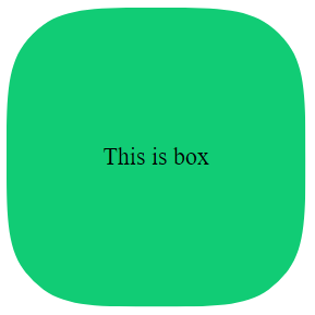
yarn add solid-corner-smoothingimport SolidCornerSmoothing from 'solid-corner-smoothing';const App = () => {
return (
<div>
<SolidCornerSmoothing
class="box"
options={{
cornerRadius: 40,
cornerSmoothing: 0.8,
reSize: true,
preserveSmoothing: true,
}}
>
This is box
</SolidCornerSmoothing>
</div>
);
};
export default App;you can use react and have to enable reSize prop to be able to change element state according to it
const [radius, setRadius] = createSignal(60);
const [smoothing, setSmoothing] = createSignal(0.7);

return (
  <div>
    <SolidCornerSmoothing
      class="box"
      options={{
        cornerRadius: radius(),
        cornerSmoothing: smoothing(),
        preserveSmoothing: true
        reSize: true
      }}
    >
      This is box
    </SolidCornerSmoothing>
  </div>
);pass the tag name as a string to the wrapper prop that will be used as the root tag
return (
  <div>
    <SolidCornerSmoothing
      class="box"
      wrapper="form"
      options={{ cornerRadius: 60, cornerSmoothing: 0.8 }}
    >
      This is box
    </SolidCornerSmoothing>
  </div>
);You can also pass a style-components to the wrapper prop to generate the root tag
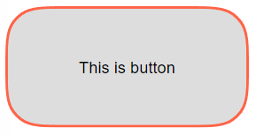
const Btn = styled('button')`
  display: flex;
  justify-content: center;
  align-items: center;
  width: 200px;
  height: 100px;
  border: none;
`;

return (
  <div>
    <SolidCornerSmoothing
      wrapper={Btn}
      options={{
        cornerRadius: 30,
        cornerSmoothing: 0.8,
        backgroundColor: '#ddd',
        border {
          color: "tomato",
          size: 2
        }
      }}
    >
      This is button
    </SolidCornerSmoothing>
  </div>
);Background color can be used via css or options props, border color can only be passed through options props. (the colors passed options props also accept css variables)
return (
  <div>
    <SolidCornerSmoothing
      class="box"
      wrapper="button"
      options={{
        cornerRadius: 30,
        cornerSmoothing: 0.8,
        preserveSmoothing: true
        border: {
          color: "tomato",
          size: 2
        }
      }}
    >
      This is button
    </SolidCornerSmoothing>
  </div>
);.box {
display: flex;
justify-content: center;
align-items: center;
width: 200px;
height: 100px;
background-color: gray;
}| Prop name | Type value | Description |
|---|---|---|
| wrapper | string, Styled Element | Root tag (default is div), can also be a solid-styled-components
|
| options | Options | Where to put options. (required to work)border-radius. |
| Prop name | Type value | Description |
|---|---|---|
| cornerRadius | number | Similar to the CSS property border-radius. |
| topLeftCornerRadius | number | Radius each corner |
| topRightCornerRadius | number | Radius each corner |
| bottomRightCornerRadius | number | Radius each corner |
| bottomLeftCornerRadius | number | Radius each corner |
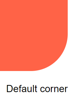
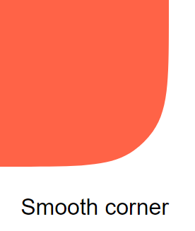
| cornerSmoothing | number | The degree of corner smoothing as a number in the range 0–1. 0 is equivalent to no smoothing and looks like normal border-radius. 1 indicates maximal smoothing. |
| preserveSmoothing | boolean | Allow corner smoothing to work better on large rounded corners. |
| reSize | boolean | Allows resizing and corners |
| border.size | number | When this prop has a value, it will turn into border mode (need to change the css according to the instructions or use prop borderColor and backgroundColor) |
| border.color | string | Border color |
| backgroundColor | string | Background color (can still use css if not using this prop) |
| fitBorderWidth | number | Add custom angle width parameter to fix visual effects |


