smd-timepicker
 React time picker with custom configurations.
Provides all the necessary stylling and user friendly interaction,
Can able to modify the existing styling as well as can able to add custome css also.
24 hours format as well as 12 hours format and easy to understand.
Install
npm install smd-timepickerUsage
import React, { Component } from 'react'

import SMDTimePicker  from 'smd-timepicker'

class Example extends Component {
  render() {
    return <SMDTimePicker value='10:25 am' onChange={onSelectingTime}/>
  }
}
props
| Prop | Default Value & Type | Description |
|---|---|---|
| onChange | onChange: (time: string) => void (function) | Captures the output in the format of user provided prop format or default format (hh:mm a) |
| format |
hh:mm a (string) |
Can able to pass the format like hh:mm a or HH:mm |
| value |
'' (string) |
If want pass default value as hh:mm a format or HH:mm format |
| is24Hours |
false (Boolean) |
If we want 24 hours format then set this to true |
| isRemoveInputSelector |
false (Boolean) |
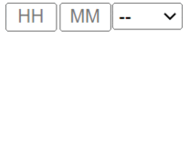
If you don't want Time select options provide this as true |
| hoursPlaceholder |
HH {string) |
For hours input placeholder |
| minutesPlaceholder |
MM {string) |
For minutes input placeholder |
| isIncludesSeconds |
false {Boolean) |
If you want seconds also to be included pass this prop as true value |
| secondsPlaceholder |
SS {string) |
For seconds input placeholder |
| inputStyles |
{} (css styles object) |
Set inline styles for input |
| inputClass |
'' (className) (css className string) |
Can able to provide our app CSS classes to the inputs |
| selectAMPMStyles |
{} (css styles object) |
Set inline styles for select AM or PM |
| selectAMPMClass |
'' (className) |
Can able to provide our app CSS classes to the select AM or PM |
| selectOptions | [{name:'AM',value:'am'},..] |
If you want to change the name of select AM or PM as lowercase values or uppercase values or titlesase values, You can obtain those with css styles also |
| timeSelectConfig | { timeOuterContainer: {}, timeInsideContainer: {}, selectSpecificData: { isSelectedBGcolor: 'lightgreen', isSelectedFontColor:'black', isHoveredBGcolor:'lightblue', isHoveredFontColor: 'black' } } |
timeOuterContainer is to change the custom styles for the select input container, timeInsideContainer is to time data value inside container , selectSpecificData this object is to activated element styles |
Example 1
import React, { useState } from 'react'
import SMDTimePicker from 'smd-timepicker'
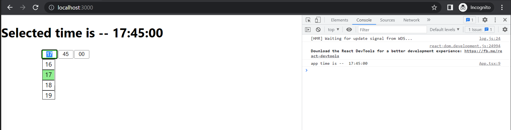
const App = () => {
const [timeV, setTime] = useState('')
const onSelectingTime = (time: string) => {
console.log('app time is -- ', time)
setTime(time)
}
return (
<div>
<h1>Selected time is -- {timeV}</h1>
<div style={{ marginLeft: '100px' }}>
<SMDTimePicker
onChange={onSelectingTime}
is24Hours={false}
value={timeV}
isIncludesSeconds={false}
inputClass=''
inputStyles={{ width:'30px', height:'30px', color: 'blue', fontWeight:'bold' }}
selectAMPMClass=''
selectAMPMStyles={{ width:'60px', height:'30px' }}
timeSelectConfig={{
selectSpecificData: { isSelectedBGcolor: 'orange', isHoveredBGcolor:"gray" },
timeInsideContainer: {backgroundColor: "lightcyan"}
}}
/>
</div>
</div>
)
}
export default App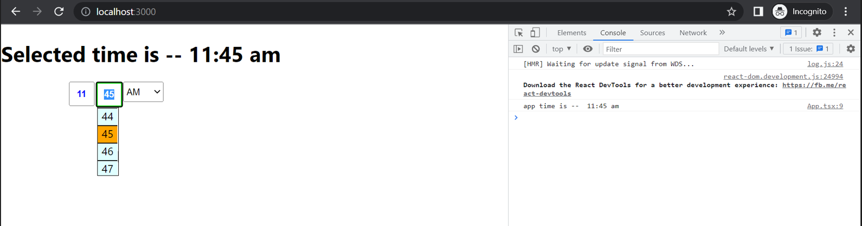
Example 2
import React, { useState } from 'react'

import SMDTimePicker from 'smd-timepicker'

const App = () => {
  const [timeV, setTime] = useState('')

  const onSelectingTime = (time: string) => {
    console.log('app time is -- ', time)
    setTime(time)
  }

  return (
    <div>
      <h1>Selected time is -- {timeV}</h1>
      <div style={{ marginLeft: '100px' }}>
        <SMDTimePicker
          onChange={onSelectingTime}
          is24Hours={true}
          value={timeV}
          isIncludesSeconds={true}
        />
      </div>
    </div>
  )
}

export default App