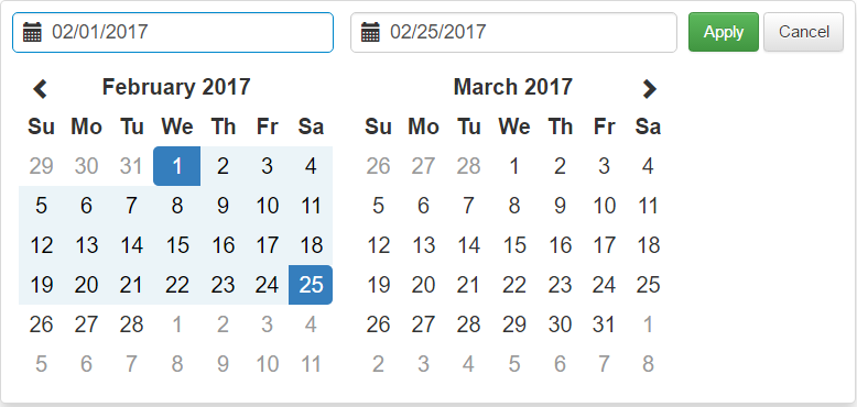
sm-daterangepicker - AngularJS (directive)
The daterangepicker component of bootstrap: http://www.daterangepicker.com/, as directive for use with AngularJS.
Installation
npm install --save sm-daterangepicker
Attention You have imported the bootstrap css into the project so that the date component is rendered correctly.
Use
Add in the module of your application:
require("sm-daterangepicker"); //return module name
angular.module("yourModuleName", ["sm-daterangepicker"]);
ou
angular.module("yourModuleName", [require("sm-daterangepicker")]);
After adding, just use the policy as follows:
<input type="text" ng-model="yourVariable" sm-daterangepicker>
ngModel
To get the beginning and end date, just get the date of the object in the model, formatted like this:
//ngModel
{
    startDate: [object Moment],
    endDate: [object Moment]
}

//Controller
$scope.yourVariable.startDate
$scope.yourVariable.endDate
Available Attributes
| Attribute | Type | Description |
|---|---|---|
| env | String | Pass this attribute with "DEV", and soon the component will log everything that is changed. (It receives by default "PROD", however it picks up from node.js if it is "DEV") |
| locale | Object | Definition of the translation, if you do not have in the project the angular provider translate. (If no translation is passed it assigns by default the English language.) |
| date-time | String | Accepts values 24h or 12h, to indicate the format, when declared displays in the input the time. |
| year | Date/Moment | It receives only a date, and it makes a limit of the beginning of the year until the end of the year, that contains in her. (When passed this parameter it ignores the minimum and maximum date) |
| start-date | Date/Moment | Sets the selected start date. |
| end-date | Date/Moment | Set as the preset end date. |
| min-date | Date/Moment | Sets the minimum date. |
| max-date | Date/Moment | Sets the maximum deadline. |
| date-limit | String | Limits a range by days, months, years, or hours, minutes, and seconds. |
| onshow | Function | Triggered when the calendar is shown. |
| onhide | Function | Triggered when the calendar is closed. |
| onapply | Function | Triggered when the apply button is clicked, or when a predefined interval is clicked. |
| oncancel | Function | Triggered when the cancel button is clicked. |
| suffix-translation | String | Namespace used in the translation provider's rendering file translate. |
Run-time update
Variables of minimum, maximum, beginning, end, and year can all be changed at runtime, and the date component has already adapted to change.
Locale
Note: There are two ways to translate the daterangepicker, one is passing the locale attribute, with the following object:
Attribute locale
//Model
$scope.localeObject = {
    format: "MM/DD/YYYY H:mm",
    separator: " -- ",
    applyLabel: "Apply",
    cancelLabel: "Cancel",
    fromLabel: "From",
    toLabel: "To",
    customRangeLabel: "Custom",
    daysOfWeek: [
                    "Su",
                    "Mo",
                    "Tu",
                    "We",
                    "Th",
                    "Fr",
                    "Sa"
                ],
    monthNames: [
                    "January",
                    "February",
                    "March",
                    "April",
                    "May",
                    "June",
                    "July",
                    "August",
                    "September",
                    "October",
                    "November",
                    "December"
                ],
    firstDay: "1"
}
//View
<input type="text" locale="localeObject" sm-daterangepicker>
Another way to do translation that is more efficient by supporting multiple languages and changing at runtime is by working with the provider angular translate.
Angular translate
To better understand what I am explaining below, read about the angular translate.
Namespace (Optional):
<input type="text" suffix-translation="NAMESPACE" sm-daterangepicker>
file_of_translation.js
"SM_DATERANGEPICKER: {}" ou "NAMESPACE.SM_DATERANGEPICKER: {}"

"SM_DATERANGEPICKER": {
    "FORMAT": "MM/DD/YYYY H:mm",
    "SEPARATOR": " -- ",
    "APPLYLABEL": "Apply",
    "CANCELLABEL": "Cancel",
    "FROMLABEL": "From",
    "TOLABEL": "To",
    "CUSTOMRANGELABEL": "Custom",
    "DAYSOFWEEK": {
        "SU": "Su",
        "MO": "Mo",
        "TU": "Tu",
        "WE": "We",
        "TH": "Th",
        "FR": "Fr",
        "SA": "Sa"
    },
    "MONTHNAMES": {
        "JANUARY": "January",
        "FEBRUARY": "February",
        "MARCH": "March",
        "APRIL": "April",
        "MAY": "May",
        "JUNE": "June",
        "JULY": "July",
        "AUGUST": "August",
        "SEPTEMBER": "September",
        "OCTOBER": "October",
        "NOVEMBER": "November",
        "DECEMBER": "December"
    },
    "FIRSTDAY": "1"
}
Date limit
Using the date-limit attribute is not that complicated, what it does just, is to make a limit of the date selected from the limited range, just pass it the following:
<input type="text" date-limit="parameter:value" sm-daterangepicker>
//Supported parameters: days, months, years, hours, minutes and seconds.
//For more than one parameter passed, separate them with a comma.
//Example: parameter:value,parameter:value...
Read in another language
Clique aqui e leia em português
Contribution
Contribute to the fact that daterangepicker directive is getting better and better. Just download the project and apply your changes, and after that it will be analyzed to be approved.
Licence
MIT