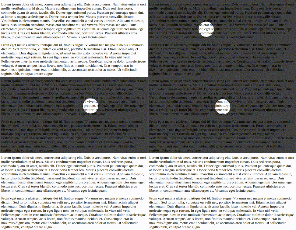
Key activable spotlight for Slidev.
Hold Shift to activate the spotlight (can be customized).
Also works in presenter mode.
npm i slidev-component-spotlightDefine this package into your slidev addons.
In your slides metadata (using frontmatter):
---
addons:
  - slidev-component-spotlight
---
Or in your package.json:
{
  "slidev": {
    "addons": [
      "slidev-component-spotlight"
    ]
  }
}Create a ./global-top.vue file in your Slidev project and use the component:
<template>
  <SlidevSpotlight/>
</template>Component that displays the pager:
<SlidevSpotlight/>Parameters:
-
activationKey(type:string, default:'Shift'): The key to hold down to activate the spotlight -
color(type:string, default:'black'): CSS color of the spotlight shadow -
opacity(type:number | string, default:0.75): Opacity of the spotlight shadow -
size(type:string, default:100px): Size of the spotlight -
transitionDuration(type:string, default:200ms): CSS transition durations

