
SlarnAutocomplate
An angular package for a very simple yet powerful autocomplete component
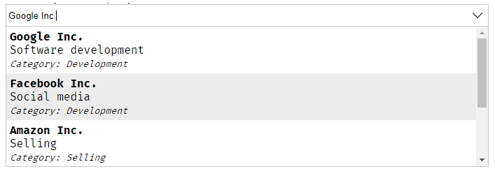
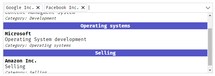
Default theme
| Simple selection | Multiple selection (with grouping) |
|---|---|
 |
 |
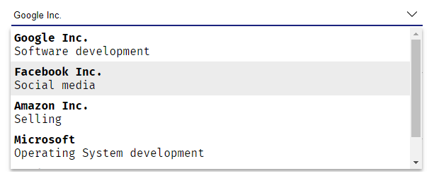
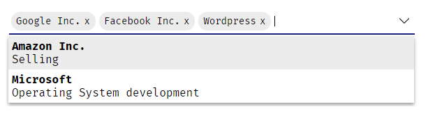
Material design theme
| Simple selection | Multiple selection |
|---|---|
 |
 |
Demo
You can find a live demo here
Installation
- Run inside your terminal
npm i slarn-autocomplete - Add
SlarnAutocompleteModuletoapp.module.ts:
; @ - Select a theme:
/*Import material design theme*/; /*Import default theme*/;In case of choosing material design theme:
If you want to change the default bottom border color and animation copy/paste this in the style.css file and change the colors as you want:
- Now call the component in your template
Usage
SlarnAutocomplete works on two modes:
- Locally: Filter through explicitly given array of objects
- Remotely: You just give the url of your api and the autocomplete send a
GETrequest to this url with a specific param calledac-regthat contains the word written in the autocomplete (which means you need to create a function in your api that get the autocomplete param and return an array of objects)
And in both cases you need to provide a configuration object to the autocomplete.
How to configure the autocomplete
Since SlarnAutocomplete works on two modes we need to provide a configuration for each one ACLocalConfiguration or ACRemoteConfiguration
Working locally
In app.component.ts:
slarn_local_config: ACLocalConfiguration = template: ` <div><strong>#name#</strong></div> <div>#description#</div> ` key: 'code' value: 'name' data: code: 'OP1' name: 'Option 1' description: 'Some discription here for Option 1' code: 'OP2' name: 'Option 2' description: 'Some discription here for Option 2' code: 'OP3' name: 'Options 3' description: 'Some discription here for Option 3' ;In app.component.html:
Working Remotely:
In app.component.ts:
slarn_remote_config: ACRemoteConfiguration = template: ` <div><strong>#name#</strong></div> <div>#description#</div> ` key: 'code' value: 'name' url: 'path/to/your/api';In app.component.html:
Getting the selected item:
SlarnAutocomplete provides a selection event that will be triggered whenever you select an option or clear the autocomplete's input:
The selected item will be the full object:
{ console;// result: { code: 'OP3', name: 'Options 3', description: 'Some discription here for Option 3' }}Setting an item
To pre-select an item you just need to provide it's key (or an array of keys in case of multiple selection) to the autocomplete:
or
of course it's based on the key you already gave in the configuration.
If the autocomplete is inside a form then you don't need to use selectedId input you just need to fill the formControl or bind it an ngModel
in app.component.ts:
form;or using ngModel
API
Configuration
Common configuration
| Name | Details | Status |
|---|---|---|
key: string |
Will be stored in the autocomplete (will be used to select an option or when sending a form) | Required |
value: string |
Will be displayed in the autocomplete | Required |
template: string |
The html view that you want to be displayed to the user | Optional |
multiple: boolean |
Switch between simple or multiple selection | Optional |
name: string |
Set a specific name to the input (in case you work with forms and you want a specific name) | Optional |
rtl: boolean |
RTL Support | Optional: (false bu default) |
language: string |
Select the language that will be used in the default texts and console errors Available languages: en, fr and arIf you don't find your language please feel free to send a pull request for it |
Optional (en by default) |
group: Group |
Group items by a specific field (contains 2 options: field and tempalte) |
Optional |
group.field Arrow function |
The field that you want to group by, and must be an arrow function ex:group: { field: item => item.groupAttribute } or group: { field: item => item.subItem.groupAttribute } |
Required |
group.template string |
The view that you want to be rendered for the group ex:group:{ template: '<strong>#__group__#</strong>'}#__group__# is where you want to display the group name |
Optional |
Local configuration
| Name | Details | Status |
|---|---|---|
data: Array<any> |
Contains an array of objects | Required |
Remote configuration
| Name | Details | Status |
|---|---|---|
url: string |
URL of your API | Required |
minCharacters: number |
minimal number of characters typed before calling the API | Optional |
loadingView: string |
The text or the html view that will be rendered while loading data remotely | Optional (default text: Loading data...) |
Render emptyListView
When there is no data found after typing, SlarnAutocomplete will render No match found! text .
But if you want to render a template of your own you can use ng-container inside slarn-autocomplete with empty-result-view class:
We can't find what you're looking for! <!--As you can see you can render buttons and do some stuff--> <!--Of course you need to create the 'addItem()' function in your component--> Add this new item Inputs and Outputs
| Name | Details | Status |
|---|---|---|
@Inputconfiguration: ACLocalConfiguration or ACRemoteConfiguration |
Contains your custom configuration of the autocomplete | Required |
@Inputdisabled: boolean |
Disable autocomplete | Optional |
@Inputunselectable: Array<string or number> |
Disable some specific items (won't be able to select them) | Optional |
@InputselectedId: any or Array<SelectedItem> |
Contains one or more id of the items that you want to be selected | |
@OutputonItemSelected: any |
Event will be fired after selecting an item ($event will be the selected item) |
Functions
| Name | Details |
|---|---|
getterselectedData |
Returns selected data ({} or Array<{}>) |
| openSuggestions() | Open the list of suggestions |
| closeSuggestions() | Close the list of suggestions |
appendItem(item: any, selectIt: boolean)item: the item that you want to add itselectIt: set it to true if you want to select this item after adding it (false by default) |
Add items dynamically to the autocomplete (works only with local configuration) |
LICENSE
This project is under MIT License