React Donut Chart
This is a dead simple donut chart component implemented in React.
To use it simply install it via npm:
npm i --save simple-react-donut-chart
demo
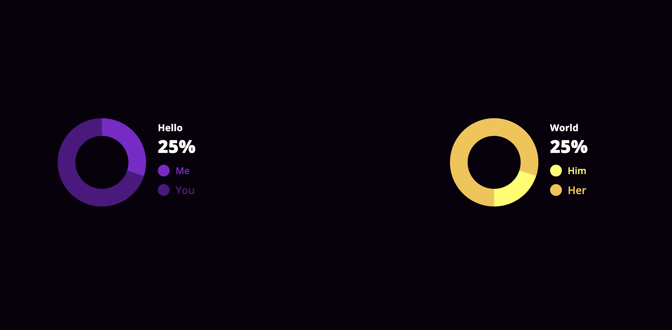
You can see this component in action here.
usage
This is an example how can you use this component in your project(s)
Yes, in this version you have to include the compiled d css also
Using the component:
<DonoutChart percentage=30 colorOn="#510E80" colorOff="#8217CC" labelOff="Me" labelOn="You" circleColor="#ffffff" baseClass="customize" textStyle= color: '#ff0000' labelStyle= off: fontSize: '16px' on: fontSize: '18px' />props
| name | isRequired | type | default | example | description |
|---|---|---|---|---|---|
percentage |
yes | Number |
0 |
percentage={10} |
the percentage the donut chart should show |
colorOn |
yes | String |
null |
colorOn="#ff0000" |
the color that matches with the percentage on the chart |
colorOff |
yes | String |
null |
colorOff="#ffff00" |
the color that matches the rest of the donut part on the chart |
labelOn |
yes | String |
null |
labelOn="On" |
the text will be shown with the percentage on the chart |
labelOff |
yes | String |
null |
labelOff="Off" |
the text will be shown with the rest of the donut part on the chart |
circleColor |
yes | String |
"#ffffff" |
circleColor="#444444" |
the color the circle should have on the middle of the donut chart |
labelStyle |
no | Object |
{} |
labelStyle={{ off: {,fontSize: '16px',}, on: {,fontSize: '18px',} }} |
styleObject passed to the labels of the donut chart |
textStyle |
no | Object |
{} |
textStyle={{ color: '#fff', }} |
styleObject passed to the explanation text of the donut chart |
baseClass |
no | String |
null |
baseClass={styles.chartBase} |
Providing a baseClass will be applied on every domNode the donut chart has. See more at the styleing section |
Styleing
By providing the baseClass props, you are able to customize the chart as you wish, with CSS.
Here is a quick example how it works:
<DonoutChart percentage=30 ... baseClass="customize"/>Given the customize as the value of baseClass the following will happen.
The donutContainer class will be assigned another class, which is the baseClass prop itself.
<div class="donutContainer customize"> ...</div>The rest of the dom will be suffixed with the baseClass prop's value.
| className | extended |
|---|---|
donutContainer |
className={`donutContainer ${baseClass}`} |
details |
className={`details details--${baseClass}`} |
indicator off |
className={`indicator off indicator-off-${baseClass}`} |
indicator on |
className={`indicator on, indicator-on-${baseClass}`} |
More might come later if there's a need.
contribution
If you encountered an issue, or a bug, or want to request a feature, please use the issues section.
If you want to modify something yourself, feel free to fork this project, create a new branch for your feature, then send a PR and I will be happy to review and merge it. 😉
dependencies
This package depends on styled-components
Misc
- this package is licenced under MIT