
Reactive Form Builder for Angular
Generate form controls, form array and form group.
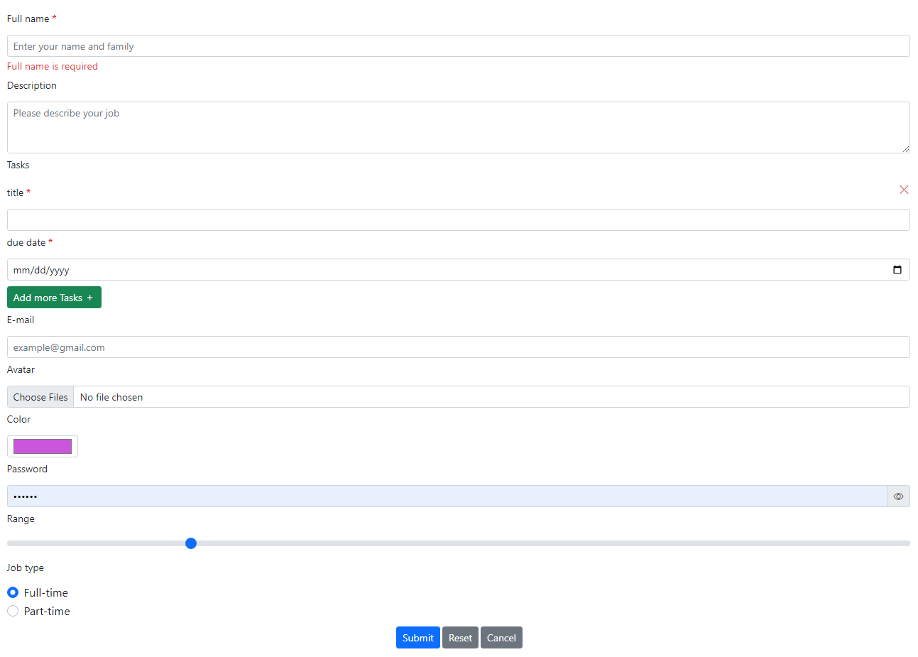
Demo
stackblitz✔️ Version 2.7.0
- Customizing form array title by setting titleClass property
- Ability to define as many form group with as many fields you want for each
- Setting full with buttons for mobile and another device size by setting fullWidthButtons property
✔️ Version 2.6.0
- Sizing for control and label by values: small,medium and large.Default is medium
- Red color added to color of buttons
- Simple validation error style has added that shows red text without background color.You can reached it by setting simpleValidationError:true
Some Features
- Ability to define form fields by type
- Ability to define as many form arrays with as many fields you want for each
- Ability to define as many form group with as many fields you want for each
- Has a config for Add button of form array
- Ability to define the as many validation rules and error message of the field and the form array fields as desired
- Has a config for form array divider
- Ability to define Send, Reset and Cancel buttons with the desired title, color, and order
- Binding form by object in edit mode
- Bootstrap style
Field types
TextRangeNumberPasswordColorDropdownRadioCheckboxFileDateDatetime localTimeWeekMonthForm arrayForm group
Table of contents
- Install
- Quick start
- Import style and icon
- How to use?
- Input
- Output
- Field properties and methods
- Button setting
- Validators
- Creator
- License
Install
npm i sh-dynamic-form-builderInstall dependencies
Use bootstrap V5
npm install bootstrap --savenpm install bootstrap-icons --savenpm install sh-ordinal-numbers --saveQuick start
import { DynamicFormBuilderModule } from "sh-dynamic-form-builder";

@NgModule({
  imports: [DynamicFormBuilderModule],
})
export class AppModule {}
Import style and icon
In angular.json
"styles": [
    "src/styles.scss",
    "./node_modules/bootstrap/dist/css/bootstrap.min.css"
    "./node_modules/bootstrap-icons/font/bootstrap-icons.scss"
]
If Bootstrap icons don't work, you should import them in global style.
@import "~bootstrap-icons/font/bootstrap-icons";How to use?
In component
formGroup = new FormGroup({});
isSubmit: boolean = false;
config: IFormConfig = {
title: 'Profile',
fields: [
{
type: 'text', name: 'fullName', label: 'Full name', id: 'fullName',
validators: [
{ rule: 'required', msg: 'Full name is required' },
{ rule: 'minlength', value: 6, msg: 'Full name must be at least 6 characters long' },
],
},
{
type: 'form-array',
label: 'Tasks',
name: 'tasks',
formArray: {
simpleAddButton: true,
addButtonBGColor: 'green',
fields: [
{
type: 'text', name: 'title', label: 'title', validators: [
{ rule: 'required', msg: 'title is required!' },
{ rule: 'maxlength', value: 50, msg: 'Maximum length should be 50 characters' }
]
},
{
type: 'date', name: 'dueDate', label: 'due date', validators: [
{ rule: 'required', msg: 'date is required!' }
]
}
]
}
},
{
type: 'text', name: 'email1', label: 'E-mail',
validators: [
{ rule: 'email', msg: 'E-mail is wrong' }
],
},
{
type: 'file', name: 'avatar', label: 'Avatar',
onUpload: this.onUpload.bind(this), multipleFile: true
}
...
buttonSetting: {
fullWidthButtons: 'only-mobile',
buttons:
[
{ type: 'submit', caption: 'Submit', bgColor: 'blue' },
{ type: 'reset', caption: 'Reset', bgColor: 'orange' },
{ type: 'cancel', caption: 'Cancel', bgColor: 'light' }
]
}
}private onUpload(event: any): void {
const files = event.files;
...
} public submit(event: FormGroup): void {
this.isSubmit = true;
this.formGroup = event;
/**Sending data ... */
this.isSubmit = false;
} public cancel(): void {
/** */
}In template
<div class="container">
  <sh-dynamic-form-builder
    [config]="config"
    [isSubmit]="isSubmit"
    (submit)="submit($event)"
  >
  </sh-dynamic-form-builder>
</div>
Input
| Name | Type | Default | Required? | Description |
|---|---|---|---|---|
| config | IFormConfig |
- |
yes | Form config |
| formValue | object |
{} |
- | Adjust form values |
| isSubmit | boolean |
false |
no | Set in to your Submit Function. If it sets "true", Submit button will be disabled.When submit is clicked it must be set "true" value, when sending data will be ended it must be set "false" value |
-
Config
| Name | Type | Default | Required? | Description |
|---|---|---|---|---|
| fields | IMainFieldItem |
- |
yes | Form fields |
| title | string |
- |
no | Form title |
| titleClass | string |
- |
no | Set style for form title, you can add one or more class name split by space. for example:'class1 class2 class3' |
| buttonSetting | IButtonSetting |
{} |
yes | Button setting |
| formControlConfig | IFormControlConfig |
{} |
yes | Form controls configuration |
-
Form control config
| Name | Type | Default | Required? | Description |
|---|---|---|---|---|
| elementSize | string |
medium |
no | Control size and label size |
| simpleValidationError | boolean |
false |
no | Red text without background color as the validation error message |
Output
| Name | Type | Description |
|---|---|---|
| (submit) | FormGroup |
Output formGroup, when Submit button clicked |
| (cancel) | boolean |
When the Cancel button has been clicked |
Field properties and methods
| Name | Type | Default | Required? | Description |
|---|---|---|---|---|
| type | string |
- |
yes | Allowed values: text, range, number, password, color, dropdown, radio, checkbox, file, date, datetime-local, time, week, month, form-group and form-array
|
| name | string |
- |
yes | Form control name |
| defaultValue | any |
- |
no | Form control default value |
| placeholder | string |
- |
no | Usable for text, number, password, dropdown and email |
| [validators] | IValidationRules |
- |
no | Set validator rules and error messages |
| id | string |
- |
no | Element id |
| width | number |
100% |
no | Width of Control |
| disable | boolean |
false |
no | Disable control |
-
File
Name Type Default Required? Description onUpload void-yes File selection event. multipleFile booleanfalseno Allow choice multiple file -
Text
Name Type Default Required? Description multiline booleanfalseno Multiline handling rowCount number5no Specifies the visible height of a text area, in lines -
Radio
Name Type Default Required? Description [options] IOption-yes Define options: {key: string;label: string;} inline booleanfalseno Show on the same horizontal row -
dropdown
Name Type Default Required? Description [options] IOption-yes Define options: {key: string;label: string;} -
Range
Name Type Default Required? Description rangeMin number0no value of the min rangeMax number100no value of the max rangeStep number1no value of the step -
Form-group
Name Type Default Required? Description formGroup IFormGroup-no Set form group fields and validations -
FormGroup
Name Type Default Required? Description [fields] IFormGroupFieldItem-yes Form group fields titleClass string-no Set style for form group title, you can add one or more class name split by space. for example:'class1 class2 class3' showInCard booleanfalseno Show in bootstrap card -
-
Form-array
Name Type Default Required? Description formArray IFormArray-no Set form array fields and validations -
FormArray
Name Type Default Required? Description [fields] IFormArrayFieldItem-yes Form array fields simpleAddButton booleanfalseno Only icon on button, without text addButtonBGColor stringgrayno Allowed values: gray,green,blue,red,orange,lightanddarkdivider IDivider-no doesn't show an ordinal number in the center of the divider line -
Divider
Name Type Default Required? Description suppress booleanfalseno Doesn't show divider lineClass string-no Set style for divider line, you can add one or more class name split by space. for example:'class1 class2 class3' ordinalNumberClass string-no Set style for ordinal number between divider line, you can add one or more class name split by space. for example:'class1 class2 class3' suppressOrdinalNumber booleanfalseno Doesn't show an ordinal number in the center of the divider line height number3no The height of divider
-
-
Button setting
| Name | Type | Default | Required? | Description |
|---|---|---|---|---|
| [buttons] | IButton |
[] |
yes | The array of buttons, order by definition |
| buttonsAlign | string |
left |
no | Usable when fullWidthButtons is false |
| fullWidthButtons | string |
none |
no | Allowed values: none, all, only-mobile
|
-
Button properties
| Name | Type | Required? | Description |
|---|---|---|---|
| type | string |
yes | Allowed values: submit, cancel and reset
|
| caption | string |
yes | Button caption |
| bgColor | string |
yes | Allowed values: gray, green, blue, red, orange, light and dark
|
Validators
| name | type | Required | Description |
|---|---|---|---|
| rule | string |
yes | Define rules |
| msg | string |
yes | Error message |
| value | any |
no | Usable for min, max,pattern,minlength and maxlength rules |
-
Validator rules
| Name | Type | Description |
|---|---|---|
| min | number |
Validator that requires the control's value to be greater than or equal to the provided number. |
| max | number |
Validator that requires the control's value to be less than or equal to the provided number. |
boolean |
Validator that requires the control's value pass an email validation test. | |
| pattern | string |
Validator that requires the control's value to match a regex pattern. |
| required | boolean |
Validator that requires the control have a non-empty value. |
| requiredTrue | boolean |
Validator that requires the control's value be true. This validator is commonly used for required checkboxes. |
| minLength | number |
Validator that requires the length of the control's value to be greater than or equal to the provided minimum length |
| maxLength | number |
Validator that requires the length of the control's value to be less than or equal to the provided maximum length. |
Creator
Hakime sheikhalishahi
License
MIT