primo-explore-search-bar-sub-menu


Description
Add a nav bar underneath the search bar to provide additional links in the primo-explore UI.
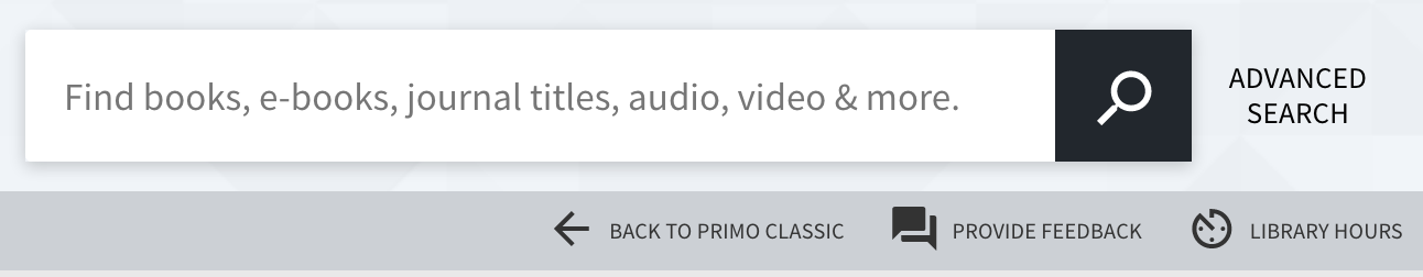
Screenshot
Installation
-
Assuming you've installed and are using primo-explore-devenv.
-
Navigate to your template/central package root directory. For example:
cd primo-explore/custom/MY_VIEW_ID -
If you do not already have a package.json file in this directory, create one:
npm init -y -
Install this package:
yarn add primo-explore-search-bar-sub-menu --dev
# OR
npm install primo-explore-search-bar-sub-menu --save-dev
Usage
Once installed, inject searchBarSubMenu as a dependency:
let app = angularNote: If you're using the --browserify build option, you will need to first import the module with:
;Then add the search-bar-sub-menu directive to the prmSearchBarAfter component:
appConfig
You'll need to configure the module by passing it an array of objects as an angular constant:
| name | type | usage |
|---|---|---|
cssClasses |
string | extra css classes to put on the buttons, i.e. 'button-over-dark' if your background color is dark |
name |
string | the text that will appear as the button link |
description |
string | for the aria label |
action |
string | url for the link. always opens in a new window. |
icon |
object | defines the icon for the link. must be chosen from https://material.io/icons/. you need to specify both the name of the action "set" (see link) and the icon itself, in the form "ic_person_outline_24px". note that all icons do not work so you may have to experiment some |
show_xs |
boolean | true is you want to continue to show button text in xs screens and only show the icons. false by default |
Translations
You can use translations to access back office text by wrapping the value in curly braces, e.g. {nui.menu.librarycard}. Anything that works in the primo templates link this <span translate="nyu.menu.librarycard"></span> will work if it's available in the current scope.
Styles
Change the background color of the menu bar:
Change the padding between the search bar the menu bar, these are the default values:
Where 36px is the default height of the menu bar.
Example
app; Tests
We are using Yarn to manage dev dependencies.
yarn
yarn test