
Material range datepicker
Material datepicker with range support
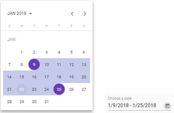
What is this?
This is patched version of Material Datepicker for Angular with range selection support.
I created this repository and this package due to it takes a lot of time to contribute to material2 repository:
Issue #4763 in material2 repo from 2017-present.
DEMO with extra features examples
Advantages
- You can change order of views: month, year and multi-year
- You can keep calendar to be opened after selecting a date (in singular range mode) or a range of dates (in range mode)
- You can use all original material attributes: min, max, formControl and others
Changelog
8.0.2
Added option to switch off rangeHoverEffect
8.0.1
Fixed loading issue on es2015 targets
8.0.0
Updated to 8.2.0 material code
7.4.0
Inline usage of calendar. See demo. Thanks to @beyondsanity for this feature
7.3.0
Introducing footer component for calendar. See demo for example usage. Thanks @paullryan for this feature
7.2.1
Update to datepicker material 7.3.1
7.2.0
Select first date on close feature
7.1.0
Range selection have a preview now.
6.1.0
Merged #31
- Add option to sort views when clicking on period label button (month -> year or year -> month)
- Add option to enable closing datepicker after date selection #30
It's awesome, but how to use it?
As easy as pie.
Installation: yarn add saturn-datepicker or npm install saturn-datepicker
Import SatDatepickerModule, SatNativeDateModule and MatDatepickerModule
<mat-form-field> <input matInput placeholder="Choose a date" [satDatepicker]="picker" [value]="date"> <sat-datepicker #picker [rangeMode]="true"></sat-datepicker> <sat-datepicker-toggle matSuffix [for]="picker"></sat-datepicker-toggle> </mat-form-field>Add styles:
- If you are using CSS: copy-paste or include somehow the file
saturn-datepicker/bundle.css - If you are using SCSS (preferable):
; // material theme data structure https://material.angular.io/guide/theming#defining-a-custom-theme ngModel/formControl value have this interface:
FAQ
How to change date format or locale?
As same as for material, but with more code, just import constants from 'saturn-datepicker'.
Also you need to install @angular/material-moment-adapter package.
import { DateAdapter, MAT_DATE_FORMATS, MAT_DATE_LOCALE, SatDatepickerModule } from 'saturn-datepicker'
import { MAT_MOMENT_DATE_FORMATS, MomentDateAdapter } from '@angular/material-moment-adapter'


@NgModule({
    imports: [
        SatDatepickerModule,
    ],
    providers: [
        MyReportsService,
        {provide: DateAdapter, useClass: MomentDateAdapter, deps: [MAT_DATE_LOCALE]},
        {provide: MAT_DATE_FORMATS, useValue: MAT_MOMENT_DATE_FORMATS},
    ],
})
export class MyModule {
}

For advanced formatting, please look through material documentation.

Also you can see [#78](https://github.com/SaturnTeam/saturn-datepicker/issues/78) [#81](https://github.com/SaturnTeam/saturn-datepicker/issues/81) [#53](https://github.com/SaturnTeam/saturn-datepicker/issues/53)
How to add option to sort views when clicking on period label button ?
orderPeriodLabel option sort the label period views.
- Default [multi-year]: multi-year then back to month
- Month [month]: month > year > multi-year
<mat-form-field> <input matInput [satDatepicker]="resultPicker"> <sat-datepicker #resultPicker [rangeMode]="true" orderPeriodLabel="month"> </sat-datepicker> </mat-form-field>How disable closing datepicker after date selection ?
closeAfterSelection option enables or disables datepicker closing after date selections. By default the option is true
<mat-form-field> <input matInput [satDatepicker]="resultPicker"> <sat-datepicker #resultPicker [rangeMode]="true" [closeAfterSelection]="false"> </sat-datepicker> </mat-form-field>In range mode, how to select the first date selected if the user closes the picker without selecting another ?
selectFirstDateOnClose option enables or disables the selection of the first date when closing the datepicker before selecting another date.
By default the option is false
<mat-form-field> <input matInput [satDatepicker]="resultPicker"> <sat-datepicker #resultPicker [rangeMode]="true" [selectFirstDateOnClose]="true"> </sat-datepicker> </mat-form-field>In range mode, how to disable the mouseover effect ?
rangeHoverEffect option enables or disables the mouseover listener on days when the rangeMode parameter is used and is enabled.
By default the option is true
<mat-form-field> <input matInput [satDatepicker]="resultPicker"> <sat-datepicker #resultPicker [rangeMode]="true" [closeAfterSelection]="false" [rangeHoverEffect]="false"> </sat-datepicker> </mat-form-field>Licence: MIT