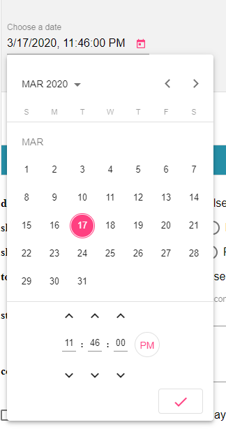
Angular Material DatetimePicker, Timepicker for @angular/material 7.x, 8.x, 9.x
Description
A DatetimePicker like @angular/material Datepicker by adding support for choosing time.
DEMO
@see LIVE DEMO
@see DEMO stackblitz
Getting started
npm install --save @angular-material-components/datetime-picker
Setup
Basically the same way the @angular/material Datepicker is configured and imported.
import { NgxMatDatetimePickerModule, NgxMatTimepickerModule } from '@angular-material-components/datetime-picker';
@NgModule({
   ...
   imports: [
      BrowserModule,
      HttpClientModule,
      BrowserAnimationsModule,
      MatDatepickerModule,
      MatInputModule,
      NgxMatTimepickerModule,
      FormsModule,
      ReactiveFormsModule,
      MatButtonModule,
      NgxMatDatetimePickerModule,
   ],
   ...
})
export class AppModule { }
Using the component
The same API as @angular/material Datepicker (@see API docs)
Datetime Picker (ngx-mat-datetime-picker)
<mat-form-field>
   <input matInput [ngxMatDatetimePicker]="picker" placeholder="Choose a date" [formControl]="dateControl"
      [min]="minDate" [max]="maxDate" [disabled]="disabled">
   <mat-datepicker-toggle matSuffix [for]="picker"></mat-datepicker-toggle>
   <ngx-mat-datetime-picker #picker [showSpinners]="showSpinners" [showSeconds]="showSeconds"
      [stepHour]="stepHour" [stepMinute]="stepMinute" [stepSecond]="stepSecond">
   </ngx-mat-datetime-picker>
</mat-form-field>
Timepicker (ngx-mat-timepicker)
<ngx-mat-timepicker [(ngModel)]="date"></ngx-mat-timepicker>
<ngx-mat-timepicker [(ngModel)]="date" [disabled]="disabled"></ngx-mat-timepicker>
<ngx-mat-timepicker [(ngModel)]="date" [stepHour]="2" [stepMinute]="5" [stepSecond]="10"></ngx-mat-timepicker>
<ngx-mat-timepicker [(ngModel)]="date" [showSpinners]="showSpinners"></ngx-mat-timepicker>
<ngx-mat-timepicker [(ngModel)]="date" [showSeconds]="showSeconds"></ngx-mat-timepicker>
<ngx-mat-timepicker [formControl]="formControl"></ngx-mat-timepicker>
List of @Input
| @Input | Type | Default value | Description |
|---|---|---|---|
| disabled | boolean | null | If true, the picker is readonly and can't be modified |
| showSpinners | boolean | true | If true, the spinners above and below input are visible |
| showSeconds | boolean | true | If true, it is not possible to select seconds |
| stepHour | number | 1 | The number of hours to add/substract when clicking hour spinners |
| stepMinute | number | 1 | The number of minutes to add/substract when clicking minute spinners |
| stepSecond | number | 1 | The number of seconds to add/substract when clicking second spinners |
| color | ThemePalette | undefined | Color palette to use on the datepicker's calendar. |
| enableMeridian | boolean | false | Whether to display 12H or 24H mode. |
| touchUi | boolean | false | Whether the calendar UI is in touch mode. In touch mode the calendar opens in a dialog rather than a popup and elements have more padding to allow for bigger touch targets. |
Choosing a date implementation and date format settings
The datepicker was built to be date implementation agnostic. This means that it can be made to work with a variety of different date implementations. However it also means that developers need to make sure to provide the appropriate pieces for the datepicker to work with their chosen implementation.
The easiest way to ensure this is to import one of the provided date modules:
| NgxMatNativeDateModule | NgxMatMomentModule | |
|---|---|---|
| Date type | Date | Moment |
| Supported locales | en-US | See project for details |
| Dependencies | None | Moment.js |
| Import from | @angular-material-components/datetime-picker | @angular-material-components/datetime-picker |
To use NgxMatMomentModule:
npm install --save @angular-material-components/moment-adapter
Please note: NgxMatNativeDateModule is based off the functionality available in JavaScript's native Date object. Thus it is not suitable for many locales. One of the biggest shortcomings of the native Date object is the inability to set the parse format.
We highly recommend using the NgxMatMomentModule or a custom NgxMatDateAdapter that works with the formatting/parsing library of your choice.
For example:
Creating a custom date adapter:
@Injectable()
export class CustomDateAdapter extends NgxMatDateAdapter<D> {...}
// D can be Date, Moment or customized type
Creating a custom date adapter module
@NgModule({
  providers: [
    {
      provide: NgxMatDateAdapter,
      useClass: CustomDateAdapter,
      deps: [MAT_DATE_LOCALE, MAT_MOMENT_DATE_ADAPTER_OPTIONS]
    }
  ],
})
export class CustomDateModule { }
Theming
- @see @angular/material Using a pre-built theme
- Add the Material Design icon font to your index.html
<link href="https://fonts.googleapis.com/icon?family=Material+Icons&display=block" rel="stylesheet">
License
MIT


