rn-sliding-view

1.1.1 • Public • Published

rn-sliding-view

npm David NPM

rn-sliding-view is a small customizable library that allows you to add animated sliding views to your screens.

It supports 4 modes: from top to bottom ("top"), from bottom to top ("bottom"), from left to right ("left") and from right to left ("right").

You can customize the component in the way you want, including styling, setting animation duration, delays, positioning, allow/disable default drag, make your own drag, etc.

bottom_position top_position left_position right_position

Contents

Installation

yarn add rn-sliding-view

or

npm install rn-sliding-view --save

Usage

The simplest usage.

All you need to do is provide two props: componentVisible and changeVisibilityCallback:

import React, { Component } from 'react';
import { View, Button, Text, TouchableOpacity } from 'react-native';
import SlidingView from 'rn-sliding-view';
 
export default class App extends Component {
  state = {
    componentVisible: false,
  };
  
  toggleComponentVisibility = () => this.setState({ componentVisible: !this.state.componentVisible });
  
  render() {
    return (
      <>
        <Button
          onPress={this.toggleComponentVisibility}
          title="tap to toggle rn-sliding-view"
        />
        {/* Your other components... */}
        <SlidingView
          componentVisible={this.state.componentVisible}
          changeVisibilityCallback={this.toggleComponentVisibility}
        >
          {/* any nested components */}
        </SlidingView>
      </>
    );
  }
}

Code of examples above.

Default positioning (bottom), default allowed drag, default height and default animation duration. You can explicitly pass position prop, but "bottom" position is default.

Click to see the code.
import React, { Component } from 'react';
import { Alert, StyleSheet, Text, TouchableOpacity, ImageBackground } from 'react-native';
import SlidingView from 'rn-sliding-view';
import wallpaper from './wallpaper.jpeg';
 
export default class App extends Component {
  state = {
    sliderVisible: false,
  };
 
  render() {
    return (
      <>
        <ImageBackground
          style={styles.container}
          source={wallpaper}
        >
          <TouchableOpacity
            onPress={() => this.setState({ sliderVisible: !this.state.sliderVisible })}
            style={styles.container}
          >
            <Text style={styles.textHeader}>rn-sliding-view at work</Text>
            <Text style={styles.text}>Default position (bottom)</Text>
            <Text style={styles.text}>Default duration (300)</Text>
            <Text style={styles.text}>Default height (50% of height screen)</Text>
            <Text style={styles.text}>Drag is allowed</Text>
            <Text style={styles.text}>Drag finishing on release is allowed</Text>
          </TouchableOpacity>
        </ImageBackground>
        <SlidingView
          componentVisible={this.state.sliderVisible}
          containerStyle={styles.slidingContainer}
          changeVisibilityCallback={() => this.setState({ sliderVisible: !this.state.sliderVisible })}
        >
          <TouchableOpacity
            onPress={() => Alert.alert('Yay! You touched me')}
            style={{ width: '100%' }}
          >
            <Text style={[styles.slidingText, { color: 'blue' }]}>
              This text is touchable
            </Text>
          </TouchableOpacity>
          <Text style={styles.slidingText}>This one is not</Text>
          <Text style={styles.slidingText}>You can put here</Text>
          <Text style={styles.slidingText}>Anything you want</Text>
        </SlidingView>
      </>
    );
  }
}
 
const styles = StyleSheet.create({
  container: {
    flex: 1,
    justifyContent: 'center',
    alignItems: 'center',
  },
  textHeader: {
    fontSize: 30,
    fontWeight: 'bold',
    textAlign: 'center',
    margin: 10,
    color: '#f493ff',
  },
  text: {
    textAlign: 'center',
    fontSize: 18,
    fontWeight: 'bold',
    marginBottom: 5,
    color: '#4fbadc',
  },
  slidingContainer: {
    backgroundColor: 'white',
    justifyContent: 'center',
    alignContent: 'stretch',
    borderTopLeftRadius: 20,
    borderTopRightRadius: 20,
  },
  slidingText: {
    textAlign: 'center',
    marginTop: 20,
    width: '100%',
    paddingBottom: 5,
    borderBottomWidth: 1,
  },
});
 

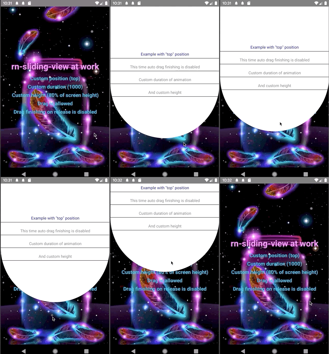
Position "top", custom height, custom animation duration, drag is allowed, disabled auto finishing drag.

Click to see the code.
import React, { Component } from 'react';
import { StyleSheet, Text, TouchableOpacity, ImageBackground } from 'react-native';
import { widthPercentageToDP as wp, heightPercentageToDP as hp } from 'react-native-responsive-screen';
import SlidingView from 'rn-sliding-view';
import wallpaper from './wallpaper.jpeg';
 
export default class App extends Component {
  state = {
    sliderVisible: false,
  };
 
  render() {
    return (
      <>
        <ImageBackground
          style={styles.container}
          source={wallpaper}
        >
          <TouchableOpacity
            onPress={() => this.setState({ sliderVisible: !this.state.sliderVisible })}
            style={styles.container}
          >
            <Text style={styles.textHeader}>rn-sliding-view at work</Text>
            <Text style={styles.text}>Custom position (top)</Text>
            <Text style={styles.text}>Custom duration (1000)</Text>
            <Text style={styles.text}>Custom height (80% of screen height)</Text>
            <Text style={styles.text}>Drag is allowed</Text>
            <Text style={styles.text}>Drag finishing on release is disabled</Text>
          </TouchableOpacity>
        </ImageBackground>
        <SlidingView
          componentVisible={this.state.sliderVisible}
          containerStyle={styles.slidingContainer}
          position="top"
          height={hp(80)}
          disableAutoDragEnd
          animationDuration={1000}
          changeVisibilityCallback={() => this.setState({ sliderVisible: !this.state.sliderVisible })}
        >
          <TouchableOpacity
            onPress={() => this.setState({ sliderVisible: !this.state.sliderVisible })}
            style={{ width: '100%' }}
          >
            <Text style={[styles.slidingText, { color: 'blue' }]}>
              Example with "top" position
            </Text>
          </TouchableOpacity>
          <Text style={styles.slidingText}>This time auto drag finishing is disabled</Text>
          <Text style={styles.slidingText}>Custom duration of animation</Text>
          <Text style={styles.slidingText}>And custom height</Text>
        </SlidingView>
      </>
    );
  }
}
 
const styles = StyleSheet.create({
  container: {
    flex: 1,
    justifyContent: 'center',
    alignItems: 'center',
  },
  textHeader: {
    fontSize: 30,
    fontWeight: 'bold',
    textAlign: 'center',
    margin: 10,
    color: '#f493ff',
  },
  text: {
    textAlign: 'center',
    fontSize: 18,
    fontWeight: 'bold',
    marginBottom: 5,
    color: '#4fbadc',
  },
  slidingContainer: {
    backgroundColor: 'white',
    justifyContent: 'center',
    alignContent: 'stretch',
    borderBottomLeftRadius: wp(50),
    borderBottomRightRadius: wp(50),
  },
  slidingText: {
    textAlign: 'center',
    marginTop: 20,
    width: '100%',
    paddingBottom: 5,
    borderBottomWidth: 1,
  },
});
 

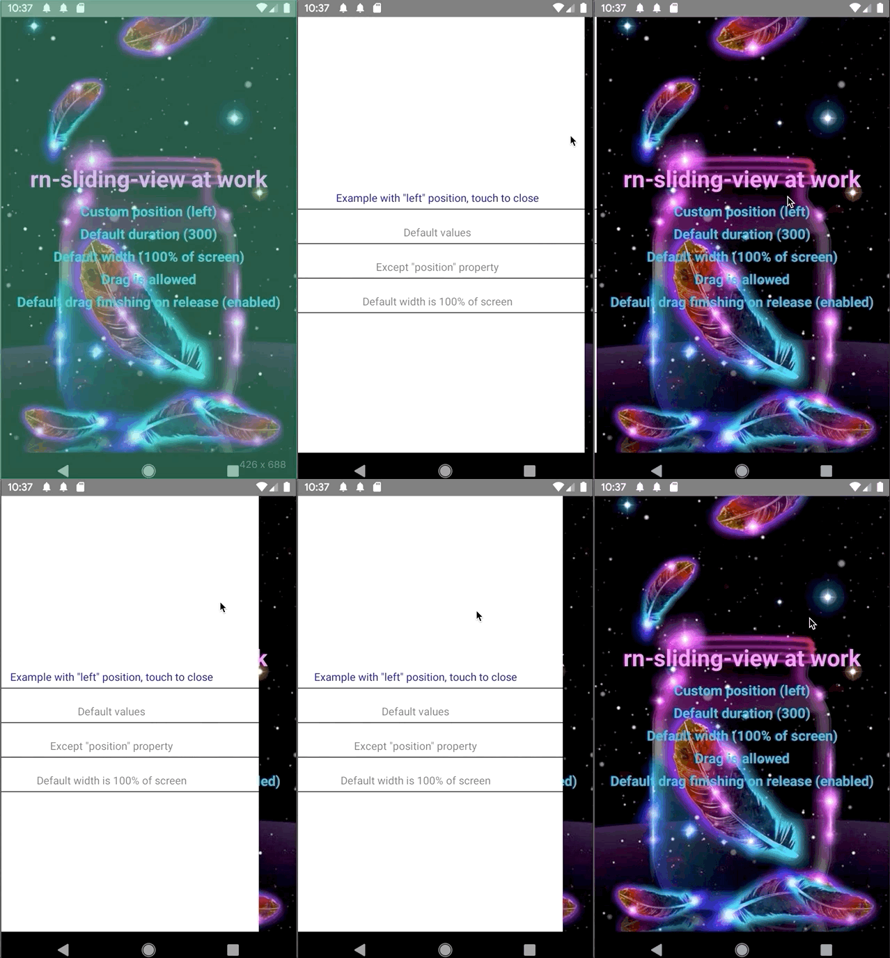
Position "left", default width, default animation duration, drag is allowed, default auto finishing drag.

Click to see the code.
import React, { Component } from 'react';
import { StyleSheet, Text, TouchableOpacity, ImageBackground } from 'react-native';
import { widthPercentageToDP as wp, heightPercentageToDP as hp } from 'react-native-responsive-screen';
import SlidingView from 'rn-sliding-view';
import wallpaper from './wallpaper.jpeg';
 
export default class App extends Component {
  state = {
    sliderVisible: false,
  };
 
  render() {
    return (
      <>
        <ImageBackground
          style={styles.container}
          source={wallpaper}
        >
          <TouchableOpacity
            onPress={() => this.setState({ sliderVisible: !this.state.sliderVisible })}
            style={styles.container}
          >
            <Text style={styles.textHeader}>rn-sliding-view at work</Text>
            <Text style={styles.text}>Custom position (left)</Text>
            <Text style={styles.text}>Default duration (300)</Text>
            <Text style={styles.text}>Default width (100% of screen)</Text>
            <Text style={styles.text}>Drag is allowed</Text>
            <Text style={styles.text}>Default drag finishing on release (enabled)</Text>
          </TouchableOpacity>
        </ImageBackground>
        <SlidingView
          componentVisible={this.state.sliderVisible}
          containerStyle={styles.slidingContainer}
          position="left"
          changeVisibilityCallback={() => this.setState({ sliderVisible: !this.state.sliderVisible })}
        >
          <TouchableOpacity
            onPress={() => this.setState({ sliderVisible: !this.state.sliderVisible })}
            style={{ width: '100%' }}
          >
            <Text style={[styles.slidingText, { color: 'blue' }]}>
              Example with "left" position, touch to close
            </Text>
          </TouchableOpacity>
          <Text style={styles.slidingText}>Default values</Text>
          <Text style={styles.slidingText}>Except "position property"</Text>
          <Text style={styles.slidingText}>Default width is 100% of screen</Text>
        </SlidingView>
      </>
    );
  }
}
 
const styles = StyleSheet.create({
  container: {
    flex: 1,
    justifyContent: 'center',
    alignItems: 'center',
  },
  textHeader: {
    fontSize: 30,
    fontWeight: 'bold',
    textAlign: 'center',
    margin: 10,
    color: '#f493ff',
  },
  text: {
    textAlign: 'center',
    fontSize: 18,
    fontWeight: 'bold',
    marginBottom: 5,
    color: '#4fbadc',
  },
  slidingContainer: {
    backgroundColor: 'white',
    justifyContent: 'center',
    alignContent: 'stretch',
  },
  slidingText: {
    textAlign: 'center',
    marginTop: 20,
    width: '100%',
    paddingBottom: 5,
    borderBottomWidth: 1,
  },
});
 

Position "right", disabled drag, custom width, custom animation duration and styles.

Click to see the code.
import React, { Component } from 'react';
import { Alert, StyleSheet, Text, TouchableOpacity, ImageBackground } from 'react-native';
import { widthPercentageToDP as wp } from 'react-native-responsive-screen';
import SlidingView from 'rn-sliding-view';
import wallpaper from './wallpaper.jpeg';
 
export default class App extends Component {
  state = {
    sliderVisible: false,
  };
 
  render() {
    return (
      <>
        <ImageBackground
          style={styles.container}
          source={wallpaper}
        >
          <TouchableOpacity
            onPress={() => this.setState({ sliderVisible: !this.state.sliderVisible })}
            style={styles.container}
          >
            <Text style={styles.textHeader}>rn-sliding-view at work</Text>
            <Text style={styles.text}>Custom position (right)</Text>
            <Text style={styles.text}>Custom duration (800)</Text>
            <Text style={styles.text}>Default width (100% of screen)</Text>
            <Text style={styles.text}>Drag is disabled</Text>
            <Text style={styles.text}>Default drag finishing on release (enabled)</Text>
          </TouchableOpacity>
        </ImageBackground>
        <SlidingView
          componentVisible={this.state.sliderVisible}
          containerStyle={styles.slidingContainer}
          position="right"
          disableDrag
          width={wp(70)}
          animationDuration={800}
          changeVisibilityCallback={() => this.setState({ sliderVisible: !this.state.sliderVisible })}
        >
          <TouchableOpacity
            onPress={() => Alert.alert('Yay! You touched me')}
            style={{ width: '100%' }}
          >
            <Text
              onPress={() => this.setState({ sliderVisible: !this.state.sliderVisible })}
              style={[styles.slidingText, { color: 'blue' }]}
            >
              Example with "right" position, touch to close
            </Text>
          </TouchableOpacity>
          <Text style={styles.slidingText}>Drag is disabled</Text>
          <Text style={styles.slidingText}>Custom width (70% of screen)</Text>
          <Text style={styles.slidingText}>Custom duration (800)</Text>
        </SlidingView>
      </>
    );
  }
}
 
const styles = StyleSheet.create({
  container: {
    flex: 1,
    justifyContent: 'center',
    alignItems: 'center',
  },
  textHeader: {
    fontSize: 30,
    fontWeight: 'bold',
    textAlign: 'center',
    margin: 10,
    color: '#f493ff',
  },
  text: {
    textAlign: 'center',
    fontSize: 18,
    fontWeight: 'bold',
    marginBottom: 5,
    color: '#4fbadc',
  },
  slidingContainer: {
    backgroundColor: 'white',
    justifyContent: 'center',
    alignContent: 'stretch',
  },
  slidingText: {
    textAlign: 'center',
    marginTop: 20,
    width: '100%',
    paddingBottom: 5,
    borderBottomWidth: 1,
  },
});

Make it draggable

Generally it's up to you what you want to do with the component. By default drag'n'drop is allowed and it has its own behaviour (described below). If you wish you can disable it via disableDrag prop and make your own logic of drag'n'drop or not make it at all. If you're going to make your own logic, make sure you've disabled default behaviour via disableDrag prop.

Default drag'n'drop behaviour.

By default you can drag the component at its any part. Maximum value is component's height (or width, if it has left or right position), minimum is an edge of device's screen. If you don't pass disableAutoDragEnd prop it has the following behaviour: when you release your finger the component evaluates the direction of its move. So on release it either hides the component or returns it to maximum value.

Custom drag'n'drop behaviour.

To make your own logic of drag'n'drop you have to pass disableDrag prop. Generally all you need to do is create your own responder and pass it to your child component.

...
componentDidMount() {
    this.responders = createResponder({
        // ...your code with responders
    })
}
 
render() {
    return (
        <SlidingView
          componentVisible={this.state.sliderVisible}
          containerStyle={styles.slidingContainer}
          customPositionY={this.state.y}
          disableDrag
          changeVisibilityCallback={() => this.setState({ sliderVisible: !this.state.sliderVisible })}
        >
            {/* Your components below */}
            <View>
                <View {...this.responders} /> <-- This view will be draggable
                 {/* Your other not draggable components */}
            </View>
        </SlidingView>
    )
}
...

After you created your responder and passed it to the component, you can handle it in the way you want. The main thing you have to do now - dynamically update currentPositionY (or currentPositionX) prop.

Important: if you want to pass TouchableOpacity (or other touchable) elements, consider making a distinction between drag and single tap. By default, pan responders override single taps of nested views, so TouchableOpacity won't work. As in example below you can set onStartShouldSetResponderCapture to () => false if you use react-native-gesture-responder library. Or use similar method of native PanResponder class.

Click to see example of custom drag'n'drop implementation
import React, { Component } from 'react';
import { View, StyleSheet, Text, TouchableOpacity, ImageBackground, Animated } from "react-native";
import { widthPercentageToDP as wp, heightPercentageToDP as hp } from 'react-native-responsive-screen';
import { createResponder } from 'react-native-gesture-responder';
import SlidingView from 'rn-sliding-view';
import wallpaper from './wallpaper.jpeg';
 
export default class App extends Component<Props> {
  state = {
    sliderVisible: false,
    y: null,
  };
 
  componentDidMount() {
    this.responders = createResponder({
      onStartShouldSetResponder: () => true,
      onStartShouldSetResponderCapture: () => false,
      onMoveShouldSetResponder: () => true,
      onMoveShouldSetResponderCapture: () => true,
      onResponderMove: (evt, gestureState) => {
        this.pan(gestureState);
      },
      onResponderRelease: (evt, gestureState) => {
        this.dragEnd(gestureState);
      },
      onPanResponderTerminationRequest: () => true,
    });
  }
 
  pan = gestureState => {
    const { y } = this.state;
    const maxY = hp(50);
    const minY = 0;
 
    const yDiff = gestureState.moveY - gestureState.previousMoveY;
    let newY = y - yDiff;
    if (=== null) newY = gestureState.moveY;
    if (newY < minY) {
      newY = minY;
    } else if (newY > maxY) {
      newY = maxY;
    }
 
    this.setState({ y: newY });
  };
 
  dragEnd = gestureState => {
    const { sliderVisible } = this.state;
    if (gestureState.moveY > gestureState.previousMoveY) {
      return this.setState({
        sliderVisible: !sliderVisible,
        y: null,
      });
    }
    return this.setState({
      y: hp(50),
    });
  };
 
  render() {
    return (
      <>
        <View style={styles.container}>
            // ... Your other components
        </View>
        <SlidingView
          componentVisible={this.state.sliderVisible}
          containerStyle={styles.slidingContainer}
          position="bottom"
          currentPositionY={this.state.y}
          disableDrag
        >
          <TouchableOpacity
            onPress={() => this.setState({ sliderVisible: !this.state.sliderVisible })}
            style={{ width: '100%' }}
          >
            <Text style={[styles.slidingText, { color: 'blue' }]}>
              Example with "left" position, touch to close
            </Text>
          </TouchableOpacity>
          <View {...this.responders}> // <-- This view will be draggable
            <Text style={styles.slidingText}>Default values</Text>
          </View>
          <Text style={styles.slidingText}>This text is not draggable</Text>
        </SlidingView>
      </>
    );
  }
}
 
const styles = StyleSheet.create({
  container: {
    flex: 1,
    justifyContent: 'center',
    alignItems: 'center',
  },
  slidingContainer: {
    backgroundColor: 'white',
    justifyContent: 'center',
    alignContent: 'stretch',
  },
  slidingText: {
    textAlign: 'center',
    marginTop: 20,
    width: '100%',
    paddingBottom: 5,
    borderBottomWidth: 1,
  },
});
 

Props

Props Default value Required Type Definition
componentVisible - true Boolean Represents if the component is visible.
animationDuration 300 false Number Sets duration of animation.
position "bottom" false String Sets the place where the component appears.
height 50% of screen false Number Sets the height of the component.
width 100% of screen false Number Sets the width of the component.
delay 0 false Number Sets the delay before animation starts.
disableDrag false false Boolean Disables default drag behaviour.
disableAutoDragEnd false false Boolean Disables default finishing drag behaviour (fires on release of touch).
changeVisibilityCallback () => {} false Function Changes visibility of the component. Required, if you use default drag behaviour. Pass the same function you use for changing componentVisible prop.
currentPositionX null false Number Represents horizontal position of the component. Required if you use "left" or "right" position prop.
currentPositionY null false Number Represents vertical position of the component. Required if you use "bottom" or "top" position prop.
children - false React.Node Children components you pass to rn-sliding-view component.
containerStyle {} false Object Custom styles of the component's container

Caveats

  • It's better to make your component a single module with separate logic of drag'n'drop, switching between visibility states, etc.

  • Consider using redux/mobX state if you want to pass rn-sliding-view at the top of your application. So you can toggle visibility via single function throughout your app.

  • The place matters. Bounds where the component will be placed are defined by its place in your code. If you nest the component inside of another nested component (not at the top level), it will be placed at the same level in your views hierarchy.

Contribution

Contributors are welcome! Please, opening PR consider following git flow. If I am afk too long you can message me directly to my linkedIn or to email: egor19942012@gmail.com.

Issues

Please, opening new issue provide the code to reproduce the problem and full description. This is the fastest way to solve it.

License

MIT

Versions

Current Tags

  • Version
    Downloads (Last 7 Days)
    • Tag
  • 1.1.1
    2
    • latest

Version History

Package Sidebar

Install

npm i rn-sliding-view

Weekly Downloads

9

Version

1.1.1

License

MIT

Unpacked Size

516 kB

Total Files

27

Last publish

Collaborators

  • dn_egor_web